Edit Box
- 2 minutes to read
The Edit Box (EditBox) is a styled text input field.
Edit Value
Use the editor’s EditValue property to get or set its value.
object inputValue = editBox1.EditValue;
Handle the EditValueChanged event to respond to text changes.
Field Labels & Prompt Text
Use the HeaderLabel, FooterLabel, and Placeholder properties to specify the corresponding labels and placeholder.

editBox1.HeaderLabel = "Header label";
editBox1.FooterLabel = "Footer label";
editBox1.Placeholder = "Placeholder text";
Leading Icon
Use the LeadingIconOptions property to specify a leading icon. You can choose an image from the DevExpress Image Gallery, which is packed with thousands of high-quality SVG and PNG icons, or you can specify your own graphics.
![]()
The following example shows how to specify the leading icon in code.
editBox1.LeadingIconOptions.SvgImage = svgImageCollection1[0];
Input Masks
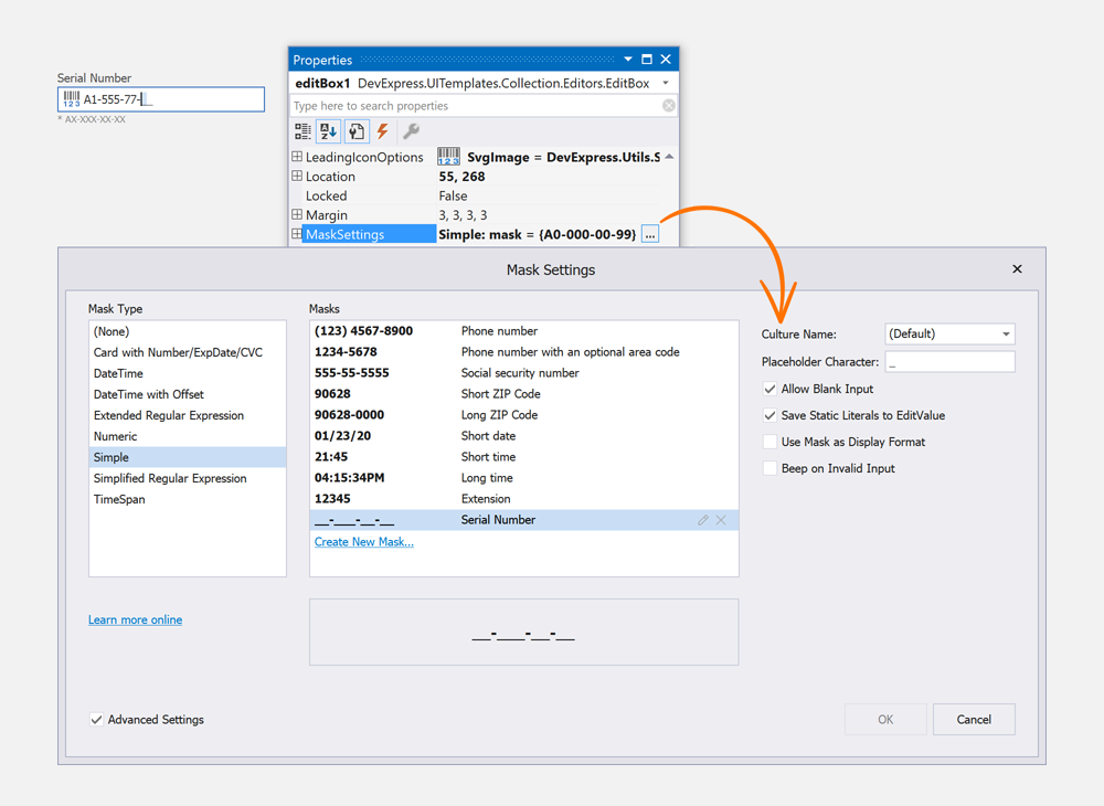
Masks help define the way in which data can be entered within an application. Use the MaskSettings property to configure the input mask. Mask options include: autocomplete, character casing, beep on error, use mask as display format, etc.
The Edit Box fully supports the following mask types:
- Simple
- Numeric
- Date-Time / TimeSpan
- Simplified & Extended Regular Expressions (RegEx)
- Payment Card Details (Card Number, Expiration Date, CVC)
The integrated Mask Editor for Visual Studio allows you to apply predefined masks, and create and configure custom masks at design time.

Read the following topic for details: Input Mask.
HTML & CSS Template Customization
The Edit Box is created with HTML & CSS templates. This allows you to create fully custom text input controls. Template customizations are handled with our HTML Template Editor that is integrated into the Visual Studio IDE. This tool uses an embedded Syntax Editor with autocomplete, tag navigation, and preview.