HTML and CSS Support
- 12 minutes to read
The HTML & CSS Support allows you to create fully custom UI elements and eliminate the use of property-based UI customizations and CustomDraw events. You can build a UI in HTML format, and customize the appearance settings, size, padding, and layout options of UI elements using CSS styles.
Key features include:
- Enhance the visual appearance of DevExpress WinForms controls with effects like shadows, shining, round corners, mouse hover/click, etc.
- Create responsive UIs with CSS.
- Specify data binding expressions in HTML markup to display values from the data sources.
- Handle events to respond to mouse actions on HTML UI elements.
- DirectX hardware acceleration for better performance.
- HTML & CSS Template Editor integrated into Visual Studio IDE.
Note
Limitation: UI controls with HTML-CSS templates cannot be printed or exported.
The following DevExpress WinForms controls ship with built-in HTML & CSS Support:
- Accordion
- Alert Controls and XtraMessageBox
- Data Grid (ItemsView, TileView, WinExplorerView)
- DirectX Form
- Listbox and ComboBox
- Gantt Control
- HTML Content and Popup
- Scheduler
- TreeList
Note
The HTML/CSS-aware controls support commonly used HTML tags, CSS properties and selectors:
Demos
HTML-CSS Markup
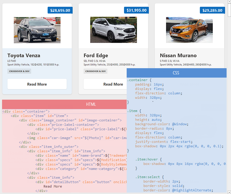
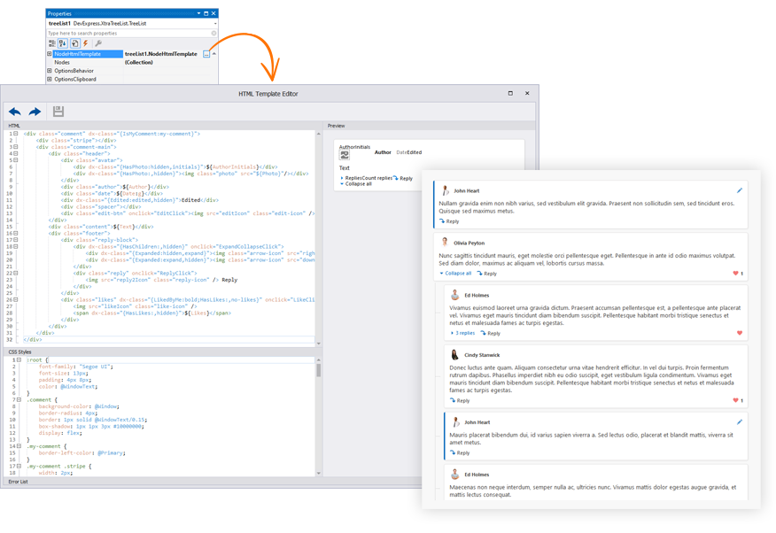
HTML and CSS-aware controls and components render their UIs from templates. The HTML markup of a control’s template specifies the control’s contents (UI elements), while the template’s CSS code specifies style, display, and layout settings applied to the UI elements.
Use the control’s HtmlTemplate property to specify the template. At design time, you can create a template in the HTML Template Editor.

This editor supports syntax highlighting, IntelliSense (a code completion aid), and the preview pane. The preview pane allows you to inspect visual elements—locate HTML tags when you hover over the elements.
Reusable HTML & CSS Templates
The HTML Template Editor allows you to load predesigned templates form the DevExpress HTML & CSS Template Gallery. These templates are based on those used in our WinForms demo applications. You can use these templates “as-is” or customize as needed.

You can create an HTML & CSS template, save the template to the gallery, and use it in any WinForms project when needed.
Example
The following example demonstrates an HtmlContentControl that renders a UI from the assigned HTML-CSS template. The control is bound to a list of Employee objects. The template’s HTML code contains data binding expressions to display values from the data source.

public class Employee {
    public string DisplayName { get; set; }
    public string FullName { get; set; }
    public SvgImage Photo { get; set; }
}
//...
Employee emp = new Employee();
emp.DisplayName = "Leah Test Coordinator";
emp.FullName = "Leah Simpson";
SvgImageCollection imageCollection = new SvgImageCollection();
imageCollection.Add("photo", "image://svgimages/icon builder/business_businesswoman.svg");
emp.Photo = imageCollection["photo"];
List<Employee> list = new List<Employee>();
list.Add(emp);
htmlContentControl1.DataContext = list;
//...
void OnButtonClick(object sender, DxHtmlElementMouseEventArgs args) {
    if(args.ElementId == "uploadBtn") {
        //...
    }
    if (args.ElementId == "removeBtn") {
        //...
    }
    XtraMessageBox.Show("Button " + args.ElementId + " clicked");
}
Specify HTML-CSS Templates Dynamically
A number of controls use HTML-CSS templates to render their items. For instance, the ItemsView generates all its items (records) from the default template specified by the ItemsView.HtmlTemplate property.
These controls have events to assign templates to items and thus override the default template dynamically:
- ItemsView.QueryItemTemplate
- WinExplorerView.QueryItemTemplate
- GanttControl.QueryItemTemplate
- TileView.CustomItemTemplate
Example
The following ItemsView.QueryItemTemplate event handler assigns different templates to different items based on an item’s type (IsOwnMessage setting).
You can find the complete code of this sample in the following demo: Chat Client.
void OnQueryItemTemplate(object sender, QueryItemTemplateEventArgs e) {
    var message = e.Row as DevAV.Chat.Model.Message;
    if(message == null)
        return;
    if(message.IsOwnMessage)
        Styles.MyMessage.Apply(e.Template);
    else
        Styles.Message.Apply(e.Template);
    //...
}
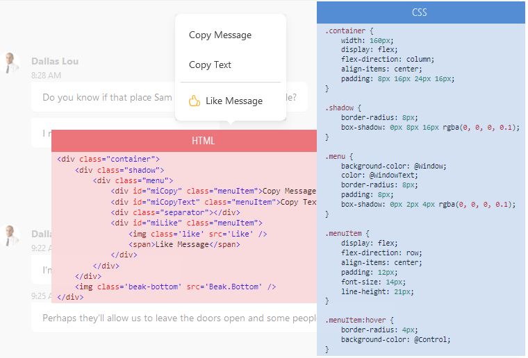
Customize Items Dynamically
Controls that generate their items from templates also have events to dynamically customize each item:
- ItemsView.CustomizeItem
- WinExplorerView.CustomizeItem
- GanttControl.CustomizeItem
- TileView.ItemCustomize
These events fire for each item in the control before the item is displayed onscreen. They allow you to access individual HTML elements that are about to be rendered, and customize their visibility and style settings.
Example
The following example changes visibility of HTML elements according to custom logic.
You can find the complete code of this sample in the following demo: Chat Client.
//CustomizeItem event handler:
void OnCustomizeItem(object sender, CustomizeItemArgs e) {
    //...
    if(message.IsLiked) {
        var btnLike = e.Element.FindElementById("btnLike");
        var btnMore = e.Element.FindElementById("btnMore");
        if(btnLike != null && btnMore != null) {
            btnLike.Hidden = false;
            btnMore.Hidden = true;
        }
    }
    if(message.IsFirstMessageOfBlock)
        return;
    if(!message.IsOwnMessage) {
        var avatar = e.Element.FindElementById("avatar");
        if(avatar != null)
            //Display an empty region instead of the 'avatar' element.
            avatar.Style.SetVisibility(Utils.Html.Internal.CssVisibility.Hidden);
    }
//...
}
Data Binding
If a control is bound to a data source, you can use the following syntax in HTML markup to display values of data source fields:
${FieldName}
The ‘$’ character specifies that the text that follows is an expression that the control needs to evaluate. The expression can contain static text and data binding to multiple fields:
$text{FieldName}text${FieldName1}text{FieldName2}text
For example, the following HTML code displays a value of the “UserName” field from the control’s data source:
<div class='contactName'>${UserName}</div>
The following example adds the ‘Welcome’ string before a user name:
<h1>$Welcome {UserName}!</h1>
External Controls and In-place Editors
The <input> tag allows you to add an in-place editor or external control to the HTML-based UI. The tag is supported for the following controls:
- HtmlContentControl
- Use the
<input>tag as a placeholder for external controls and Repository Items (in-place editors) you want to display within a layout. - Data Grid Views (ItemsView, TileView, and WinExplorerView)
- Use the
<input>tag as a placeholder for Repository Items (in-place editors). It’s not possible to use this tag to display external controls in Data Grid Views.

<input name="textEditEmail" class="field-input"/>
<input name="repositoryItemPictureEdit1" value="${ImageData}" class="editor"/>
See the following topic for more information: HTML Tags - Input.
Buttons

Follow the steps below to render a button:
- Define an HTML element that renders a button. Specify the element’s class (for instance, set the class name to “button”).
- In CSS code, define the “button” class to specify the element’s display properties.
- Also define the hover state for the button class to highlight the element when it’s hovered over.
The following sample uses the <div> tag to define a button:
<div id="uploadBtn" class="centered button">Upload</div>
<div id="removeBtn" class="centered button">Remove</div>
UI Element Mouse Actions
You can respond to mouse actions on HTML UI elements at the control level, HTML markup level, and when using Fluent API.
Control’s Mouse Events
HTML-aware controls expose events that you can handle to respond to mouse actions on HTML UI elements. These events are typically called:
ElementMouseClickElementMouseDownElementMouseMoveElementMouseOutElementMouseOverElementMouseUp
void htmlContentControl1_ElementMouseClick(object sender, DevExpress.Utils.Html.DxHtmlElementMouseEventArgs e) {
    if(e.ElementId == "btnSend") {
        //...
    }
}
HTML Mouse Events
The following mouse events are supported in HTML markup: onclick, ondblclick, onmousedown, onmouseup, onmouseover, onmousemove, and onmouseout. You can subscribe to these events as follows:
Define a method in code-behind with the following signature:
Note
The method must be discoverable by a HTML/CSS-aware control to auto-wire events. Event auto-wiring does not work if the control is placed in certain containers, such as BackstageViewControl, PopupContainerControl or FlyoutPanel. Use control’s mouse events or move the method and control to an XtraUserControl descendant class, and drop its instance into the container.
In the HTML code, set an element’s event to the name of the defined method.
<img onclick="<MethodName>" ... />
Example:
<div class='buttonPanel'>
    <img onclick="OnPhoneClick" src="PhoneCall" class="button" />
</div>
Fluent API
You can use Fluent API to subscribe to an element’s mouse click event.
var fluent = context.OfType<ViewModel>();
fluent.BindCommandToElement(htmlContentControl, "btnPhone", x => x.Phone);
//...
public class ViewModel {
    public void Phone() {
        //...
    }
    //...
}
See the following demo: Html Main Demo - Interaction.
Images

Use the <img> HTML tag to display an image. Assign the image source to the tag’s src attribute. The image source can be one of the following values:
The name or index of a target image in the control’s HtmlImages collection (for instance, HtmlContentControl.HtmlImages).
A binding expression (
${FieldName}) that defines a field in the control’s data source that stores image data. Note that the target field must store strings (image names) or images (BitmaporSvgImageobjects). ImageURL and byte arrays are not supported.An HTML template checks whether the data field contains SVG graphics or bitmaps. If it is not, the template looks for the image with the specified name in the
SvgImageCollectionassigned to the control’sHtmlImagesproperty.<img src="${LargePhoto}" width="100" height="100">
HTML-CSS-aware Controls
HtmlContentControl
HtmlContentControl is a surface where you can build a UI from HTML-CSS markup.

HtmlContentPopup
HtmlContentPopup is a popup version of the HtmlContentControl. This component generates a UI from HTML-CSS code and displays it as a flyout or modal window.
GridControl’s ItemsView
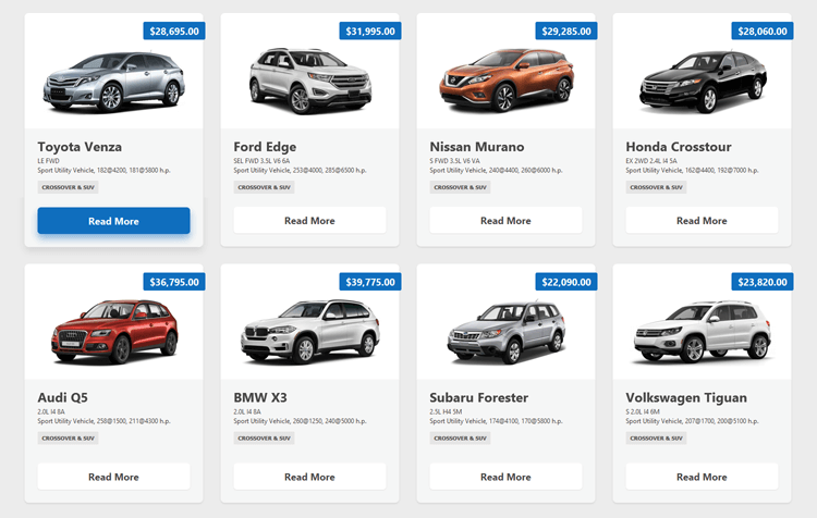
The new ItemsView does not have default data representation. It renders its items (data records) solely from the HTML-CSS template that you specify with a property, or dynamically with an event.

GridControl’s TileView
TileView generates its items (tiles) from a template. You can choose between regular templates and HTML-CSS-based templates.

See Create Tile Template.
GridControl’s WinExplorerView
WinExplorerView supports HTML-CSS templates to build a layout of cards. You can specify HTML-CSS templates for each display style manually (ExtraLarge, Large, Medium, List, Tiles, and so on), or dynamically with an event.
GanttControl
GanttControl allows you to use HTML-CSS markup to render many elements:
- Tasks, Summaries, and Milestones
- Regular and Summary Task Progress
- Regular, Summary, and Milestone Task Baselines
- Text Labels
- Interaction Tooltips
- Split Tasks

See the following topic for more information: HTML Templates in Gantt Control.
Scheduler Control
You can use HTML-CSS-based templates in the SchedulerControl to render appointments.

TreeList
The WinForms TreeList control supports HTML/CSS templates and allows you to generate unique custom layouts for nodes and its empty space area. Use the following API to create and apply HTML templates:
- NodeHtmlTemplate - Specifies the default HTML-CSS template for nodes.
- EmptyTreeHtmlTemplate - Specifies the default HTML-CSS template for an empty TreeList control.
- HtmlTemplates - A collection of HTML templates that can be applied to TreeList UI elements based on a condition.
- QueryNodeTemplate - Allows you to apply a template from the
HtmlTemplatescollection based on a condition. - CustomizeNodeTemplate - Allows you to customize templated nodes.
DirectX Form
A replacement for standard Visual Studio forms that enables the DirectX Hardware Acceleration for its child controls, and supports HTML-CSS-based templates.
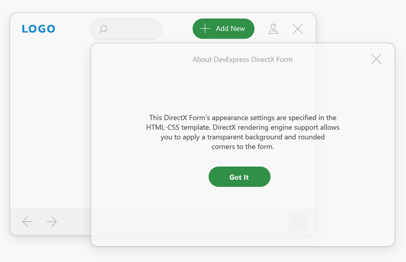
See DirectX Form.
Alert Controls
Templates for the AlertControl allow you to render modern application notifications.
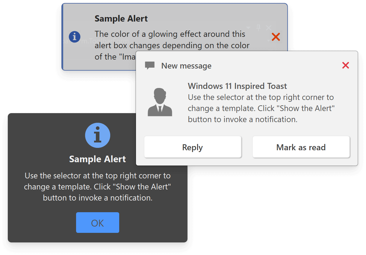
See Alert Windows with HTML Templates.
Listbox Controls and ComboBox Editor
You can use HTML-CSS-based templates to render items in the following controls:

See the following topics for additional information:
Accordion Control
AccordionControl allows you to use HTML-CSS templates to render its UI elements:
- Items and groups
- Footer elements
- Elements in the minimized state, etc.
