How To: Create a TabbedGroup Container
- 3 minutes to read
A Tabbed Group is a content container that can contain multiple Documents, but displays only one of them at a time. End-users click Document Headers to navigate through Documents. These Headers can be displayed either as traditional tab headers or as Windows 10-inspired tiles. This example illustrates how to create and customize the Tabbed Group Container.
Prerequisites
- Create a Windows Forms Application.
- Windows UI applications are generally designed to run in full-screen mode. Modify the main form to meet these requirements. Set the FormBorderStyle property to None and the WindowState property to Maximized.
- Drop a DocumentManager component on the form.
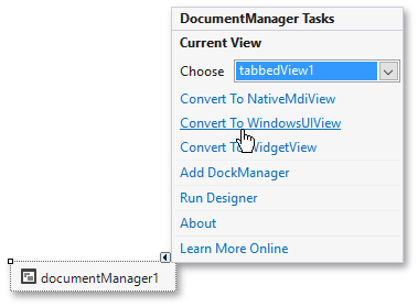
Change the DocumentManager‘s View to WindowsUI View. Click the DocumentManager‘s smart tag and select the Convert To WindowsUIView option.
Create a Page Group
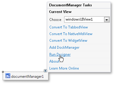
Click the Document Manager’s smart tag, and select Run Designer in the invoked Tasks menu, to run the DocumentManager Designer.
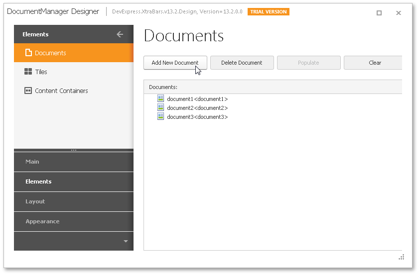
In the DocumentManager Designer, select the Elements | Documents section and add three Documents by clicking the Add New Document button.
Along with these Documents, the Document Manager will create three Tiles and a Tile Container for these Tiles. You will not need the Tiles or the Tile Container for this example, so switch to the corresponding Designer sections and delete them.
In the Designer’s Content Containers section, create a new Tabbed Group container by clicking Add New Container and selecting TabbedGroup.
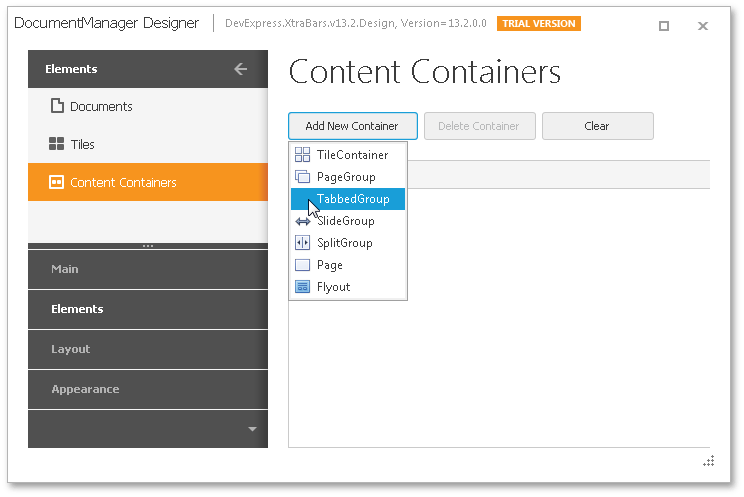
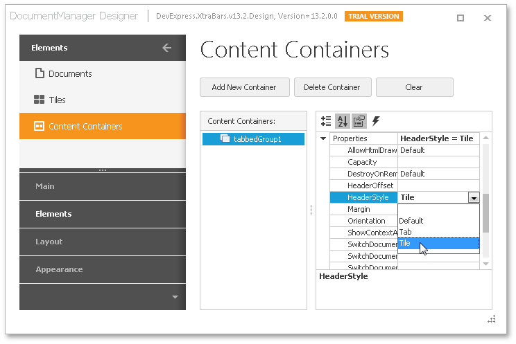
Here, you can specify all required TabbedGroup properties. For example, you can set the ITabbedGroupDefaultProperties.HeaderStyle property to Tile.
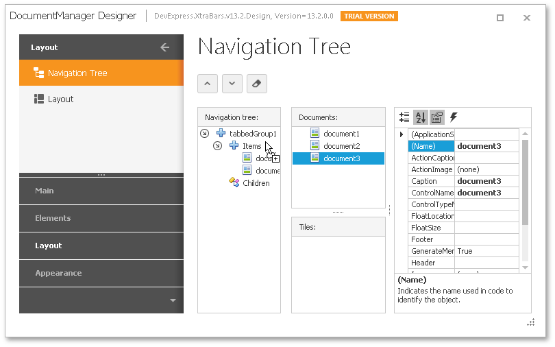
Now switch to the Layout | Navigation Tree section and populate the Tabbed Group with your Documents. To do this, drag these Documents to the Group’s Items collection.
The Documents you created in step 6 are empty. To populate them with content, handle the BaseView.QueryControl event and assign the required content to the e.Control property. For simplicity, assign the same content (e.g., a User Control) to all Documents, as shown in the code below.
private void windowsUIView1_QueryControl(object sender, DevExpress.XtraBars.Docking2010.Views.QueryControlEventArgs e) { e.Control = new myUserControl(); }This approach to assigning content to Documents is called Deferred Load. See the Deferred Load topic for more info.
You now have a fully functional Tabbed Group container. The next step explains how to customize Document headers.
Header Customization
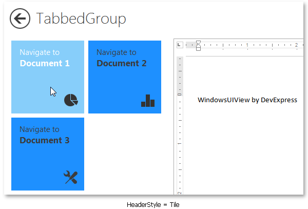
First, expand the Tabbed Group’s AppearanceHeaderButton property and set a custom back color for Tiles in all visual states - normal, hovered and pressed. For example, set the DodgerBlue background for the normal state and LightSkyBlue for the hovered and pressed states. Also, be sure to set the WordWrap property in the TextOptions section to Wrap.
Choose any Document and specify its BaseDocument.Header and BaseDocument.Image properties. You can use HTML tags to format Document headers. If you enabled word wrapping, the <br> tag will allow you to split the tile text into multiple lines.
document1.Header = "<color="Black"><size=16>Document 1</size><br><size=8>Document Manager<br>by DevExpress</size></color>";Finally, set the desired tile size, text and image locations.
tabbedGroup1.Properties.TileSize = 150; tabbedGroup1.Properties.TileTextAlignment = TileHeaderContentAlignment.TopLeft; tabbedGroup1.Properties.TileImageAlignment = TileHeaderContentAlignment.BottomRight;The figure below illustrates customized tiles within a Tabbed Group.