ExpandContainer Class
Combines controls into a headered container that supports the collapse/expand functionality.
Namespace: DevExpress.UI.Xaml.Layout
Assembly: DevExpress.UI.Xaml.Layout.v21.2.dll
NuGet Package: DevExpress.Uwp.Controls
Declaration
[TemplateVisualState(Name = "Expanded", GroupName = "ExpandedStates")]
[TemplateVisualState(Name = "Collapsed", GroupName = "ExpandedStates")]
[TemplatePart(Name = "PART_Content", Type = typeof(ExpandContainerContentPresenter))]
[TemplatePart(Name = "PART_Header", Type = typeof(ExpandContainerHeader))]
[TemplatePart(Name = "PART_ExpandButton", Type = typeof(ExpandButton))]
[StyleTypedProperty(Property = "HeaderStyle", StyleTargetType = typeof(ExpandContainerHeader))]
[StyleTypedProperty(Property = "ExpandButtonStyle", StyleTargetType = typeof(ExpandButton))]
public class ExpandContainer :
HeaderedContentContainerRemarks
The ExpandContainer, as its name suggests, supports the expand/collapse functionality. An end-user can expand/collapse the container via a dedicated button. In code, the container’s expansion state can be changed via the ExpandContainer.IsExpanded property. The ExpandContainer.Expanded and ExpandContainer.Collapsed events help you respond to an expansion state change.

The ExpandContainer supports a single child. You can place any control inside the container. This can be a StackPanel, Grid, etc.
Expandable containers are also supported by the LayoutControl, which is a control providing advanced layout features. To create an expandable container within a LayoutControl, create a LayoutGroup and set its LayoutGroup.AllowExpand property to true.
Example
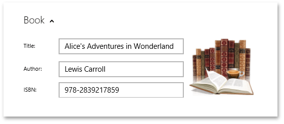
The following example creates an ExpandContainer containing a Grid with sample controls:
xmlns:Layout="using:DevExpress.UI.Xaml.Layout"

<StackPanel Width="550" Background="{StaticResource ApplicationPageBackgroundThemeBrush}">
    <Layout:ExpandContainer  Header="Book" >
        <Grid x:Name="LayoutRoot" Width="480" Height="135">
            <Grid.ColumnDefinitions>
                <ColumnDefinition Width="70" />
                <ColumnDefinition Width="250" />
                <ColumnDefinition Width="150" />
            </Grid.ColumnDefinitions>
            <Grid.RowDefinitions>
                <RowDefinition Height="50" />
                <RowDefinition Height="42" />
                <RowDefinition Height="42"/>
            </Grid.RowDefinitions>
            <TextBlock Text="Title:" Grid.Column="0" Grid.Row="0" VerticalAlignment="Center"/>
            <TextBlock Text="Author:" Grid.Column="0" Grid.Row="1" VerticalAlignment="Center"/>
            <TextBlock Text="ISBN:" Grid.Column="0" Grid.Row="2" VerticalAlignment="Center"/>

            <TextBox Text="Alice's Adventures in Wonderland" Grid.Column="1" Grid.Row="0" VerticalAlignment="Center"/>
            <TextBox Text="Lewis Carroll" Grid.Column="1" Grid.Row="1" VerticalAlignment="Center"/>
            <TextBox Text="978-2839217859" Grid.Column="1" Grid.Row="2" VerticalAlignment="Center"/>
            <Image Grid.Column="2" Grid.Row="0" Grid.RowSpan="3" Source="Images/Books.png"/>
        </Grid>
    </Layout:ExpandContainer>
</StackPanel>