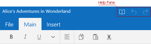
Help Pane
Help Pane is represented by the HelpPane class. It is located on the top-right side above the Ribbon Tabs content. The Help Pane is shown regardless of what Ribbon Tab is currently selected.
You can use regular, radio and toggle buttons within a Help Pane. The Icon property specifies the icon displayed by the button. The Content property specifies the button tooltip. There are two ways of specifying which actions a button item will perform - using the Click or Tapped event or attaching an ICommand object to a button via the Command property.
To attach a Help Pane to a RibbonControl, assign a HelpPane instance to the RibbonControl.HelpPane property. See the example below.
<Ribbon:RibbonControl.HelpPane>
    <Ribbon:HelpPane>
            <Ribbon:HelpPaneButton Content="Save Changes" Command="{Binding SaveChangesCommand}">
                <Ribbon:HelpPaneButton.Icon>
                    <SymbolIcon Symbol="Save" />
                </Ribbon:HelpPaneButton.Icon>
            </Ribbon:HelpPaneButton>
            <Ribbon:HelpPaneToggleButton Content="Toggle Edit Mode" Command="{Binding ToggleEditModeCommand}">
                <Ribbon:HelpPaneToggleButton.Icon>
                    <SymbolIcon Symbol="Save" />
                </Ribbon:HelpPaneToggleButton.Icon>
            </Ribbon:HelpPaneToggleButton>
    </Ribbon:HelpPane>
</Ribbon:RibbonControl.HelpPane>