Layout Control
- 2 minutes to read
The LayoutControl enables you to build a simple or compound layout of controls within a form with the intrinsic support for consistent control arrangement.
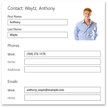
The LayoutControl consists of items that can be combined into titled, expandable or borderless groups. A typical layout item is encapsulated by the LayoutItem class. It represents a header and content pair, where any control can be used as the item’s content. However, you are not limited to using only LayoutItems as group content. You can use any control you wish.
The following is a list of major LayoutControl features.
- Consistent control lay-outing without overlapping (ensured by combining items into groups).
- Expandable and borderless groups.
- Items in groups can be arranged in a horizontal or vertical direction.
- Automatic alignment of item headers within groups.
- Ability to specify different layout directions of items in the Landscape and Portrait modes.
- Automatic control rearrangement when the application’s snapped state is enabled. Item headers are automatically moved to the top of controls and items within groups are vertically oriented (provided that the group’s orientation was not forcibly set).
- Layout items are highlighted when focused.
- Ability to control a layout item’s size (item stretching, auto-size and proportional size) and spacing.
- Multiple items can be combined into a single cell and as such overlap each other. This allows you to display text over an image, for instance.
- Ability to use controls as group items.
- MVVM design pattern support enabling you to populate groups with items from underlying data collections.
See Also