Ribbon Control
- 2 minutes to read
The Ribbon Control is represented by the RibbonControl class. It implements the Ribbon UI that provides a light, modern and sharper looking way to organize application menus by grouping menu items into separate Tabs and Groups.
Most commonly used items can be shown in a Help Pane, so that they are always available to an end-user regardless of what tab is currently active. A root application menu and settings are represented by the Backstage View. The RibbonControl has a different layout in desktop and mobile applications and supports adaptive layout - items are hidden into a flyout and shown the in control depending on the available space.
The Ribbon And Toolbar Items document provides information about items that can be used in Ribbon and Toolbar controls.
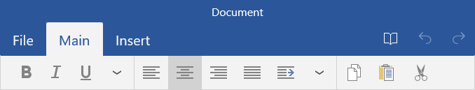
The following screenshot shows a sample RibbonControl which contains two pages (“Main” and “Insert”). The first page has three groups delimited by vertical separators, and each group contains specific items.
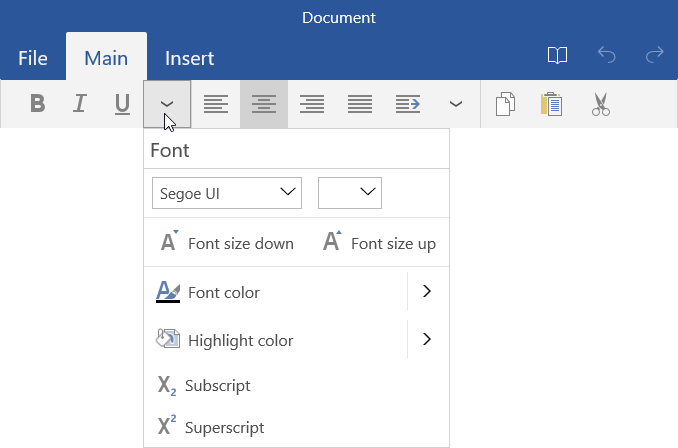
Group captions are hidden from the Ribbon bar and are only displayed in flyouts that provide access to collapsed Ribbon buttons. In the image below, the flyout for the Font group is invoked:
The Ribbon control supports auto-hide mode, in which the Ribbon’s title (see RibbonControl.Title) is only initially visible.

An end-user can click the title to expand the collapsed Ribbon control. See the RibbonControlBase.ViewMode property for more information.
The RibbonToolbarControl provides a similar to Ribbon Control capabilities to organize your application menus by grouping your commands into separate tabs and groups. This control provides lighter layout and in comparison to Ribbon Control does not contain a title, root application menu, and contextual tabs.
The ToolbarControl is a lightweight one-tab toolbar control.