Appearance Customization
- 2 minutes to read
This topic describes properties and techniques that you can use to customize Bar, Toolbar, and Ribbon UI elements.
Common Properties
You can use the following standard WPF properties to customize the appearance of Bar/Toolbar/Ribbon elements:
- Background
- BorderBrush
- BorderThickness
- CornerRadius
- Foreground
- Margin
- Padding
Use Triggers for Conditional Customization
Use the BarItem.Triggers property to conditionally customize the BarItem appearance properties. The standard WPF triggers applied to BarItems do not customize the BarItemLink appearance. The BarItem.Triggers property checks the trigger condition for each BarItemLink that is bound to the BarItem.
Tip
For more information on the bar item structure, refer to the following help topic: Items and Links.
Bars
Bar Item States
Use the following properties to specify the possible states for bar items and bar item links within a RibbonControl:
If the BarItemLinkBase.RibbonStyle property is set to Default, the corresponding BarItem.RibbonStyle property is used. Otherwise, the BarItem.RibbonStyle property is ignored.
BarSplitButtonItem
The BarSplitButtonItem control consists of a command with a down arrow. You can use appearance properties inherited from the BarItem control to specify the appearance of the BarSplitButtonItem command part.
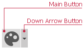
Use the following properties to specify the arrow appearance:
- ArrowAlignment
- ArrowBackground
- ArrowBorderBrush
- ArrowBorderThickness
- ArrowCornerRadius
- ArrowForeground
- ArrowPadding
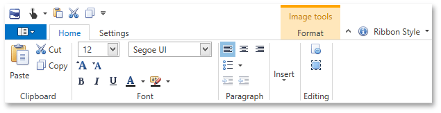
Ribbon
Visual Elements
The following table lists styles that define the appearance of the Ribbon’s visual elements:
| Visual Element | Style |
|---|---|
| RibbonPage content | ContentBorderStyle |
| RibbonPageGroup header | HeaderBorderStyle |
| RibbonPage caption | NormalPageCaptionTextStyle |
| Selected RibbonPage caption | SelectedPageCaptionTextStyle |
| Hovered RibbonPage caption | HoverPageCaptionTextStyle |
Paint Styles
The RibbonControl ships with the following paint styles:
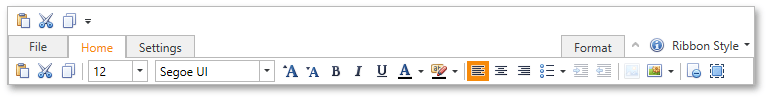
Office Slim
The Ribbon style inspired by the ribbon UI introduced in Microsoft “Office Universal” apps.
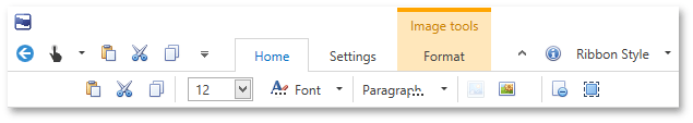
Tablet Office
A style inspired by the Ribbon control in Microsoft Office for iPad.
Office 2019 Ribbon Control
A style inspired by the Ribbon control in Microsoft Office 2019.
Office 2010 Ribbon Control
To implement an application menu found in Microsoft Office 2010, use the BackstageViewControl. Assign a BackstageViewControl to the RibbonControl.ApplicationMenu property. Refer to the Backstage View topic for more information.
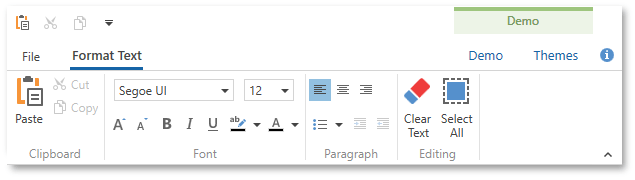
Office 2007 Ribbon Control
This style emulates the Ribbon used in Microsoft Office 2007.
To implement an application menu found in Microsoft Office 2007, use the ApplicationMenu. Assign an ApplicationMenu to the RibbonControl.ApplicationMenu property. Refer to the Application Menu topic for more information.
Use the following properties to change the paint style of the RibbonControl and its elements: