Date Navigator
- 2 minutes to read
The DateNavigator control allows users to select a date or a range of dates to display in the Scheduler.
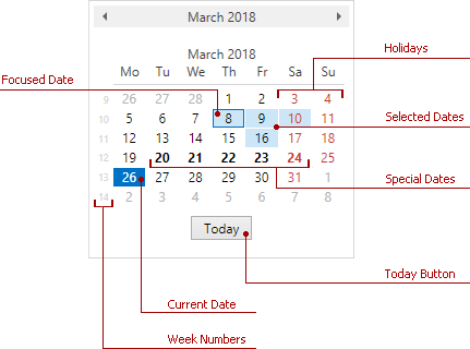
The image below shows the elements of the DateNavigator.

Add the Date Navigator
The DateNavigator is a standalone control. To use it with the Scheduler, add the DateNavigator to your application and use the SchedulerDateNavigatorStyleSettings.Scheduler property to bind it to the SchedulerControl. See the example below.
    xmlns:dxe="http://schemas.devexpress.com/winfx/2008/xaml/editors"
    xmlns:dxsch="http://schemas.devexpress.com/winfx/2008/xaml/scheduling"
<!---->
 <Grid>
    <Grid.ColumnDefinitions>
        <ColumnDefinition Width="*" />
        <ColumnDefinition Width="Auto" />
    </Grid.ColumnDefinitions>
    <dxsch:SchedulerControl x:Name="scheduler" />
    <dxe:DateNavigator x:Name="datenavigator"
        Grid.Column="1"
        VerticalAlignment="Stretch">
        <dxe:DateNavigator.StyleSettings>
            <dxsch:SchedulerDateNavigatorStyleSettings Scheduler="{Binding ElementName=scheduler}" />
        </dxe:DateNavigator.StyleSettings>
    </dxe:DateNavigator>
</Grid>
Refer to the How to: Create the Scheduler with the DateNavigator for a step-by-step tutorial.
Customize the Date Navigator
Display Settings
The table below lists the properties that affect the DateNavigator appearance.
Characteristics | Properties |
|---|---|
Today button visibility | |
Number of rows and columns | |
First day of the week | |
Holidays | |
Workdays | |
Special dates | |
Week numbers |
Behavior Settings
The table below lists the properties that affect the DateNavigator behavior. Use the DateNavigator.StyleSettings property to specify the SchedulerDateNavigatorStyleSettings.
Characteristics | Properties |
|---|---|
Dates users can select | |
Multiple date selection | |
Multiple date range selection | DateNavigator.AllowMultipleRanges (requires the DateNavigator.IsMultiSelect option) |
The maximum number of dates users can select simultaneously | |
Change the scheduler view based on the selection | SchedulerDateNavigatorStyleSettings.AllowChangeSchedulerView |
Update the month part of the selected dates when the user navigates through different months | SchedulerDateNavigatorStyleSettings.AllowUpdateSelectionOnMonthChanged |
The maximum number of consecutively selected weeks | SchedulerDateNavigatorStyleSettings.MaxSelectedConsecutiveWeeks |
The maximum number of individually selected dates | SchedulerDateNavigatorStyleSettings.MaxSelectedNonConsecutiveDates |