Navigation Controls
- 3 minutes to read
This section describes the DevExpress controls that perform navigation within your application, from simple side bars to Windows Modern inspired tile bars.
Accordion Control
The AccordionControl is an advanced navigation control that allows you to create hierarchical user interfaces that are compact and easy to navigate. Key features include:
- An unlimited number of hierarchy levels.
- Data-binding support.
- Integrated search field.
Tip
Topic: Accordion Control
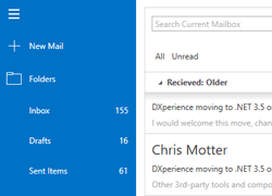
Navigation Bar
The Navigation Bar is a well-known variation of the side navigation bar that features collapsible groups with items within it. Key features include:
- Three available Views that affect NavBar Control behavior and appearance.
- Layout flexibility and runtime customization options.
- The capability to embed any control to a NavBar item.
- A set of built-in commands that allow you to program various actions in XAML markup.
- Interaction with OfficeNavigationBar.
Tip
Topic: Navigation Bar
Office Navigation Bar
An Outlook 2013-inspired navigation bar that supports integration with the Navigation Bar. Supports the following features:
- Automatically retrieves Navigation Bar groups and presents them as its own items.
- A built-in Customization Button that allows end-users to display more or fewer items and re-arrange them as needed.
- Supports Peek Panels that can be attached to Office Navigation Bar items and displayed on hover.
Tip
Topic: Office Navigation Bar
Tile Nav Pane
A hierarchical multi-level tile menu that provides navigation in a touch-friendly manner. Key features include:
- Supports three levels of navigation for displaying categories, items and sub-items.
- The top-level bar can host regular and drop-down buttons.
- Embedded Home button.
- Built-in navigation breadcrumbs that help your end-users to keep track of their current location in the navigation hierarchy.
- Various animation effects.
Tip
Topic: Tile Nav Pane
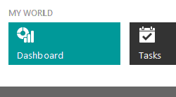
Tile Bar
A simple navigation bar with tiles. Any tile within a Tile Bar can display an associated drop-down control. This goes for any object, including another Tile Bar for implementing multi-level navigation bars.
Tip
Topic: Tile Bar
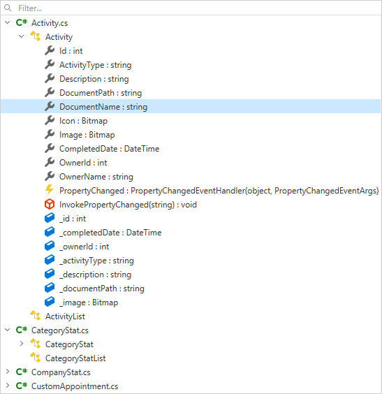
TreeView
The TreeView is a navigation control that displays self-referenced and hierarchical data.
Tip
Topic: TreeView
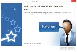
Wizard Control
The WPF Wizard Control is a handy tool for building wizards - dialogs with multiple pages that guide your end users through a specific process (e.g., product installation). The list below outlines main Wizard Control features:
- Three types of pages, each with its own mark-up and set of features.
- Embedded wizard buttons.
- Various page templates.
- Rich navigation capabilities.
- Suits for creating both simple wizards, where pages change one by one in a strict order, and wizards with a non-linear page sequence, where one page can lead to various other pages depending on the specific criteria.
Tip
Topic: Wizard Control
Hamburger Menu
The WPF Hamburger Menu is used to implement the navigation UI that emulates popular web applications. Its features include:
- Adaptive layout.
- Different types of navigation items: regular, check and radio buttons, and hyperlinks.
- Sub menus displaying items in side panels and “favorite” items directly in the main menu.
- MVVM Support.
Tip
Topic: Hamburger Menu