TcxHintStyle Class
Contains style settings for hints controlled by the TcxHintStyleController component.
Declaration
TcxHintStyle = class(
    TcxCustomHintStyle,
    IcxHint
)
Remarks
You can customize the style of hints controlled by the TcxHintStyleController component using its HintStyle property. Make certain to downcast the property to TcxHintStyle or TdxScreenTipStyle, depending upon the used hint type.
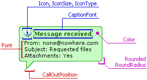
The TcxHintStyle provides a set of properties that can be divided into several groups. The first group specifies the shape of the hint. These are the CallOutPosition, Rounded and RoundRadius properties. See Animate for AnimationDelay properties which control hint animation effects. You can also specify the icon to be displayed within hints and its size using the Icon, IconSize and IconType properties. The CaptionFont and Font properties set the font used to display the hint text. Finally, the Color and BorderColor properties specify the hint background and border colors.
The image below illustrates some of these settings.
Note
you can switch easily between the standard hint style and custom appearance using the Standard property. Set it to True to ignore all the above settings and to display standard hints. If this property value is False, all the properties listed above take effect.