DrawerPage.IsScrimEnabled Property
Gets or sets whether the scrim is shown when the drawer is opened.
Namespace: DevExpress.XamarinForms.Navigation
Assembly: DevExpress.XamarinForms.Navigation.dll
NuGet Package: DevExpress.XamarinForms.Navigation
Declaration
public bool IsScrimEnabled { get; set; }Property Value
| Type | Description |
|---|---|
| Boolean | true, if the scrim is shown when the drawer is opened; otherwise, false. |
Remarks
If the IsScrimEnabled property is set to true, the DrawerPage shows the scrim and blocks interaction with the content area when the drawer is opened. To change the scrim color, use the ScrimColor property.
Note
The scrim does not affect the view when the DrawerBehavior property is set to Split.

Example
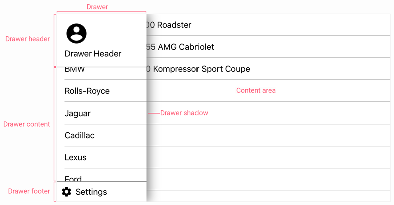
This example demonstrates how to adjust the DrawerPage’s basic settings.

<dxn:DrawerPage
    xmlns="http://xamarin.com/schemas/2014/forms"
    xmlns:x="http://schemas.microsoft.com/winfx/2009/xaml"
    xmlns:dxn="clr-namespace:DevExpress.XamarinForms.Navigation;assembly=DevExpress.XamarinForms.Navigation"
    xmlns:local="clr-namespace:DrawerPageExample"
    xmlns:viewmodel="clr-namespace:DrawerPageExample.ViewModels"
    xmlns:view="clr-namespace:DrawerPageExample.Views"
    x:Class="DrawerPageExample.MainPage"
    DrawerPosition="Left"
    DrawerBehavior="SlideOnTop"
    DrawerWidth="180"
    IsScrimEnabled="false"
    IsDrawerShadowVisible="true"
    DrawerShadowHeight="5"
    DrawerShadowRadius="10"
    DrawerShadowColor="#808080">
    <dxn:DrawerPage.BindingContext>
        <viewmodel:MainViewModel/>
    </dxn:DrawerPage.BindingContext>
    <dxn:DrawerView.DrawerHeaderContent>
        <view:DrawerHeader/>
    </dxn:DrawerView.DrawerHeaderContent>
    <dxn:DrawerView.DrawerFooterContent>
        <view:DrawerFooter/>
    </dxn:DrawerView.DrawerFooterContent>
    <dxn:DrawerPage.DrawerContent>
        <ListView x:Name="categoryList"
                    ItemsSource="{Binding VehiclesByMake}">
            <ListView.ItemTemplate>
                <DataTemplate>
                    <TextCell Text="{Binding GroupKey}" />
                </DataTemplate>
            </ListView.ItemTemplate>
        </ListView>
    </dxn:DrawerPage.DrawerContent>
    <dxn:DrawerPage.MainContent>
        <ContentPage>
            <ListView BindingContext="{x:Reference categoryList}"
                        ItemsSource="{Binding SelectedItem.Vehicles}">
                <ListView.ItemTemplate>
                    <DataTemplate>
                        <TextCell Text="{Binding FullName}"/>
                    </DataTemplate>
                </ListView.ItemTemplate>
            </ListView>
        </ContentPage>
    </dxn:DrawerPage.MainContent>
</dxn:DrawerPage>
The following table lists the DrawerPage object’s properties used in this example to configure the drawer panel and content area:
Property | Description |
|---|---|
Drawer Content | |
Gets or sets a view the DrawerPage displays as the drawer content. | |
Gets or sets a view the DrawerPage displays as the drawer header. | |
Gets or sets a view the DrawerPage displays as the drawer footer. | |
Drawer Position and Behavior | |
Gets or sets the screen edge to which the drawer is anchored. | |
Gets or sets how the drawer behaves on opening / closing. | |
Drawer Size | |
Gets or sets the width of the drawer when DrawerPosition is set to Left or Right. | |
Drawer Shadow | |
Gets or sets whether the drawer casts a shadow. | |
Gets or sets the color of the drawer shadow. | |
Gets or sets the height of the shadow the drawer casts. | |
Gets or sets the blur radius of the shadow the drawer casts. | |
Content Area and Scrim | |
Gets or sets a page that the DrawerPage displays in the content area. | |
| Gets or sets whether the scrim is shown when the drawer is opened. |