TabPage Class
A page that allows tab navigation through a collection of pages.
Namespace: DevExpress.XamarinForms.Navigation
Assembly: DevExpress.XamarinForms.Navigation.dll
NuGet Package: DevExpress.XamarinForms.Navigation
Declaration
public class TabPage :
    Page,
    ITabControl,
    ITabItemSizeSettings
Remarks
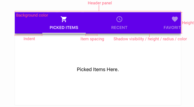
Header Panel
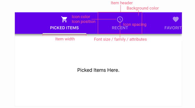
Item Header
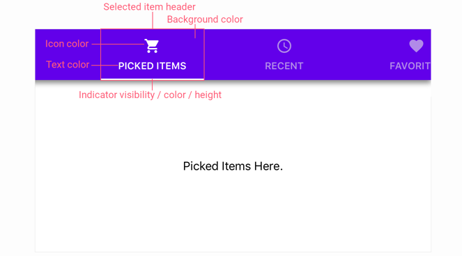
Selected Item Header
Example
This example demonstrates how to customize the appearance, behavior and position of the TabPage‘s header panel.
Note
The TabPage’s ItemHeader… properties configure header parameters for all tab items the page shows. Use TabPageItem‘s Header… properties to customize these parameters individually for each item.
<dxn:TabPage xmlns="http://xamarin.com/schemas/2014/forms"
             xmlns:x="http://schemas.microsoft.com/winfx/2009/xaml"
             xmlns:local="clr-namespace:TabPageExample"
             xmlns:dxn="http://schemas.devexpress.com/xamarin/2014/forms/navigation"
             x:Class="TabPageExample.MainPage"
             HeaderPanelHeight="72"
             HeaderPanelPosition="Top"
             HeaderPanelContentAlignment="Center"
             HeaderPanelBackgroundColor="#1e88e5"
             IsHeaderPanelShadowVisible="true"
             HeaderPanelShadowHeight="4"
             HeaderPanelShadowRadius="4"
             HeaderPanelShadowColor="#cc222222"
             HeaderPanelItemSpacing="0"
             HeaderPanelIndent="52"
             ItemHeaderWidth="*"
             ItemHeaderMinWidth="90"
             ItemHeaderMaxWidth="360"
             ItemHeaderVisibleElements="TextAndIcon"
             ItemHeaderPadding="16,0,16,0"
             ItemHeaderIconPosition="Top"
             ItemHeaderIconSpacing="4"
             ItemHeaderIconColor="#99191919"
             ItemHeaderTextColor="#99191919"
             ItemHeaderFontSize="14"
             ItemHeaderFontAttributes="Bold"
             SelectedItemHeaderTextColor="White"
             SelectedItemHeaderIconColor="White"
             SelectedItemHeaderBackgroundColor="Transparent"
             IsSelectedItemIndicatorVisible="true"
             SelectedItemIndicatorColor="White"
             SelectedItemIndicatorHeight="2"
             ItemHeaderPlacementOnSelection="Edge">
    <!-- Tab items here. -->
</dxn:TabPage>
The markup above uses the following properties of the TabPage object:
Property | Description |
|---|---|
Gets or sets the header panel’s height when the HeaderPanelPosition is set to Top or Bottom. | |
Gets or sets the header panel’s position within the page. | |
Specifies how item headers are aligned in the header panel. | |
Gets or sets the background color of the TabPage’s header panel. | |
Gets or sets whether the header panel’s shadow is visible. | |
Gets or sets the height of the header panel’s shadow. | |
Gets or sets the blur radius of the header panel’s shadow. | |
Gets or sets the color the TabPage uses to paint the header panel’s shadow. | |
Gets or sets the spacing between tab item headers. | |
Gets or sets the spacing between the header panel’s start edge and the first item. | |
Gets or sets the width of item headers when the HeaderPanelPosition is set to Top or Bottom. | |
Gets or sets the minimum width of tab item headers when the HeaderPanelPosition is set to Top or Bottom. | |
Gets or sets the maximum width of tab item headers when the HeaderPanelPosition is set to Top or Bottom. | |
Gets or sets a value that specifies elements an item header shows. | |
Gets or sets the inner padding of item headers. | |
Gets or sets the icon position relative to the text within item headers. | |
Gets or sets the spacing between the icon and text of an item header. | |
Gets or sets the color of icons displayed in tab item headers. | |
Gets or sets the color of text displayed in tab item headers. | |
Gets or sets the color of text displayed in the selected tab item header. | |
Gets or sets the font size for the text displayed within item headers. | |
Gets or sets whether the text displayed within item headers is bold, italic, or neither. | |
Gets or sets the color of an icon displayed in the selected tab item header. | |
Gets or sets the background color of a tab item header when the item is selected. | |
Gets or sets whether the selected item indicator is visible. | |
Gets or sets the color of the selected item indicator. | |
Gets or sets the height of the selected item indicator. | |
Specifies how the TabPage positions an item header when a user selects the item. |