DrawerPage.DrawerWidth Property
Gets or sets the width of the drawer when DrawerPosition is set to Left or Right.
Namespace: DevExpress.XamarinForms.Navigation
Assembly: DevExpress.XamarinForms.Navigation.dll
NuGet Package: DevExpress.XamarinForms.Navigation
Declaration
public TabItemLength DrawerWidth { get; set; }Property Value
| Type | Description |
|---|---|
| TabItemLength | The drawer width when DrawerPosition is set to Left or Right. |
Example
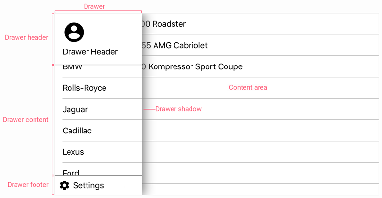
This example demonstrates how to adjust the DrawerPage’s basic settings.
<dxn:DrawerPage
    xmlns="http://xamarin.com/schemas/2014/forms"
    xmlns:x="http://schemas.microsoft.com/winfx/2009/xaml"
    xmlns:dxn="clr-namespace:DevExpress.XamarinForms.Navigation;assembly=DevExpress.XamarinForms.Navigation"
    xmlns:local="clr-namespace:DrawerPageExample"
    xmlns:viewmodel="clr-namespace:DrawerPageExample.ViewModels"
    xmlns:view="clr-namespace:DrawerPageExample.Views"
    x:Class="DrawerPageExample.MainPage"
    DrawerPosition="Left"
    DrawerBehavior="SlideOnTop"
    DrawerWidth="180"
    IsScrimEnabled="false"
    IsDrawerShadowVisible="true"
    DrawerShadowHeight="5"
    DrawerShadowRadius="10"
    DrawerShadowColor="#808080">
    <dxn:DrawerPage.BindingContext>
        <viewmodel:MainViewModel/>
    </dxn:DrawerPage.BindingContext>
    <dxn:DrawerView.DrawerHeaderContent>
        <view:DrawerHeader/>
    </dxn:DrawerView.DrawerHeaderContent>
    <dxn:DrawerView.DrawerFooterContent>
        <view:DrawerFooter/>
    </dxn:DrawerView.DrawerFooterContent>
    <dxn:DrawerPage.DrawerContent>
        <ListView x:Name="categoryList"
                    ItemsSource="{Binding VehiclesByMake}">
            <ListView.ItemTemplate>
                <DataTemplate>
                    <TextCell Text="{Binding GroupKey}" />
                </DataTemplate>
            </ListView.ItemTemplate>
        </ListView>
    </dxn:DrawerPage.DrawerContent>
    <dxn:DrawerPage.MainContent>
        <ContentPage>
            <ListView BindingContext="{x:Reference categoryList}"
                        ItemsSource="{Binding SelectedItem.Vehicles}">
                <ListView.ItemTemplate>
                    <DataTemplate>
                        <TextCell Text="{Binding FullName}"/>
                    </DataTemplate>
                </ListView.ItemTemplate>
            </ListView>
        </ContentPage>
    </dxn:DrawerPage.MainContent>
</dxn:DrawerPage>
The following table lists the DrawerPage object’s properties used in this example to configure the drawer panel and content area:
Property | Description |
|---|---|
Drawer Content | |
Gets or sets a view the DrawerPage displays as the drawer content. | |
Gets or sets a view the DrawerPage displays as the drawer header. | |
Gets or sets a view the DrawerPage displays as the drawer footer. | |
Drawer Position and Behavior | |
Gets or sets the screen edge to which the drawer is anchored. | |
Gets or sets how the drawer behaves on opening / closing. | |
Drawer Size | |
| Gets or sets the width of the drawer when DrawerPosition is set to Left or Right. |
Drawer Shadow | |
Gets or sets whether the drawer casts a shadow. | |
Gets or sets the color of the drawer shadow. | |
Gets or sets the height of the shadow the drawer casts. | |
Gets or sets the blur radius of the shadow the drawer casts. | |
Content Area and Scrim | |
Gets or sets a page that the DrawerPage displays in the content area. | |
Gets or sets whether the scrim is shown when the drawer is opened. | |