Lesson 2: Populate Tab Items from an Items Source
- 6 minutes to read
This lesson explains how to create a tab bar that allows end users to filter a list. The lesson uses TabView capability to generate tab items from a data source to build the filtering tab bar:
Note
This lesson populates tab items automatically from a view model. Refer to the Lesson 1 to learn how to manually create tab items.
Step 1. Add the Navigation Library to the Solution
Note that a new empty Xamarin.Forms solution is a startup point in this lesson.
Add the following assembly references to your Xamarin.Forms solution’s projects:
Project
Assembly
<YourAppName>
(A .NET Standard project that contains the shared code)
DevExpress.XamarinForms.Core.dll
DevExpress.XamarinForms.Navigation.dll
<YourAppName>.Android
(A project that contains the Android-specific code)
DevExpress.XamarinForms.Navigation.Android.dll
DevExpress.Xamarin.Android.Navigation.dll
<YourAppName>.iOS
(A project that contains the iOS-specific code)
DevExpress.XamarinForms.Navigation.iOS.dll
DevExpress.Xamarin.iOS.Navigation.dll
Note
Confirm that the downloaded <DevExpress.Xamarin> bundle has been unzipped. These files are in the <DevExpress.Xamarin bundle>/Binaries directory in this case.
Note that iOS-specific project requires that you initialize the Navigation Component. To do this, add code below before the LoadApplication method call in your iOS project’s AppDelegate.cs file:
DevExpress.XamarinForms.Navigation.Navigation.Init();
Assign a TabView instance to the MainPage’s Content property:
<!-- Note that the page declares the dxn namespace that contains the TabView and TabItem classes. -->
<ContentPage xmlns="http://xamarin.com/schemas/2014/forms"
             xmlns:x="http://schemas.microsoft.com/winfx/2009/xaml"
             xmlns:dxn="clr-namespace:DevExpress.XamarinForms.Navigation;assembly=DevExpress.XamarinForms.Navigation"
             xmlns:views="clr-namespace:GettingStarted2.Views"
             x:Class="GettingStarted2.Views.MainPage">
    <dxn:TabView>
    </dxn:TabView>
</ContentPage>
Step 2. Prepare Models and View Models
Add the Vehicle class, which represents a data object in the app, to the Xamarin.Forms project:
namespace GettingStarted2.Models {
    public class Vehicle {
        public string MakeName { get; }
        public string ModelName { get; }
        public string FullName => $"{MakeName} {ModelName}";

        public Vehicle(string model, string make) {
            this.MakeName = make;
            this.ModelName = model;
        }
    }
}
Create the GroupedVehiclesViewModel class that is a tab item’s view model. This view model contains content displayed by the tab item in the header and in the main area:
namespace GettingStarted2.ViewModels {
    public class GroupedVehiclesViewModel: INotifyPropertyChanged {
        private bool isSelected = false;

        public string GroupKey { get; }
        public IReadOnlyList<Vehicle> Vehicles { get; }
        // This property is used to change tab appearance depending on its state.
        public bool IsSelected {
            get { return isSelected; }
            set {
                if (value == isSelected) return;
                isSelected = value;
                RaisePropertyChanged();
            }
        }
        public event PropertyChangedEventHandler PropertyChanged;

        public GroupedVehiclesViewModel(string groupKey, IEnumerable<Vehicle> vehicles) {
            if (String.IsNullOrEmpty(groupKey)) {
                this.GroupKey = String.Empty;
            } else {
                this.GroupKey = groupKey;
            }
            if (vehicles == null) {
                this.Vehicles = new List<Vehicle>();
            } else {
                this.Vehicles = vehicles.ToList();
            }
        }
        private void RaisePropertyChanged([CallerMemberName] string caller = "") {
            PropertyChangedEventHandler handler = PropertyChanged;
            if (handler != null) {
                handler.Invoke(this, new PropertyChangedEventArgs(caller));
            }
        }
    }
}
Create the MainViewModel class that provides content displayed by the MainPage:
namespace GettingStarted2.ViewModels {
    public class MainViewModel: INotifyPropertyChanged {
        private const int UnselectedIndex = -1;
        private static readonly IReadOnlyList<Vehicle> allVehicles = new List<Vehicle> {
            new Vehicle("Mercedes-Benz", "SL500 Roadster"),
            new Vehicle("Mercedes-Benz", "CLK55 AMG Cabriolet"),
            new Vehicle("Mercedes-Benz", "C230 Kompressor Sport Coupe"),
            new Vehicle("BMW", "530i"),
            new Vehicle("Rolls-Royce", "Corniche"),
            new Vehicle("Jaguar", "S-Type 3.0"),
            new Vehicle("Cadillac", "Seville"),
            new Vehicle("Cadillac", "DeVille"),
            new Vehicle("Lexus", "LS430"),
            new Vehicle("Lexus", "GS430"),
            new Vehicle("Ford", "Ranger FX-4"),
            new Vehicle("Dodge", "RAM 1500"),
            new Vehicle("GMC", "Siera Quadrasteer"),
            new Vehicle("Nissan", "Crew Cab SE"),
            new Vehicle("Toyota", "Tacoma S-Runner"),
        };

        public IReadOnlyList<GroupedVehiclesViewModel> VehiclesByMake { get; }

        int selectedIndex = UnselectedIndex;
        public int SelectedIndex {
            get => selectedIndex;
            set {
                if (selectedIndex == value) return;
                if (selectedIndex != UnselectedIndex) {
                    VehiclesByMake[selectedIndex].IsSelected = false;
                }
                selectedIndex = value;
                if (selectedIndex != UnselectedIndex) {
                    VehiclesByMake[selectedIndex].IsSelected = true;
                }
                RaisePropertyChanged();
            }
        }

        public event PropertyChangedEventHandler PropertyChanged;

        public MainViewModel() {
            List<GroupedVehiclesViewModel> groupedVehiclesVMs = new List<GroupedVehiclesViewModel>();
            groupedVehiclesVMs.Add(new GroupedVehiclesViewModel("All", allVehicles));

            IEnumerable<IGrouping<string, Vehicle>> groupedVehicles = allVehicles.GroupBy(v => v.MakeName);
            foreach (IGrouping<string, Vehicle>  vehiclesGroup in groupedVehicles) {
                groupedVehiclesVMs.Add(new GroupedVehiclesViewModel(vehiclesGroup.Key, vehiclesGroup));
            }

            VehiclesByMake = groupedVehiclesVMs;
        }

        private void RaisePropertyChanged([CallerMemberName] string caller = "") {
            PropertyChangedEventHandler handler = PropertyChanged;
            if (handler != null) {
                handler.Invoke(this, new PropertyChangedEventArgs(caller));
            }
        }
    }
}
Step 3. Bind View Models to the Tab View
Assign a MapViewModel instance to the MainPage’s BindingContext:
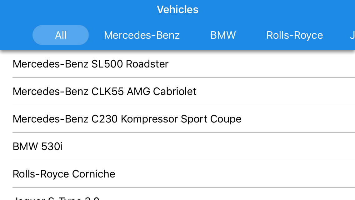
<ContentPage
    xmlns="http://xamarin.com/schemas/2014/forms"
    xmlns:x="http://schemas.microsoft.com/winfx/2009/xaml"
    xmlns:dxn="clr-namespace:DevExpress.XamarinForms.Navigation;assembly=DevExpress.XamarinForms.Navigation"
    xmlns:views="clr-namespace:GettingStarted2.Views"
    xmlns:viewmodels="clr-namespace:GettingStarted2.ViewModels"
    x:Class="GettingStarted2.Views.MainPage">
    <ContentPage.BindingContext>
        <viewmodels:MainViewModel/>
    </ContentPage.BindingContext>
    <!-- Other ContentPage settings. -->
</ContentPage>
Bind the Tab View’s ItemsSource property to the view model’s VehiclesByMake property, and the SelectedItemIndex property to the view model’s SelectedIndex property in the MainPage.xaml file. Then, specify the ItemHeaderTemplate, which manages the Header Item appearance, and the ItemTemplate, which changes the content appearance.
<ContentPage
    xmlns="http://xamarin.com/schemas/2014/forms"
    xmlns:x="http://schemas.microsoft.com/winfx/2009/xaml"
    xmlns:dxn="clr-namespace:DevExpress.XamarinForms.Navigation;assembly=DevExpress.XamarinForms.Navigation"
    xmlns:views="clr-namespace:GettingStarted2.Views"
    xmlns:viewmodels="clr-namespace:GettingStarted2.ViewModels"
    x:Class="GettingStarted2.Views.MainPage"
    Title="{Binding Title}">
    <!-- Other ContentPage settings. -->
    <dxn:TabView
        ItemsSource="{Binding VehiclesByMake}"
        SelectedItemIndex="{Binding SelectedIndex, Mode=TwoWay}">
        <dxn:TabView.ItemHeaderTemplate>
            <DataTemplate>
                <Label Text="{Binding GroupKey}"
                       HorizontalTextAlignment="Center"
                       VerticalTextAlignment="Center"/>
            </DataTemplate>
        </dxn:TabView.ItemHeaderTemplate>
        <dxn:TabView.ItemTemplate>
            <DataTemplate>
                <ListView ItemsSource="{Binding Vehicles}">
                    <ListView.ItemTemplate>
                        <DataTemplate>
                            <TextCell Text="{Binding FullName}"/>
                        </DataTemplate>
                    </ListView.ItemTemplate>
                </ListView>
            </DataTemplate>
        </dxn:TabView.ItemTemplate>
    </dxn:TabView>
</ContentPage>
After that step, the application should looks as follows:
Step 4. Customize the Tab View
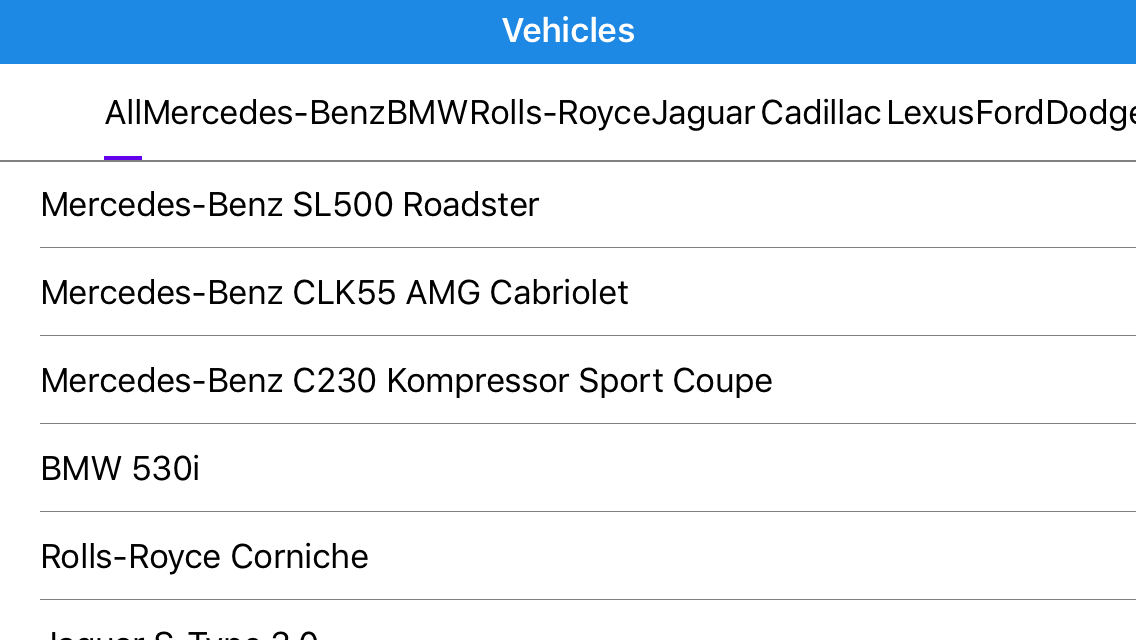
This step configures the appearance of the Tab View’s header panel and header items:
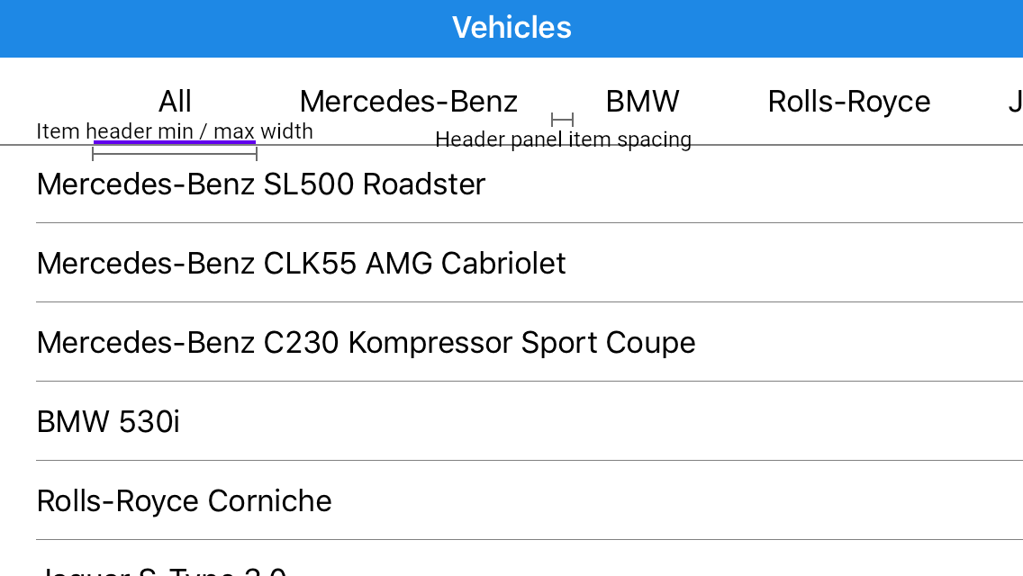
Specify min and max sizes for items (the ItemHeaderMinWidth and ItemHeaderMaxWidth properties), the spacing between items (HeaderPanelItemSpacing), and item padding:
<dxn:TabView
    ItemHeaderMinWidth="90"
    ItemHeaderMaxWidth="360"
    HeaderPanelItemSpacing="8">
    <dxn:TabView.ItemHeaderTemplate>
        <DataTemplate>
            <Frame Padding="16,0,16,0"
                   HasShadow="False">
                <Label Text="{Binding GroupKey}"
                       HorizontalTextAlignment="Center"
                       VerticalTextAlignment="Center"/>
            </Frame>
        </DataTemplate>
    </dxn:TabView.ItemHeaderTemplate>
    <!-- Other Tab View settings.-->
</dxn:TabView>
The app looks as follows:
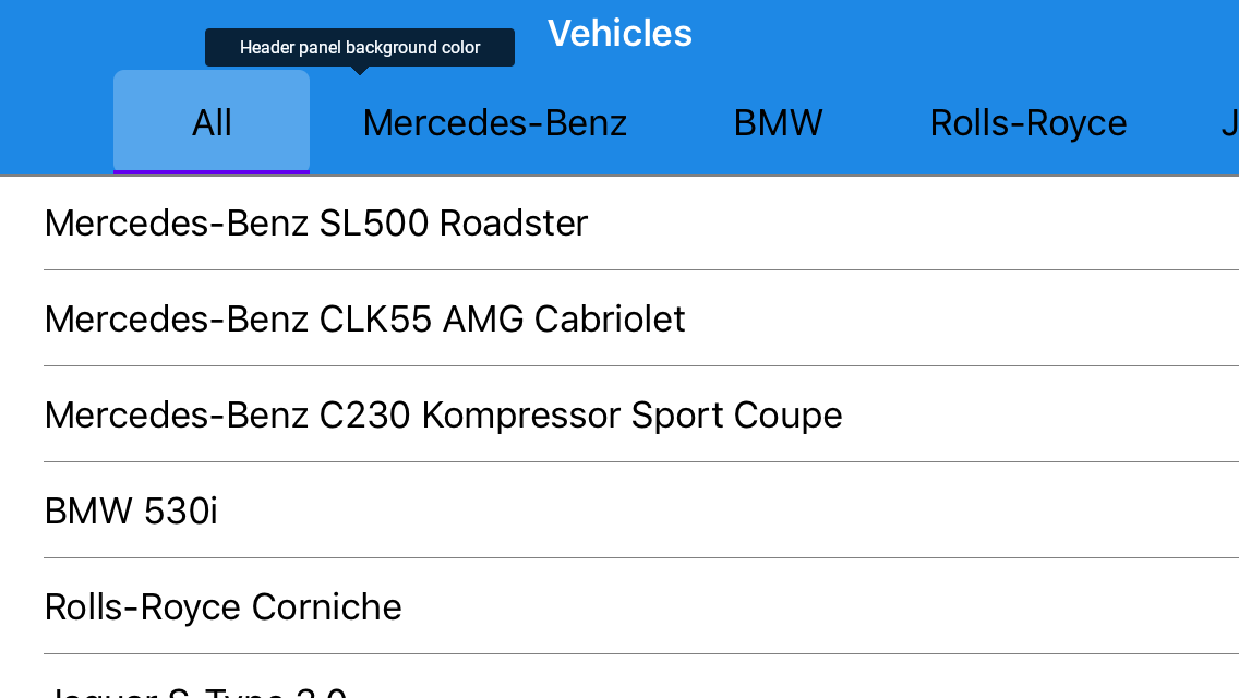
Modify the header panel background (HeaderPanelBackgroundColor), and bind an item’s background color to a view model state:
<ContentView.Resources> <ResourceDictionary> <views:IsSelectedToColorConverter x:Key="isSelectedToColorConverter" DefaultColor="Transparent" SelectedColor="#40FFFFFF"/> </ResourceDictionary> </ContentView.Resources> <dxn:TabView HeaderPanelBackgroundColor="{StaticResource accentColor}"> <dxn:TabView.ItemHeaderTemplate> <DataTemplate> <Frame BackgroundColor="{Binding IsSelected, Converter={StaticResource isSelectedToColorConverter}}"> <!-- Other Frame settings --> </Frame> </DataTemplate> </dxn:TabView.ItemHeaderTemplate> <!-- Other Tab View settings.--> </dxn:TabView>The following image shows the application in the current state:
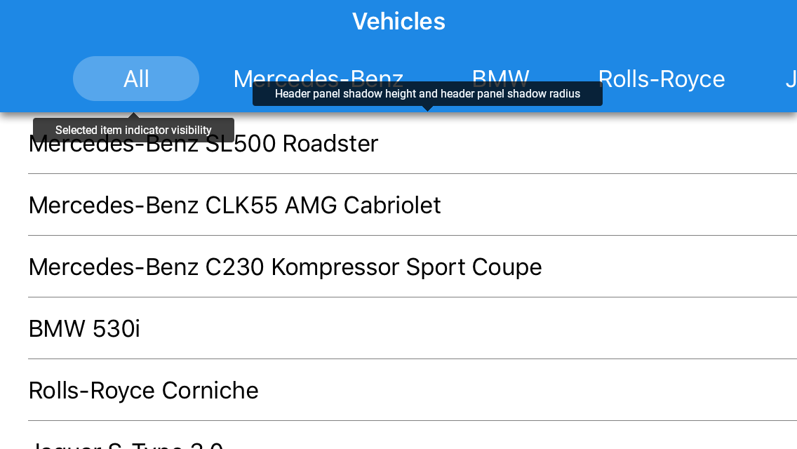
Specify the frame’s border radius and margin, configure tab view’s shadow (HeaderPanelShadowHeight and HeaderPanelShadowRadius properties), hide the Selected Item Indicator (IsSelectedItemIndicatorVisible), and customize the label’s text color:
<dxn:TabView
    ItemsSource="{Binding VehiclesByMake}"
    SelectedItemIndex="{Binding SelectedIndex, Mode=TwoWay}"
    ItemHeaderMinWidth="90"
    ItemHeaderMaxWidth="360"
    HeaderPanelBackgroundColor="{StaticResource accentColor}"
    HeaderPanelItemSpacing="8"
    HeaderPanelShadowHeight="3"
    HeaderPanelShadowRadius="3"
    IsSelectedItemIndicatorVisible="False">
    <dxn:TabView.ItemHeaderTemplate>
        <DataTemplate>
            <Frame Margin="0,8,0,8"
                   Padding="16,0,16,0"
                   CornerRadius="16"
                   HasShadow="false"
                   BackgroundColor="{Binding IsSelected, Converter={StaticResource isSelectedToColorConverter}}">
                <Label Text="{Binding GroupKey}"
                       HorizontalTextAlignment="Center"
                       VerticalTextAlignment="Center"
                       TextColor="White"/>
            </Frame>
        </DataTemplate>
    </dxn:TabView.ItemHeaderTemplate>
    <!-- Other Tab View settings. -->
</dxn:TabView>
The application is finished and should look as follows when you launch it:
Complete Code
You can clone the Getting Started Lesson 2 solution from GitHub.