Lesson 1: Create Tab Items Manually
- 5 minutes to read
This lesson explains to you how to create a bottom navigation bar using the TabView view:
Note
Note that the control displays manually added items in this lesson. Refer to the Lesson 2 guide to learn how to populate the tab view from an items source.
Step 1. Add the Navigation Library to Your Project
Note that a new empty Xamarin.Forms solution is a startup point in this lesson.
Add the following assembly references to your Xamarin.Forms solution’s projects:
Project
Assembly
<YourAppName>
(A .NET Standard project that contains the shared code)
DevExpress.XamarinForms.Core.dll
DevExpress.XamarinForms.Navigation.dll
<YourAppName>.Android
(A project that contains the Android-specific code)
DevExpress.XamarinForms.Navigation.Android.dll
DevExpress.Xamarin.Android.Navigation.dll
<YourAppName>.iOS
(A project that contains the iOS-specific code)
DevExpress.XamarinForms.Navigation.iOS.dll
DevExpress.Xamarin.iOS.Navigation.dll
Note
Confirm that the downloaded <DevExpress.Xamarin> bundle has been unzipped. These files are in the <DevExpress.Xamarin bundle>/Binaries directory in this case.
Note that iOS-specific project requires that you initialize the Navigation Component. To do this, add code below before the LoadApplication method call in your iOS project’s AppDelegate.cs file:
DevExpress.XamarinForms.Navigation.Navigation.Init();
Assign a TabView instance to the MainPage’s Content property:
<!-- Note that the page declares the dxn namespace that contains the TabView and TabItem classes. -->
<ContentPage xmlns="http://xamarin.com/schemas/2014/forms"
             xmlns:x="http://schemas.microsoft.com/winfx/2009/xaml"
             xmlns:dxn="clr-namespace:DevExpress.XamarinForms.Navigation;assembly=DevExpress.XamarinForms.Navigation"
             xmlns:local="clr-namespace:GettingStarted1"
             x:Class="GettingStarted1.MainPage">
    <dxn:TabView>
    </dxn:TabView>
</ContentPage>
Step 2. Populate the Tab View with Items
Download icons for tabs from a Git repository and put them into the following directories:
- Copy all drawable directories from Resources to your Android project’s Resources directory.
- Copy the Assets.xcassets directory into your iOS project’s directory.
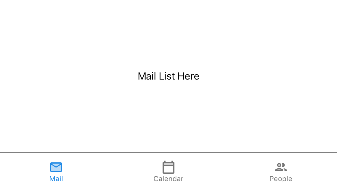
Add a new TabItem instance to the view’s Items property:
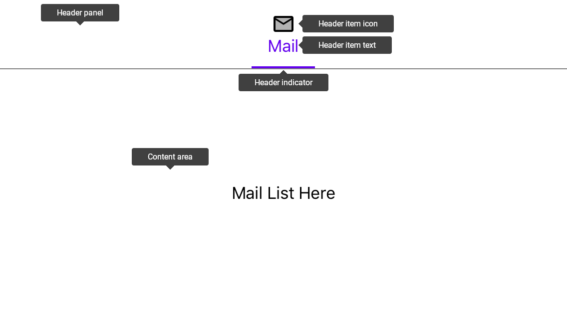
<dxn:TabView>
    <dxn:TabItem HeaderText="Mail">
        <dxn:TabItem.HeaderIcon>
            <OnPlatform x:TypeArguments="FileImageSource">
                <On Platform="iOS"
                    Value="mail"/>
                <On Platform="Android"
                    Value="ic_mail.xml"/>
            </OnPlatform>
        </dxn:TabItem.HeaderIcon>
        <dxn:TabView.Content>
            <StackLayout>
                <Label Text="Mail List Here"
                       HorizontalOptions="Center"
                       VerticalOptions="CenterAndExpand"/>
            </StackLayout>
        </dxn:TabView.Content>
    </dxn:TabItem>
</dxn:TabView>
An item consists of a Header in the Header Panel and content that the view displays in the main area. The Header can display an icon and/or text that identifies the item’s content:
The following properties configure a TabItem:
Property
Description
Gets or sets an icon the item header displays.
Gets or sets the text of the item header title.
Gets or sets a view the Tab View displays in the content area when the item is selected.
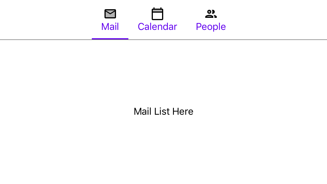
Add two more TabItem objects:
<dxn:TabItem HeaderText="Calendar">
    <dxn:TabItem.HeaderIcon>
        <OnPlatform x:TypeArguments="FileImageSource">
            <On Platform="iOS" Value="calendar"/>
            <On Platform="Android" Value="ic_calendar.xml"/>
        </OnPlatform>
    </dxn:TabItem.HeaderIcon>
    <dxn:TabView.Content>
        <StackLayout>
            <Label Text="Calendar Here"
                   HorizontalOptions="Center"
                   VerticalOptions="CenterAndExpand"/>
        </StackLayout>
    </dxn:TabView.Content>
</dxn:TabItem>
<dxn:TabItem HeaderText="People">
    <dxn:TabItem.HeaderIcon>
        <OnPlatform x:TypeArguments="FileImageSource">
            <On Platform="iOS" Value="people"/>
            <On Platform="Android" Value="ic_people.xml"/>
        </OnPlatform>
    </dxn:TabItem.HeaderIcon>
    <dxn:TabView.Content>
        <StackLayout>
            <Label Text="People Here"
                   HorizontalOptions="Center"
                   VerticalOptions="CenterAndExpand"/>
        </StackLayout>
    </dxn:TabView.Content>
</dxn:TabItem>
The following image shows the step result:
Step 3. Customize the Tab View Appearance
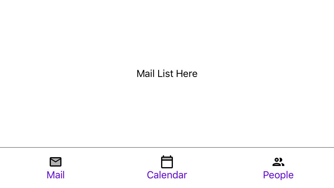
Move the Header Panel to the view’s bottom edge, hide the Selected Item Indicator, and make items fill all available space:
<dxn:TabView HeaderPanelPosition="Bottom"
             ItemHeaderWidth="*"
             IsSelectedItemIndicatorVisible="False">
    <!-- Tab items here. -->
</dxn:TabView>
The code above uses the properties below:
Property
Description
Gets or sets the header panel’s position within the view.
Gets or sets whether the Selected Item Indicator is visible.
Gets or sets the width of header items when HeaderPanelPosition is set to Top or Bottom.
Now the app looks as follows:
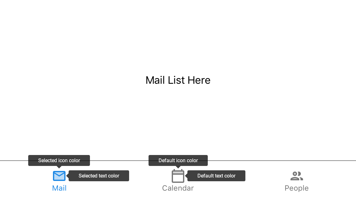
Specify icon / text colors:
<ContentPage.Resources>
    <Color x:Key="lightText">#99191919</Color>
    <Color x:Key="red600">#e53935</Color>
    <Color x:Key="green600">#43a047</Color>
    <Color x:Key="blue600">#1e88e5</Color>
</ContentPage.Resources>
<dxn:TabView ItemHeaderTextColor="{StaticResource lightText}"
             ItemHeaderIconColor="{StaticResource lightText}"
             ItemHeaderFontSize="12">
    <!-- Other view settings. -->
    <dxn:TabItem HeaderText="Mail"
                 SelectedHeaderTextColor="{StaticResource blue600}"
                 SelectedHeaderIconColor="{StaticResource blue600}">
        <!-- Other item settings. -->
    </dxn:TabItem>
    <dxn:TabItem HeaderText="Calendar"
                 SelectedHeaderTextColor="{StaticResource green600}"
                 SelectedHeaderIconColor="{StaticResource green600}">
        <!-- Other item settings. -->
    </dxn:TabItem>
    <dxn:TabItem HeaderText="People"
                 SelectedHeaderTextColor="{StaticResource red600}"
                 SelectedHeaderIconColor="{StaticResource red600}">
        <!-- Other item settings. -->
    </dxn:TabItem>
</dxn:TabView>
Note that you can customize colors for an item in default and selected states. The TabView specifies these colors for all items simultaneously and a tab item can override these colors individually:
The following properties configures the TabItem appearance:
Property
Description
Gets or sets the color tab items use to paint their texts when items are in the default state.
Gets or sets the color all tab items use to paint its header icons.
Gets or sets the size of the font for item headers’ text.
Gets or sets the color the tab item uses in the selected state to paint its text.
Gets or sets the color the tab item uses in the selected state to paint its icon.
Complete Markup
The complete application markup, written in this lesson, is available below. Note that this example is available on GitHub.
<?xml version="1.0" encoding="utf-8"?>
<ContentPage
    xmlns="http://xamarin.com/schemas/2014/forms"
    xmlns:x="http://schemas.microsoft.com/winfx/2009/xaml"
    xmlns:local="clr-namespace:GettingStarted1"
    xmlns:ios="clr-namespace:Xamarin.Forms.PlatformConfiguration.iOSSpecific;assembly=Xamarin.Forms.Core"
    xmlns:dxn="clr-namespace:DevExpress.XamarinForms.Navigation;assembly=DevExpress.XamarinForms.Navigation"
    x:Class="GettingStarted1.MainPage"
    ios:Page.UseSafeArea="true">
    <ContentPage.Resources>
        <Color x:Key="red600">#e53935</Color>
        <Color x:Key="green600">#43a047</Color>
        <Color x:Key="blue600">#1e88e5</Color>
        <Color x:Key="lightText">#99191919</Color>
    </ContentPage.Resources>
    <dxn:TabView ItemHeaderWidth="*"
                 HeaderPanelPosition="Bottom"
                 ItemHeaderTextColor="{StaticResource lightText}"
                 ItemHeaderIconColor="{StaticResource lightText}"
                 ItemHeaderFontSize="12"
                 IsSelectedItemIndicatorVisible="False">
        <dxn:TabItem HeaderText="Mail"
                     SelectedHeaderTextColor="{StaticResource blue600}"
                     SelectedHeaderIconColor="{StaticResource blue600}">
            <dxn:TabItem.HeaderIcon>
                <OnPlatform x:TypeArguments="FileImageSource">
                    <On Platform="iOS" Value="mail"/>
                    <On Platform="Android" Value="ic_mail.xml"/>
                </OnPlatform>
            </dxn:TabItem.HeaderIcon>
            <dxn:TabView.Content>
                <StackLayout>
                    <Label Text="Mail List Here"
                           HorizontalOptions="Center"
                           VerticalOptions="CenterAndExpand"/>
                </StackLayout>
            </dxn:TabView.Content>
        </dxn:TabItem>
        <dxn:TabItem HeaderText="Calendar"
                     SelectedHeaderTextColor="{StaticResource green600}"
                     SelectedHeaderIconColor="{StaticResource green600}">
            <dxn:TabItem.HeaderIcon>
                <OnPlatform x:TypeArguments="FileImageSource">
                    <On Platform="iOS" Value="calendar"/>
                    <On Platform="Android" Value="ic_calendar.xml"/>
                </OnPlatform>
            </dxn:TabItem.HeaderIcon>
            <dxn:TabView.Content>
                <StackLayout>
                    <Label Text="Calendar Here"
                           HorizontalOptions="Center"
                           VerticalOptions="CenterAndExpand"/>
            </StackLayout>
            </dxn:TabView.Content>
        </dxn:TabItem>
        <dxn:TabItem HeaderText="People"
                     SelectedHeaderTextColor="{StaticResource red600}"
                     SelectedHeaderIconColor="{StaticResource red600}">
            <dxn:TabItem.HeaderIcon>
                <OnPlatform x:TypeArguments="FileImageSource">
                    <On Platform="iOS" Value="people"/>
                    <On Platform="Android" Value="ic_people.xml"/>
                </OnPlatform>
            </dxn:TabItem.HeaderIcon>
            <dxn:TabView.Content>
                <StackLayout>
                    <Label Text="People Here"
                           HorizontalOptions="Center"
                           VerticalOptions="CenterAndExpand"/>
                </StackLayout>
            </dxn:TabView.Content>
        </dxn:TabItem>
    </dxn:TabView>
</ContentPage>