TabView.HeaderPanelBackgroundColor Property
Gets or sets the background color of the view’s header panel.
Namespace: DevExpress.XamarinForms.Navigation
Assembly: DevExpress.XamarinForms.Navigation.dll
Declaration
public Color HeaderPanelBackgroundColor { get; set; }Property Value
| Type | Description |
|---|---|
| Color | The background color of the view’s header panel. |
Remarks
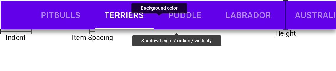
The following image highlights this parameter:
Example
This example demonstrates how to customize appearance and behavior of the Tab View:
<dxn:TabView HeaderPanelBackgroundColor="#1e88e5"
             HeaderPanelShadowHeight="4"
             HeaderPanelShadowRadius="4"
             HeaderPanelShadowColor="#cc222222"
             IsHeaderPanelShadowVisible="true"
             HeaderPanelHeight="72"
             HeaderPanelPosition="Top"
             HeaderPanelItemSpacing="0"
             HeaderPanelIndent="52"
             HeaderPanelContentAlignment="Center"
             ItemHeaderWidth="*"
             ItemHeaderMinWidth="90"
             ItemHeaderMaxWidth="360"
             ItemHeaderVisibleElements="TextAndIcon"
             ItemHeaderPadding="16,0,16,0"
             ItemHeaderFontSize="14"
             ItemHeaderFontAttributes="Bold"
             ItemHeaderIconSpacing="4"
             ItemHeaderIconPosition="Top"
             ItemHeaderTextColor="#99191919"
             ItemHeaderIconColor="#99191919"
             SelectedItemHeaderTextColor="White"
             SelectedItemHeaderIconColor="White"
             SelectedItemHeaderBackgroundColor="Transparent"
             SelectedItemIndicatorColor="White"
             IsSelectedItemIndicatorVisible="true"
             SelectedItemIndicatorHeight="2"
             SelectedItemIndicatorScrollAlignment="Edges">
    <!-- Tab items here. -->
</dxn:TabView>
The markup above uses the following properties:
Note
The TabView …ItemHeader… properties configure parameters of all tab items’ headers the view shows. Use TabItem‘s …Header… properties to customize these parameters individually for each item.
Property | Description |
|---|---|
Gets or sets the header panel’s position within the view. | |
Gets or sets the header panel’s height when the HeaderPanelPosition is set to Top or Bottom. | |
| Gets or sets the background color of the view’s header panel. |
Gets or sets the height of the header panel’s shadow. | |
Gets or sets the blur radius of the header panel’s shadow. | |
Gets or sets the color the Tab View uses to paint the header panel’s shadow. | |
Gets or sets whether the Header Panel’s shadow is visible. | |
Gets or sets the spacing between item headers. | |
Gets or sets spacing before the first item and the panel’s start edge. | |
Gets or sets a value that specifies how the view aligns item headers in the header panel. | |
Gets or sets a value that specifies elements the item header shows. | |
Gets or sets the width of header items when HeaderPanelPosition is set to Top or Bottom. | |
Gets or sets the minimum width of header items when HeaderPanelPosition is set to Top or Bottom. | |
Gets or sets the maximum width of header items when HeaderPanelPosition is set to Top or Bottom. | |
Gets or sets the inner padding of header items. | |
Gets or sets the font family to which the font for item headers’ text belongs. | |
Gets or sets the size of the font for item headers’ text. | |
Gets or sets a value that indicates whether the font for item headers’ text is bold, italic, or neither. | |
Gets or sets the position of the header icons relative to the headers’ text. | |
Gets or sets spacing between the icon and the text of a header item. | |
Gets or sets the color tab items use to paint their texts when items are in the default state. | |
Gets or sets the color all tab items use to paint its header icons. | |
Gets or sets the color tab item headers in the selected state use to paint icons. | |
Gets or sets the color tab item headers in the selected state use to paint icons. | |
Gets or sets the background color of tab item headers in the selected state. | |
Gets or sets the color of the Selected Item Indicator. | |
Gets or sets whether the Selected Item Indicator is visible. | |
Gets or sets the height of the Selected Item Indicator. | |
Gets or sets a value that specifies how the TabView positions newly selected items. |