DashboardDesigner.FilterCriteriaDisplayStyle Property
Gets or sets the display style of filter conditions in the Filter Editor.
Namespace: DevExpress.DashboardWin
Assembly: DevExpress.Dashboard.v26.1.Win.dll
Declaration
[DefaultValue(FilterCriteriaDisplayStyle.Default)]
public FilterCriteriaDisplayStyle FilterCriteriaDisplayStyle { get; set; }Property Value
| Type | Default | Description |
|---|---|---|
| FilterCriteriaDisplayStyle | Default | The display style of filter conditions in the Filter Panel and built-in Filter Editor. When the FilterCriteriaDisplayStyle property is set to Default, the actual display style is specified by the static WindowsFormsSettings.FilterCriteriaDisplayStyle property. |
Available values:
| Name | Description |
|---|---|
| Default | When a control’s FilterCriteriaDisplayStyle property is set to Default, the actual display style is specified by the WindowsFormsSettings.FilterCriteriaDisplayStyle property. For the Report Designer and Dashboard Designer, the default display style is Visual. For other controls, the default display style is Visual starting from v21.1; in older versions, the default display style is Text. |
| Visual | Renders filter criteria in an easy-to-read format and uses skin-based colored highlights to differentiate between column names, functions, and values. In the Filter Panel, the ‘x’ button is displayed when you hover over a condition. This button allows users to remove individual conditions from the filter.
|
| Text | Renders filter criteria in a text-based format.
|
Remarks
Use the static WindowsFormsSettings.FilterCriteriaDisplayStyle property to specify the default display style of filter criteria for dashboard items in the entire application. A DashboardDesigner control overrides this setting if you set the FilterCriteriaDisplayStyle property to any value except Default.
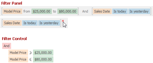
The following list demonstrates the available display styles of filter criteria.
Visual -
Renders filter criteria in an easy-to-read format and uses skin-based colored highlights to differentiate between column names, functions, and values. In the Filter Panel, the ‘x’ button is displayed when you hover over a condition. This button allows users to remove individual conditions from the filter.

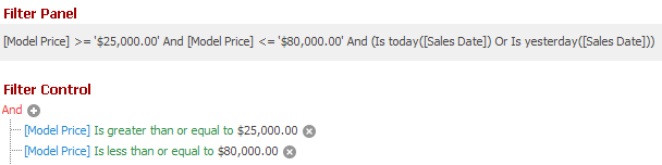
Text -
Renders filter criteria in a text-based format.
