CSS Isolation
- 2 minutes to read
The Blazor CSS isolation feature allows you to create component-specific styles and avoid styling conflicts between components and libraries.
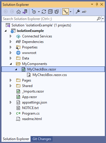
DevExpress components for Blazor support CSS isolation, except for the DxPopup, DxDropDown, DxFlyout, and DxWindow components as they are always rendered in the page root. To enable the isolation feature, create a folder for your custom components that use DevExpress components. In this folder, create the following items:
- A Razor component, for example,
MyCheckBox. - A
.razor.cssfile for isolated styles. The stylesheet should have the same name as the component.
In the MyCheckBox.razor markup, specify the DevExpress component. Blazor generates the b-{string} attribute at build time and uses it to target HTML markup elements in the current component, where {string} is a 10-character string. Blazor cannot generate attributes for child components such as DevExpress Blazor. Wrap DevExpress components in a markup element, for example, <div> or <span>, to ensure that they are treated as HTML elements.
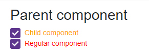
<h2>Parent component</h2>

<div>
    <DxCheckBox Checked="true"
                CssClass="my-checkbox">Child component</DxCheckBox>
</div>
In the MyCheckBox.razor.css file, specify component-specific styles. Use the ::deep combinator to apply styles.
::deep .my-checkbox {
    color: orange;
}
Add the MyCheckBox component to your application. You can add the DxCheckBox component with the same CSS class to ensure that MyCheckBox styles are isolated.
@using isolationExample.MyComponents

<style>
    .my-checkbox {
        color: red;
    }
</style>

<MyCheckBox />

<DxCheckBox Checked="true" CssClass="my-checkbox">Regular component</DxCheckBox>