DevExpress Theme Customization
- 4 minutes to read
This topic describes how DevExpress theme styles are organized. It also includes step-by-step instructions for DevExpress theme customization.
How DevExpress Blazor Theming Works
Most DevExpress components use proprietary CSS selectors for rendering; a few use Bootstrap CSS selectors. Components that use DevExpress selectors are listed below:
Scheduler and Rich Text Editor components use Bootstrap selectors, while their inner components (such as buttons and dialogs) use DevExpress selectors.
A built-in DevExpress theme includes both DevExpress and Bootstrap CSS rules. To customize these rules, override DevExpress or Bootstrap SCSS variable values, respectively.
DevExpress SCSS Variables
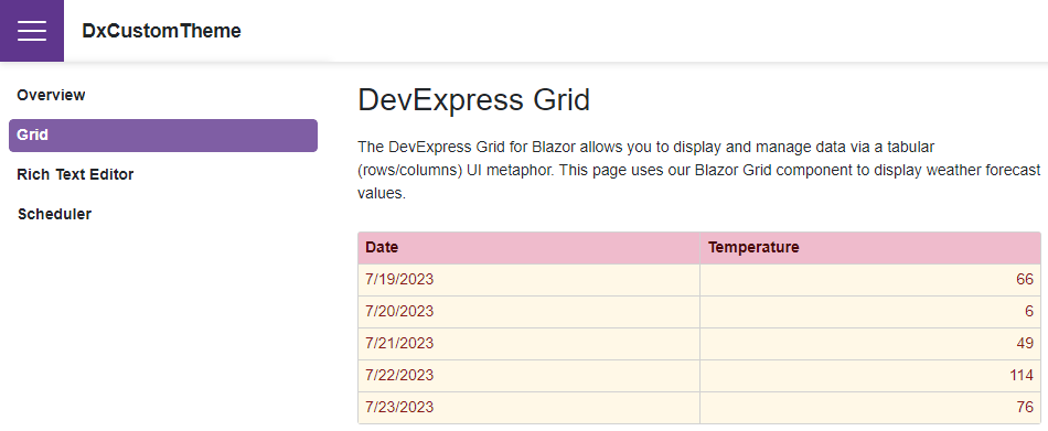
DevExpress SCSS variable names include a dx prefix. These variables define the appearance of DevExpress Blazor components that use our own CSS selectors. For instance, the dx-grid-bg and dx-grid-color variables allow you to customize the appearance of the Grid component:
$dx-grid-bg: #fff8e7 !default;
$dx-grid-color: #8b1a1a !default;
$dx-grid-header-bg: #efbbcc !default;
$dx-grid-header-color: #480607 !default;
You can find the complete list of DevExpress variables in files located in the themes folder. The default full path to these files is C:\Program Files\DevExpress 23.1\Components\Sources\DevExpress.Blazor.Themes\scss\components.
Bootstrap SCSS Variables
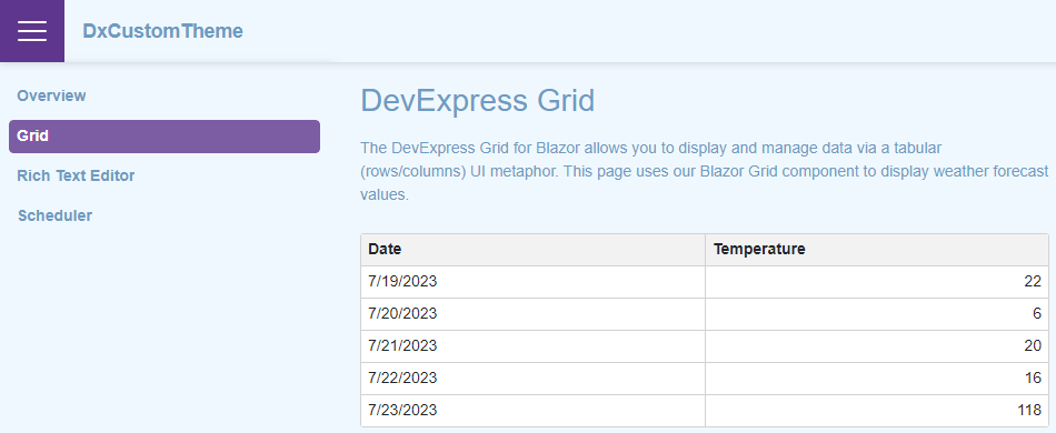
Bootstrap SCSS variables define the appearance of components that use Bootstrap CSS selectors. For instance, you can override values of the body-bg and body-color variables to customize the appearance of the page and the TreeView component, which uses Bootstrap selectors:
$body-bg: #f0f8ff !default;
$body-color: #6d9bc3 !default;
Customize a Built-in Theme
Follow the instructions described in the sections below to create a custom theme based on a DevExpress theme.
Note
Theme customizations, including SCSS variables, rely on internal implementation and may stop working after you upgrade the project. Refer to the following section for more information on how to upgrade a custom theme: Upgrade a Custom Theme to a New Version.
Set Up the Environment
Install Node.js and npm if needed.
Navigate to the folder with DevExpress themes. The default path is
C:\Program Files\DevExpress 23.1\Components\Sources\DevExpress.Blazor.Themes.Execute the following command in this folder to install dependencies:
npm iOn your local disk that stores DevExpress Blazor components, create a folder so that you can access DevExpress source code with a relative path.
In the newly created folder, execute the following command and name the package. You can skip the other package settings.
npm initThe command generates the package.json file.
Execute the following command to install the SASS dependency:
npm i sass -save-dev
Set Up the Theme Build
Create a file with a
*.scssextension, for example, scss-file-name.scss.In the package.json file, replace the Scripts attribute value with the following string:
"scripts": {
    "build": "sass ./<scss-file-name>.scss:<output-css-dir>/<theme-name>.css"
},
When you execute a command to build your theme’s stylesheet, this script creates the <output-css-dir> folder and builds the <theme-name> stylesheet in this folder.
Open the scss-file-name.scss file and reference the DevExpress theme’s source file with a relative path, for example, as follows:
@import "../../Program Files/DevExpress 23.1/Components/Sources/DevExpress.Blazor.Themes/scss/blazing-berry/blazing-berry.bs5.scss";
Change Values of CSS Variables
Before the
@importstatement, override default values of Bootstrap and/or DevExpress SCSS variables:/* Bootstrap variables */ $body-bg: #f0f8ff !default; $body-color: #6d9bc3 !default; /* DevExpress variables */ $dx-grid-bg: #fff8e7 !default; $dx-grid-color: #8b1a1a !default; $dx-grid-header-bg: #efbbcc !default; $dx-grid-header-color: #480607 !default; @import "../../Program Files/DevExpress 23.1/Components/Sources/DevExpress.Blazor.Themes/scss/blazing-berry/blazing-berry.bs5.scss";In your theme’s folder, execute the following command to build the stylesheet:
npm run build
Integrate a Custom Theme Into Your Application
Copy this stylesheet from the <output-css-dir> folder to the wwwroot/css folder of your project.
Replace the link to the old stylesheet with a link to the newly added stylesheet in one of the following layout files:
- Pages/_Layout.cshtml for Blazor Server applications created in .NET6 or DevExpress template in .NET7
- Pages/_Host.cshtml for Blazor Server applications created with a Microsoft template in .NET7
- wwwroot/index.html for Blazor WebAssembly or Hybrid applications
If you do not implement any solutions to refresh cached resources on user machines, add the asp-append-version attribute to the theme link. The attribute ensures that web browsers on user machines use the actual version of DevExpress CSS resources instead of a cached version. Refer to HTTP caching for more information about the browser cache.
<head>
    @*...*@
    <link href="css/<theme-name>.css" rel="stylesheet" asp-append-version="true" />
    <link href="css/site.css" rel="stylesheet" />
    @*...*@
</head>
Build your project. You can now see the modified theme.
Upgrade a Custom Theme to a New Version
You need to update your custom theme when you upgrade Blazor components to a new version (major or minor):
- Update custom selectors if you specified them on a theme level.
- Rebuild your theme with a new theme’s source file. Start with the Set Up the Theme Build section.