Icons
- 3 minutes to read
You can see predefined icons in different DevExpress Blazor components, for example, series legend items in a Chart, an expand button in an Accordion and TreeView, and so on. DevExpress Blazor components also support custom icon libraries allowing you to replace standard or add custom icons as a URL (IconUrl properties) or CSS class (XXCssClass properties). To perform this customization, use icon sets, for example, the DevExtreme Icon Library, Iconic, or Bootstrap-recommended libraries. Predefined component icons are 16x16 pixels in size. You can specify this same size for your custom icons to ensure UI consistency.
Tip
To download custom icons used in DevExpress Blazor demos, refer to the following GitHub repository: SVG Icons.
Use the IconUrl property to specify a URL for an icon in the following navigation and layout components:
| Component | Unbound Mode | Bound Mode |
|---|---|---|
| DxAccordion | AccordionItem.IconUrl | DxAccordionDataMapping.IconUrl |
| DxContextMenu | ContextMenuItem.IconUrl | DxContextMenuDataMapping.IconUrl |
| DxMenu | MenuItem.IconUrl | DxMenuDataMapping.IconUrl |
| DxTreeView | TreeViewNode.IconUrl | DxTreeViewDataMapping.IconUrl |
| DxTabs | DxTabBase.TabIconUrl | Bound mode is unsupported |
| DxFormLayoutGroup | DxFormLayoutGroup.HeaderIconUrl | Bound mode is unsupported |
| DxFormLayoutTabPage | DxFormLayoutTabPage.HeaderIconUrl | Bound mode is unsupported |
Specify the IconCssClass property to change the appearance of the icon specified by the IconUrl property. The example below shows how to assign an icon to a toolbar item and specify its size:
<style>
.my-style {
width: 16px;
}
</style>
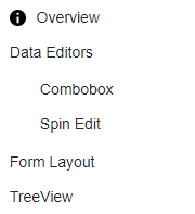
<DxTreeView>
<Nodes>
<DxTreeViewNode Name="Overview"
Text="Overview"
NavigateUrl="https://demos.devexpress.com/blazor/"
IconUrl="images/Info.svg"
IconCssClass="my-style" />
<DxTreeViewNode Name="Editors" Text="Data Editors" />
<DxTreeViewNode Name="FormLayout" Text="Form Layout" NavigateUrl="https://demos.devexpress.com/blazor/FormLayout" />
<DxTreeViewNode Name="TreeView" Text="TreeView" NavigateUrl="https://demos.devexpress.com/blazor/TreeView" />
</Nodes>
</DxTreeView>
For other components or when you can assign an icon as a CSS class, use the IconCssClass property. The code below demonstrates how to assign Iconic icons to Toolbar items:
<div class="card p-2">
    <DxToolbar>
        <DxToolbarItem Text="Item" />
        <DxToolbarItem Text="Link to the next demo"
                       NavigateUrl="https://demos.devexpress.com/blazor/Toolbar#DropDown" />
        <DxToolbarItem BeginGroup="true" IconCssClass="oi oi-align-left" />
        <DxToolbarItem IconCssClass="oi oi-align-center" />
        <DxToolbarItem IconCssClass="oi oi-align-right" />
        <DxToolbarItem IconCssClass="oi oi-cog"
                       Alignment="ToolbarItemAlignment.Right"
                       BeginGroup="true" />
        <DxToolbarItem Text="About" IconCssClass="oi oi-info" />
    </DxToolbar>
</div>

DevExtreme Icon Library
DevExtreme includes SVG and font icons for all DevExtreme themes. You can find all available icons in the following topic: DevExtreme Icons.
Add a link to one of the DevExtreme themes in one of the following files to access the icon set:
- Pages/_Layout.cshtml for Blazor Server applications created in .NET6 or DevExpress template in .NET7
- Pages/_Host.cshtml for Blazor Server applications created with a Microsoft template in .NET7
- wwwroot/index.html for Blazor WebAssembly or Hybrid applications
Specify dx-icon-<icon-name> as the IconCssClass property value, where icon-name is the name of the icon you want to use.
The example below shows how to assign DevExtreme icons to Toolbar items:
<div class="card p-2 bg-transparent">
    <DxToolbar>
        <DxToolbarItem Text="Item" />
        <DxToolbarItem Text="Link to the next demo"
                       NavigateUrl="https://demos.devexpress.com/blazor/Toolbar#DropDown" />
        <DxToolbarItem BeginGroup="true" IconCssClass="dx-icon-alignleft" />
        <DxToolbarItem IconCssClass="dx-icon-aligncenter" />
        <DxToolbarItem IconCssClass="dx-icon-alignright" />
        <DxToolbarItem IconCssClass="dx-icon-preferences"
                       Alignment="ToolbarItemAlignment.Right"
                       BeginGroup="true" />
        <DxToolbarItem Text="About" IconCssClass="dx-icon-info" />
    </DxToolbar>
</div>