Themes
- 12 minutes to read
DevExpress Blazor components use the client-side Bootstrap framework to render their user interface. You can apply a Bootstrap-based theme to a Blazor application to change the appearance of all the components.
Overview
If you created an application with the Blazor App Microsoft template, the application uses the standard Bootstrap theme. This theme’s stylesheet is in the wwwwroot/css/bootstrap folder and linked in the layout file’s HEAD section:
- In the Pages/_Host.cshtml (for .NET 5.0) or Pages/_Layout.cshtml (for .NET 6.0) file for Blazor Server.
- In the wwwroot/index.html file for Blazor WebAssembly.
<head>
    @*...*@
    <link href="css/site.css" rel="stylesheet" />
    <link href="css/bootstrap/bootstrap.min.css" rel="stylesheet" />
    <link href="_content/DevExpress.Blazor/dx-blazor.css" rel="stylesheet" />
</head>
You can use the standard Bootstrap theme v4 or v5. Refer to the BootstrapVersion property description for more information on how to configure the project to use Bootstrap 5.
To use another theme, replace the link to the css/bootstrap/bootstrap.min.css file with a link to a CSS file of a DevExpress Bootstrap theme or third-party Bootstrap theme.
Note
The Microsoft project template adds the NavMenu component and site.css file. This file contains CSS rules for NavMenu-related classes that have the same names as Bootstrap classes. When you place DevExpress Blazor components (like TreeView or Tabs) on a page, they can be rendered incorrectly due to rules defined in the site.css file. To resolve this issue, modify the site.css file and NavMenu component. Use the approaches described in How to inspect CSS rules and How to implement CSS-related solutions for DevExpress components to determine which CSS rules cause this issue.
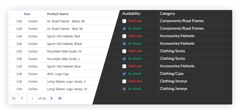
DevExpress Blazor Demos use the DevExpress Blazing Berry theme. You can select another theme in the theme switcher.
Apply a DevExpress Bootstrap Theme
The DevExpress Blazing Berry, DevExpress Blazing Dark, DevExpress Purple and DevExpress Office White open source themes were designed for websites built with Bootstrap v4 and v5.
Do the following to apply DevExpress Bootstrap themes:
- Download or clone these themes from the open source GitHub repository.
Copy the CSS files from the dist/{theme-name} or dist.v5/{theme-name} folder and add them to the corresponding folder in the project’s wwwroot/css folder.
If you use DevExpress themes built with Bootstrap v5, you should also configure the project as described in the GlobalOptions.BootstrapVersion topic.
In the layout file (_Host.cshtml, _Layout.cshtml, or index.html), add a link to a theme’s CSS file instead of the css/bootstrap/bootstrap.min.css link.
<head>
    @*...*@
    <link rel="stylesheet" href="css/blazing-berry/bootstrap.min.css" />
    @*...*@
</head>
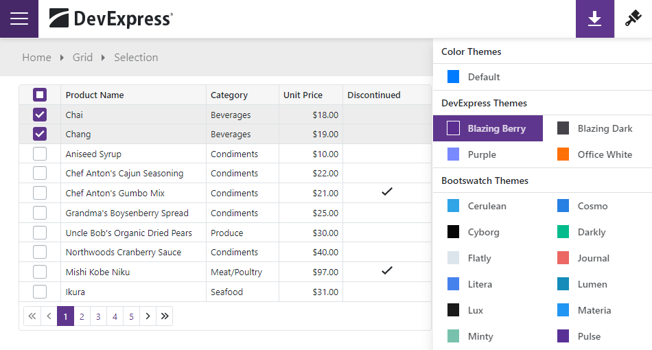
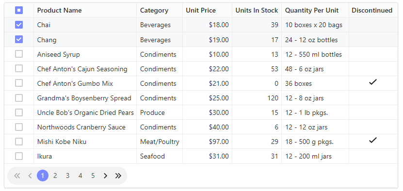
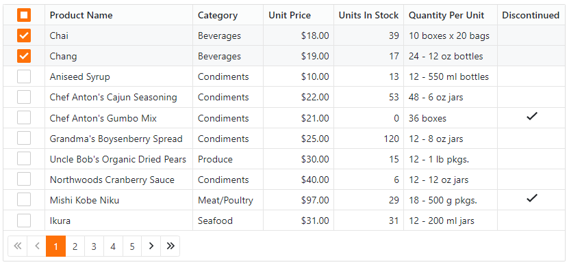
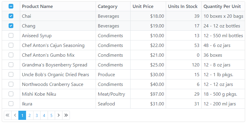
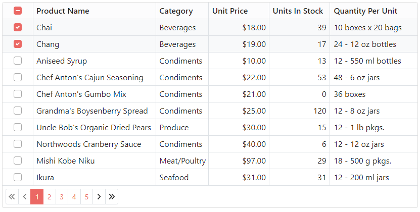
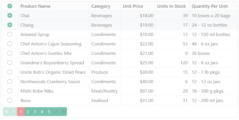
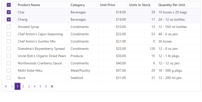
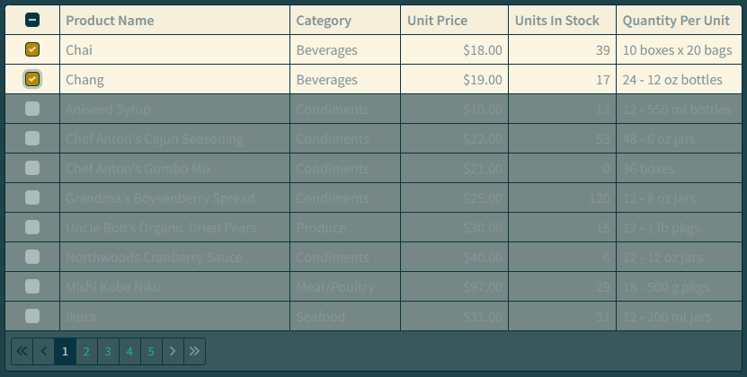
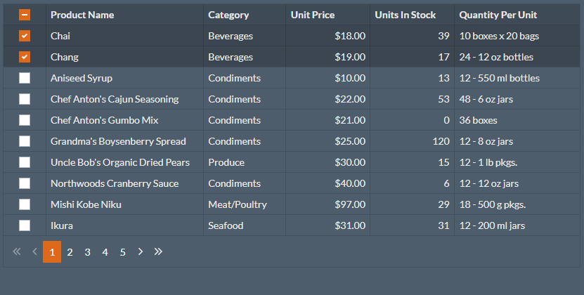
The following image gallery illustrates the Grid component with DevExpress themes:
DevExpress Blazing Berry
DevExpress Blazing Dark
DevExpress Purple
DevExpress Office White
You can also modify the theme source files (SCSS) and use npm to compile the resulting themes. See Customization for more information.
Apply a Third-Party or Custom Bootstrap Theme
- Download any Bootstrap theme, for instance, a free Bootswatch theme. You can also create a custom Bootstrap theme v4 or a custom theme v5.
- Copy a theme’s files to your application’s wwwroot/css folder.
- In the layout file (_Host.cshtml, _Layout.cshtml, or index.html), add a link to the CSS file instead of the css/bootstrap/bootstrap.min.css link.
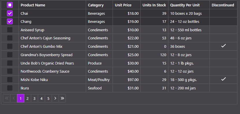
The code snippet below applies the Pulse Bootswatch theme.
<head>
    @*...*@
    <link rel="stylesheet" href="css/pulse/bootstrap.min.css" />
    @*...*@
</head>
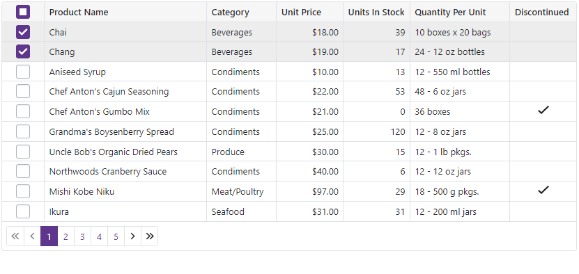
The following image gallery shows the Grid component with different Bootswatch themes:
Cerulean
Journal
Minty
Pulse
Solar
Superhero
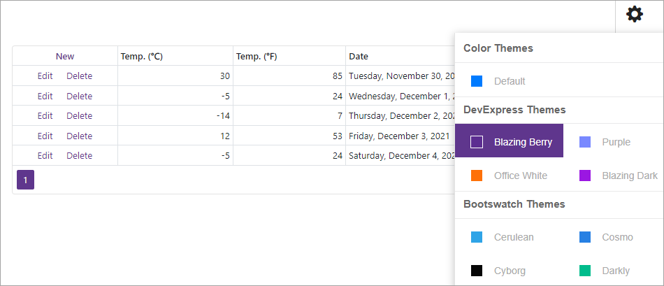
Implement a Theme Switcher
This example demonstrates how to create a Theme Switcher with the standard Bootstrap theme, 4 DevExpress Bootstrap themes, and more than 20 Bootswatch themes. The implementation depends on the .NET version you use in your application.
.NET5 Implementation
Follow the steps below to implement a Theme Switcher in your application that targets .NET5:
Copy the switcher-resources folder to your application’s wwwroot/css folder.
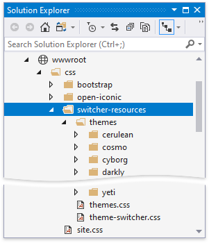
The themes folder includes nested folders whose names correspond to theme names. Each nested folder contains the theme’s stylesheet (bootstrap.min.css file). The themes.css file contains CSS rules used to draw colored squares for each theme in the Theme Switcher. The theme-switcher.css file contains CSS rules that define the Theme Switcher’s settings and behavior.
Link the themes.css and theme-switcher.css files in the site.css file.
@import url('switcher-resources/themes.css');
@import url('switcher-resources/theme-switcher.css');
// ...
Create the ThemeSwitcher folder and add a new ThemeSwitcher.razor component. Define the component’s appearance, populate it with theme items, implement the visibility logic, and apply the selected theme on item click.
- For Blazor Server, generate a link to the selected theme and pass this link to a separate service (LinkService that is implemented later).
- For Blazor WebAssembly, link the selected theme directly in the component layout.
@inject LinkService ThemeLinkService <div id="settingsbar" class="@(Shown ? "" : "hidden-settings-bar")"> <nav id="themesMenu"> <ul class="nav nav-pills"> @foreach (var themeSet in themeData) { <li class="nav-item theme-group">@themeSet.Title</li> @foreach (var theme in themeSet.Themes) { <li class="nav-item"> <a class="nav-link @(currentTheme == theme ? "active" : "") " href="javascript:;" @onclick="@(() => OnItemClick(theme))"> <span class="image @theme.ToLower().Replace(" ", "-")" aria-hidden="true"></span> <span class="theme-name">@theme</span> </a> </li> } } </ul> </nav> </div> @code { [Parameter] public bool Shown { get; set; } [Parameter] public Action<bool> ShownChanged { get; set; } string currentTheme = "default"; public class ThemeSetModel { public string Title { get; } public string[] Themes { get; } public ThemeSetModel(string title, params string[] themes) { Title = title; Themes = themes; } } List<ThemeSetModel> themeData = new List<ThemeSetModel>() { new ThemeSetModel("Color Themes", "default"), new ThemeSetModel("DevExpress Themes", "blazing berry", "purple", "office white"), new ThemeSetModel("Bootswatch Themes", "cerulean", "cosmo", "cyborg", "darkly", "flatly", "journal", "litera", "lumen", "lux", "materia", "minty", "pulse", "sandstone", "simplex", "sketchy", "slate", "solar", "spacelab", "superhero", "united", "yeti") }; void OnItemClick(string theme) { currentTheme = theme; string themeLink = "css/switcher-resources/themes/" + currentTheme + "/bootstrap.min.css"; ThemeLinkService.SetTheme(themeLink); Shown = !Shown; ShownChanged?.Invoke(Shown); } }In the MainLayout.razor file, add a button that changes the Theme Switcher visibility and render the created ThemeSwitcher component:
@inherits LayoutComponentBase
@using BlazorAppThemes.ThemeSwitcher

<div class="main">
    <div align="right" class="@($"theme-settings { ThemeSwitcherShown }")">
        <a class="nav-item nav-link" @onclick="@ToggleThemeSwitcherPanel" href="javascript:void(0);">
            <span class="oi oi-cog"></span>
        </a>
    </div>

    <ThemeSwitcher @bind-Shown="@ThemeSwitcherShown"></ThemeSwitcher>
    <div class="content px-4">
        @Body
    </div>
</div>


@code {
    bool themeSwitcherShown = false;
    bool ThemeSwitcherShown {
        get => themeSwitcherShown;
        set {
            themeSwitcherShown = value;
            InvokeAsync(StateHasChanged);
        }
    }

    void ToggleThemeSwitcherPanel() {
        ThemeSwitcherShown = !ThemeSwitcherShown;
    }
}
Open the Index.razor file and add the DxGrid component.
@page "/"
@using switcher.Data
@inject WeatherForecastService ForecastService

<DxGrid Data="@forecasts"
        PageSize="5"
        ShowFilterRow="false">
    <Columns>
        <DxGridCommandColumn Width="150px"></DxGridCommandColumn>
        <DxGridDataColumn FieldName="@nameof(WeatherForecast.TemperatureC)" Caption="@("Temp. (\x2103)")" TextAlignment="@GridTextAlignment.Right"></DxGridDataColumn>
        <DxGridDataColumn FieldName="@nameof(WeatherForecast.TemperatureF)" Caption="@("Temp. (\x2109)")"></DxGridDataColumn>
        <DxGridDataColumn FieldName="@nameof(WeatherForecast.Date)" DisplayFormat="D"></DxGridDataColumn>
    </Columns>
</DxGrid>

@code {
    object[] forecasts;
    protected override async Task OnInitializedAsync() {
        forecasts = await ForecastService.GetForecastAsync(DateTime.Now);
    }
}
The Theme Switcher for Blazor WebAssembly is ready. Perform the following for Blazor Server only:
Implement the ThemeLink.razor component in the ThemeSwitcher folder that dynamically generates a link to a theme’s stylesheet. Create the LinkService class that processes this link.
@implements IObserver<string> @implements IDisposable @inject LinkService ThemeLinkService <link rel="stylesheet" href="@_currentThemeLink" /> @code { IDisposable _subscription; string _currentThemeLink; bool _initialized; protected override void OnInitialized() { base.OnInitialized(); _subscription = ThemeLinkService.Subscribe(this); _initialized = true; } void IDisposable.Dispose() { using (_subscription) _subscription = null; } void IObserver<string>.OnNext(string newThemeLink) { _currentThemeLink = newThemeLink; if (_initialized) InvokeAsync(StateHasChanged); } void IObserver<string>.OnCompleted() { } void IObserver<string>.OnError(Exception error) { } }Register the LinkService at the application’s startup (the Startup.cs file).
using BlazorAppThemes.ThemeSwitcher;
// ...

public class Startup  {
    public void ConfigureServices(IServiceCollection services) {
        // ...
        services.AddScoped<LinkService>();
    }
}
Render the ThemeLink component in the _Host.cshtml file’s HEAD section.
<head>
    // ...
    <link href="css/site.css" rel="stylesheet" />
    @* If the ThemeSwitcher.razor file is in the ThemeSwitcher folder *@
    @(await Html.RenderComponentAsync<ThemeSwitcher.ThemeLink>(RenderMode.ServerPrerendered))
    @* If the ThemeSwitcher.razor is in the Shared folder *@
    @(await Html.RenderComponentAsync<ThemeLink>(RenderMode.ServerPrerendered))
    <link href="_content/DevExpress.Blazor/dx-blazor.css" rel="stylesheet" />
</head>
.NET6 Implementation
Follow the steps below to implement a Theme Switcher in your application that targets .NET6:
Use a DevExpress Project Template to create a new Blazor Server or Blazor WebAssembly application.
Copy the switcher-resources folder to your application’s wwwroot/css folder.
The themes folder includes nested folders whose names correspond to theme names. Each nested folder contains the theme’s stylesheet (bootstrap.min.css file). The themes.css file contains CSS rules used to draw colored squares for each theme in the Theme Switcher. The theme-switcher.css file contains CSS rules that define the Theme Switcher’s settings and behavior.
Link the themes.css and theme-switcher.css files in the following file:
- site.css for Blazor Server
- site.css or app.css for Blazor WebAssembly, depending on the application template used.
@import url('switcher-resources/themes.css');
@import url('switcher-resources/theme-switcher.css');
// ...
Create the ThemeItem.cs file in the Shared folder and define a type to store each theme’s name and a URL to the corresponding bootstrap.min.css file.
namespace switcher.Shared
{
    public record ThemeItem(string Name, string StylesheetLinkUrl)
    {
        public static readonly ThemeItem Default = Create("default");
        public static ThemeItem Create(string name) => new ThemeItem(name, $"css/switcher-resources/themes/{name}/bootstrap.min.css");
    };
}
Create a new ThemeSwitcherSideView.razor component in the same folder and declare the following:
- Variables that specify the theme selector panel’s visibility (
Visible) and the current theme’s URL (ActiveTheme). - Event callbacks (
VisibleChangedandActiveThemeChanged) that update the parent component state when you select another theme. Refer to Microsoft documentation for more information: Binding with Component Parameters. - A theme collection to store all themes in the switcher (
GroupedThemes).
@code { static readonly Dictionary<string, string[]> GroupedThemes = new () { ["Color Themes"] = new [] { "default" }, ["DevExpress Themes"] = new [] { "blazing berry", "purple", "office white", "blazing dark" }, ["Bootswatch Themes"] = new [] { "cerulean", "cosmo", "cyborg", "darkly", "flatly", "journal", "litera", "lumen", "lux", "materia", "minty", "pulse", "sandstone", "simplex", "sketchy", "slate", "solar", "spacelab", "superhero", "united", "yeti" } }; [Parameter] public bool Visible { get; set; } [Parameter] public EventCallback<bool> VisibleChanged { get; set; } [Parameter] public ThemeItem ActiveTheme { get; set; } [Parameter] public EventCallback<ThemeItem> ActiveThemeChanged { get; set; } @* ... *@ }- Variables that specify the theme selector panel’s visibility (
Add the sidebar’s layout to display icons for all themes in the
GroupedThemescollection:@if(Visible) { <nav id="themesMenu"> <ul class="nav nav-pills"> @foreach (var themeSet in GroupedThemes) { <li class="nav-item theme-group">@themeSet.Key</li> @foreach (var theme in themeSet.Value) { <li class="nav-item"> <a class="nav-link @(ActiveTheme.Name == theme ? "active" : "") " href="#" @onclick=@(async(e) => await OnItemClick(theme)) @onclick:preventDefault> <span class="image @theme.ToLower().Replace(" ", "-")" aria-hidden="true"></span> <span class="theme-name">@theme</span> </a> </li> } } </ul> </nav> }Handle the active theme changes. The snippet below uses JSInterop to fetch external resources when you click a theme tile:
@inject IJSRuntime JSRuntime
@* ... *@
@code {
@* ... *@
    [Parameter] public bool Visible { get; set; }
    [Parameter] public EventCallback<bool> VisibleChanged { get; set; }
    [Parameter] public ThemeItem ActiveTheme { get; set; }
    [Parameter] public EventCallback<ThemeItem> ActiveThemeChanged { get; set; }
    async Task OnItemClick(string theme) {
        if (ActiveTheme.Name != theme) {
            var themeItem = ThemeItem.Create(theme);
            await JSRuntime.InvokeVoidAsync("fetch", themeItem.StylesheetLinkUrl, new {
                method = "GET",
                mode = "no-cors"
            });
            await Task.WhenAll(
                ActiveThemeChanged.InvokeAsync(themeItem),
                VisibleChanged.InvokeAsync(false)
            );
        }
    }
}
Create the ThemeSwitcherToggleButton.razor component in the Shared folder. Declare the
Activevariable andActiveChangedevent callback to allow data binding. Add the toggle button’s HTML markup that reflects theActivevariable’s value and invokes theActiveChangedevent callback when you click the button.<div align="right" class="theme-settings @Active"> <a class="nav-item nav-link" @onclick="@OnClick" @onclick:preventDefault href="#"> <span class="oi oi-cog"></span> </a> </div> @code { [Parameter] public bool Active { get; set; } [Parameter] public EventCallback<bool> ActiveChanged { get; set; } async Task OnClick() { await ActiveChanged.InvokeAsync(!Active); } }Define the Theme Switcher UI in HTML markup in the MainLayout.razor file. The component uses two-way binding to bind the link to the active theme. Use the
@keydirective attribute to guarantee preservation of elements or components based on the key’s value.@inherits LayoutComponentBase <HeadContent> <link href="@_activeTheme.StylesheetLinkUrl" rel="stylesheet" /> @{if (_activeTheme.StylesheetLinkUrl.Contains("slate")) { <style> .dxbs-gridview { --selection-bg: rgba(255, 255, 255, 0.075) !important; } </style> } } <link href="_content/DevExpress.Blazor/dx-blazor.css" rel="stylesheet" /> </HeadContent> <div class="main"> <ThemeSwitcherToggleButton @bind-Active=@_themeSwitcherShown /> <div id="settingsbar" class="@(_themeSwitcherShown ? "" : "hidden-settings-bar")"> <ThemeSwitcherSideView @bind-ActiveTheme="@_activeTheme" @bind-Visible="@_themeSwitcherShown" /> </div> <div class="content px-4" @key=@_activeTheme> @Body </div> </div> @code { bool _themeSwitcherShown = false; ThemeItem _activeTheme = ThemeItem.Default; }For Blazor server, remove the default theme’s stylesheet (
<link rel="stylesheet" href="css/{your-default-theme-name}/bootstrap.min.css">) from the<head>section of the _Layout.cshtml file.Open the Index.razor file and add the DxGrid component.
@page "/"
@using switcher.Data
@inject WeatherForecastService ForecastService

<DxGrid Data="@forecasts"
        PageSize="5"
        ShowFilterRow="false">
    <Columns>
        <DxGridCommandColumn Width="150px"></DxGridCommandColumn>
        <DxGridDataColumn FieldName="@nameof(WeatherForecast.TemperatureC)" Caption="@("Temp. (\x2103)")" TextAlignment="@GridTextAlignment.Right"></DxGridDataColumn>
        <DxGridDataColumn FieldName="@nameof(WeatherForecast.TemperatureF)" Caption="@("Temp. (\x2109)")"></DxGridDataColumn>
        <DxGridDataColumn FieldName="@nameof(WeatherForecast.Date)" DisplayFormat="D"></DxGridDataColumn>
    </Columns>
</DxGrid>

@code {
    object[] forecasts;
    protected override async Task OnInitializedAsync() {
        forecasts = await ForecastService.GetForecastAsync(DateTime.Now);
    }
}
The .NET6 example code relies on the HeadOutlet component. Refer to the following Microsoft article for information about this component in Blazor Server and WASM applications: HeadOutlet Component.