Designer
- 2 minutes to read
This topic describes how to invoke the Gauge Designer and explains its structure.
The Gauge Designer is an integrated visual editing tool that allows you to customize gauges. The designer includes all features required to edit gauges. Its elements include Label and Range editors.
You can click the smart tag of a gauge or element to invoke a corresponding designer. This allows you to edit the entire gauge, or only specific elements.
Do the following to open the designer for a gauge or its element:
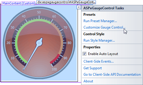
- Click the Gauge control’s smart tag and select Customize Gauge Control…
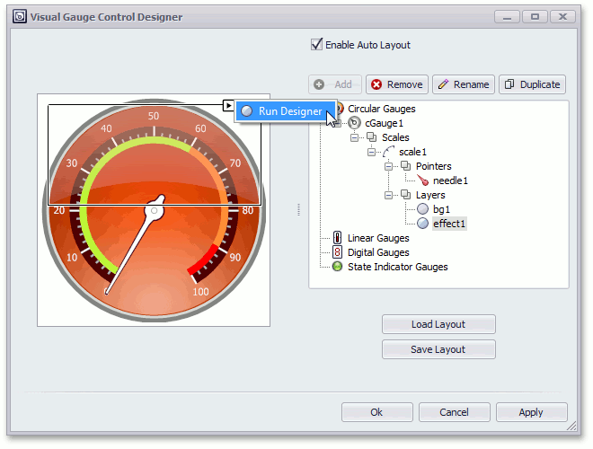
- In the invoked Visual Gauge Control Designer, select the gauge or a gauge element.
- Click the smart tag of the selected gauge or element.
- Select Run Designer.
The following image demonstrates how to run the designer for the Effect Layer element:
This invokes the Effect Layers editor.
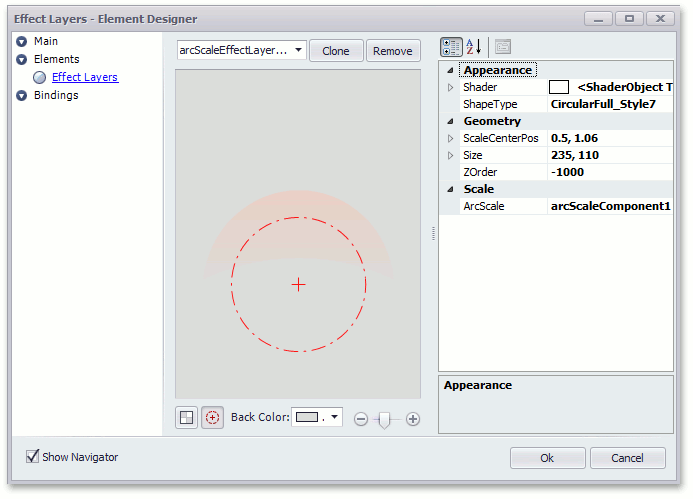
This editor contains all required settings to customize an element’s appearance, geometry, and scale position.
A typical designer view consists of a navigation pane on the left and an editing area on the right. The navigation pane is divided into three main categories that provide access to gauge properties grouped by features.
- Main
- Elements
These panes are described below using the Circular Gauge editor as an example.
Main
The Main category’s editing area demonstrates the structure of the selected gauge and marks its main elements.
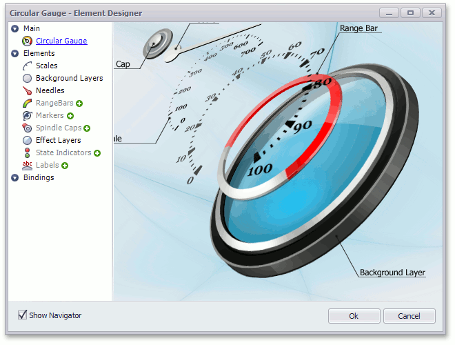
Elements
The Elements category allows you to create and remove elements, and change their properties as required.
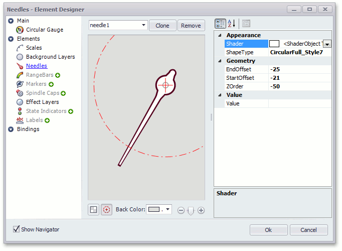
Supported gauge element types are listed under the category’s name. To access a specific element, click the required gauge element type.
If the gauge does not contain an element of a specific type, then the corresponding item in the navigation pane is grayed out (see the image above). In this instance, click the  icon next to the group’s name to create an element of this type.
Then, choose the required element from the Selected Element combo box at the top of the editing area.
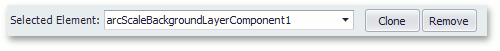
If an element of a specific type already exists, the icon is hidden. To add more elements of this type, click the Clone button. This creates a new element and copies the currently selected element’s properties.
To remove an existing element, select it from the Selected Element combo box and then click the Remove button.