ASPxComboBox
- 6 minutes to read
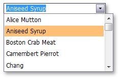
The ASPxComboBox editor combines the functionality of a single-line text editor, button editor, and dropdown list editor. The editor’s dropdown displays a list of items that users can select.
ASPxComboBox offers the following features.
Data-Bound and Unbound Modes Support
You can use an item’s FieldName property to define these data fields manually. Alternatively, if the data source fields are named in the same way as the item’s characteristics (Text, ImageURL, Value), the editor automatically connects these properties to their corresponding fields. If data source fields have other names (“Names”, “Count” and so on), you must specify the field from which values should be obtained (for example, the “Names” field) and map it to its corresponding “”Text” property.
ASPxComboBox supports database server mode. In this mode, the editor loads only required (visible) items to the server memory and implements data-aware operations (for example, filtering) at the database level. Note that the GridViewDataComboBoxColumn object does not support database server mode.
Three Item Load Modes
The ASPxComboBox control supports three item load modes.
Load Mode Description Affected Properties Default All items are loaded to the client side, so all data operations (such as scrolling, filtering) are executed on the client, without generating a round trip to the server. EnableCallbackMode=”False” On-Demand Items are loaded from the server on demand using callbacks. For instance, you can dynamically load list items when a user scrolls the list. This callback mode speeds up the first page load, since initially only a few items need to load. EnableCallbackMode = “True” Dynamic You can manually populate a dropdown list with the required items, based on the currently applied filter criteria (the ASPxAutoCompleteBoxBase.IncrementalFilteringMode property value is not set to “None”) and the scroll action performed by a user. EnableCallbackMode=”True” See the following help topic to learn more: Item Load Modes.
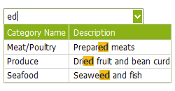
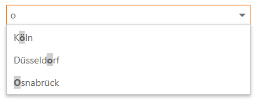
Incremental Filtering
You can enable users to filter list items dynamically, based on the text typed into the editor’s input box on the client side (find-as-you-type filtering). The following filter modes are available.
Load Mode Description StartsWith The editor is filtered for list items that begin with the search string. Contains The editor is filtered for list items that contain the search string. The search string results are highlighted within items for clarity. You can use the ASPxAutoCompleteBoxBase.IncrementalFilteringMode property to enable the required filter mode.
See the following topic to learn more: Incremental Filtering of ASPxComboBox.
Custom Filtering
The ASPxComboBox enables you to implement custom filter logic on the server and client sides. For example, you can filter items by multiple words and multiple columns simultaneously, or filter items that contain diacritic characters. Refer to the following help topic for more information: Custom Filtering.
Online demo: Custom Filtering
Delayed Filtering
You can define the time interval between the time a user starts typing within the editor’s edit box (the ASPxAutoCompleteBoxBase.IncrementalFilteringDelay property) and the time that the filter is applied. When the ASPxComboBox editor is in incremental filter mode, you can specify the minimum number of symbols a user must type before the editor applies a filter (see the ASPxAutoCompleteBoxBase.FilterMinLength property).
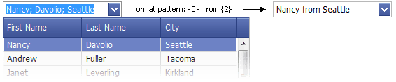
Display Formatting
You can use the standard format mechanism to format editor display values. The ASPxAutoCompleteBoxBase.TextFormatString property allows you to define the pattern used to format the selected item’s text displayed within the editor’s edit box.
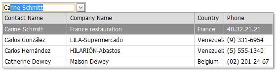
Multi-Column Mode
You can display the ASPxComboBox’s list data in multiple columns. This functionality is in effect if the editor’s items collection is obtained from a data source. You can also define a column’s header caption, width, visibility state and other settings for columns. To configure columns, you can invoke the “Columns…” item from the editor’s smart tag menu.
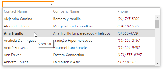
Item Images
You can specify a uniform image for all editor items (the ASPxAutoCompleteBoxBase.ItemImage property) or define images for individual items (see the ASPxAutoCompleteBoxBase.ImageUrlField property). Images associated with list items are displayed within the editor’s dropdown list. You can display the selected item image within the editor’s edit box in addition to text.
Item Appearance Customization
ASPxComboBox allows you to customize item appearance. To specify style settings for editor cells and rows, use the ASPxAutoCompleteBoxBase.ItemTextCellPrepared and the ASPxAutoCompleteBoxBase.ItemRowPrepared events, respectively.
Item Template
You can use the ASPxAutoCompleteBoxBase.ItemTemplate property to create a custom layout for its items.

Customizable Button Collection
The ASPxComboBox control contains a collection of its custom edit buttons. Each button exposes a set of properties that allow you to define the button’s appearance and behavior. You can also customize the settings of the default button, which invokes a dropdown window on click.

Built-in Validation
The ASPxComboBox control allows you to validate data on both the client and server sides. See the following help topic to learn more: Validation.
Full-Featured Client-Side API
The ASPxClientComboBox object is the client-side equivalent of the ASPxComboBox control. This object exposes the control’s comprehensive client-side API.
You can use the following methods to modify editor behavior.
Method Description ASPxClientComboBox.AddItem Adds a new item to the end of the control’s items collection. ASPxClientComboBox.BeginUpdate Prevents the client combobox editor from being rendered until the ASPxClientComboBox.EndUpdate method is called. ASPxClientComboBox.ClearItems Removes all items from the client combo box editor. ASPxClientComboBox.EndUpdate Re-enables editor render operations after a call to the ASPxClientComboBox.BeginUpdate method and forces an immediate re-rendering. ASPxClientComboBox.FindItemByText Returns a combo box item by its text. ASPxClientComboBox.FindItemByValue Returns a combo box item by its value. ASPxClientComboBox.GetItem Returns an item specified by its index within the combo box editor’s item collection. ASPxClientComboBox.GetItemCount Gets the number of items contained in the editor’s item collection. ASPxClientComboBox.GetSelectedIndex Returns the index of the selected item within the combo box editor. ASPxClientComboBox.GetSelectedItem Returns the combo box editor’s selected item. ASPxClientComboBox.GetText Gets the text displayed in the editor’s edit box. ASPxClientComboBox.InsertItem Adds a new item to the control’s items collection at the specified index. ASPxClientComboBox.MakeItemVisible Scrolls the editor’s item list, so that the specified item becomes visible. ASPxClientComboBox.PerformCallback Sends a callback to the server and generates the server-side ASPxAutoCompleteBoxBase.Callback event, passing it the specified argument. ASPxClientComboBox.RemoveItem Removes an item specified by its index from the client list editor. ASPxClientComboBox.SetSelectedIndex Sets the combobox editor’s selected item specified by its index. ASPxClientComboBox.SetSelectedItem Sets the list editor’s selected item. ASPxClientComboBox.SetText Specifies the text displayed within the editor’s edit box.