ASPxButton
- 2 minutes to read
The ASPxButton control provides extended button functionality. The ASPxButton’s client-side and server-side APIs allow you to customize the button’s appearance, and perform different validation tasks without additional validation controls.
Main Features
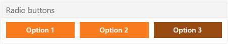
Radio Button Functionality
You can use the ASPxButton.Checked and ASPxButton.GroupName properties to group several buttons and use them as radio buttons. Use the ASPxButton.CheckedStyle property to customize the button’s checked state appearance. The control raises the ASPxButton.CheckedChanged event when an end user checks the button. Refer to the Button Features online demo to see the radio button functionality.
Native Render
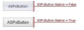
Set the ASPxButton.Native property to true to render the ASPxButton as a native HTML input element (button). This reduces the amount of generated HTML code and improves the editor’s performance. In native mode, the button’s appearance depends on how the client browser renders native HTML elements.
Render Modes
The ASPxButton.RenderMode property allows you to specify how the browser renders the button.
Render Mode ASPxButton ButtonRenderMode.Button 
ButtonRenderMode.Danger 
ButtonRenderMode.Link 
ButtonRenderMode.Outline 
ButtonRenderMode.Secondary 
Built-in Validation
The ASPxButton control allows you to validate its data on the client and server side. Refer to the Validation topic for more information.
Appearance Customization
Appearance
Description
Native HTML button input element
When the browser renders the ASPxButton control as a native HTML button input element, the browser uses the native Windows style to paint the button. In this mode, the button’s appearance depends on the system settings.
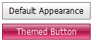
Apply DevExpress Themes
You can apply DevExpress themes to DevExpress controls to ensure a consistent appearance. Refer to the DevExpress Themes Overview topic for more information.
Button appearance properties
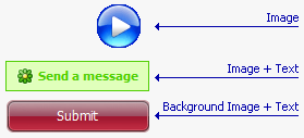
The ASPxButton content can consist of text and an image in the following combinations:
- Image - Represents the button as an image.
- Image and Text - Represents the button as a combination of an image and text.
- Background Image and Text. - Represents the button as a combination of a background image and text.
Client-Side API
The ASPxClientButton object (the ASPxButton control’s client-side equivalent) provides the button’s client-side APIs.
Method Description ASPxClientButton.DoClick Simulates a mouse click on the button. ASPxClientButton.Focus Focuses the button. ASPxClientButton.GetChecked Specifies whether the button is checked. ASPxClientButton.SetChecked Specifies the button’s checked status. ASPxClientButton.GetEnabled Indicates whether the button is enabled. ASPxClientButton.SetEnabled Enables the button. ASPxClientButton.GetImageUrl Returns the URL of the button’s image. ASPxClientButton.SetImageUrl Specifies the URL of the button’s image. ASPxClientButton.GetText Returns the button’s text. ASPxClientButton.SetText Sets the button’s text.