Display and Customize the Ribbon UI in an XAF Blazor Application
- 3 minutes to read
An XAF Core Blazor application can display the standard Toolbar UI or Ribbon UI. If you create a new application, XAF sets the UI type to Ribbon.
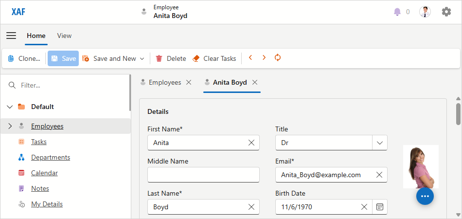
Ribbon UI
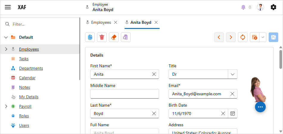
Standard UI
Display the Ribbon UI in an Existing Application
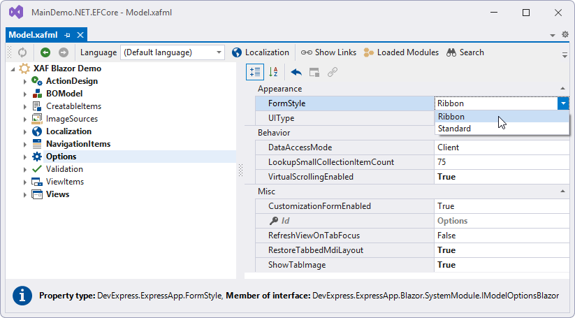
In the Solution Explorer, expand the MySolution.Blazor.Server project and double-click the Model.xafml file to open it in the Model Editor. Navigate to the Options node and set the FormStyle property to Ribbon.
Customize the Ribbon UI
An XAF application builds the Ribbon UI structure based on the model specified in the Model Editor. You can customize the default Ribbon structure as follows:
- In the Solution Explorer, expand the MySolution.Blazor.Server project and double-click the Model.xafml file to open it in the Model Editor.
Navigate to the Action Design | ActionToRibbonMapping node.
Use the ActionToRibbonMapping node to customize default ribbon elements or add custom elements.
- The ActionToRibbonMapping node contains a list of ribbon page models (IModelRibbonPage).
You can specify a page Caption, order Index, and whether the page is Contextual. Contextual pages are displayed after standard ribbon pages and their headers are highlighted. - A ribbon page model contains a list of ribbon page group models (IModelRibbonPageGroup).
You can specify a group Caption and order Index. - A ribbon page group model contains a list of Action Container links (IModelActionContainerToRibbonLink).
Use the ActionContainer property to link an Action Container and the Index property to order links in the group. An Action Container contains a list of action links (IModelActionLink). To access these elements, navigate to the Action Design | ActionToContainerMapping node. See the following help topic for more information: How to: Reorder an Action Container's Actions Collection.
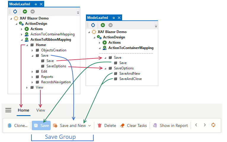
- The ActionToRibbonMapping node contains a list of ribbon page models (IModelRibbonPage).
Access the DxRibbon Component
- Under the SolutionName.Blazor.Server project, add a Window Controller to the Controllers folder.
Override the
OnActivatedmethod as demonstrated in the following code snippet:File: MySolution.Blazor.Server\Controllers\TabsCustomizationWindowController.cs
using DevExpress.ExpressApp;
using DevExpress.ExpressApp.Blazor.Services;
using DevExpress.ExpressApp.Blazor.Templates.Ribbon;

namespace MySolution.Blazor.Server.Controllers;

public class TabsCustomizationWindowController : WindowController {
    private IImageUrlService imageUrlService;

    public TabsCustomizationWindowController() {
        TargetWindowType = WindowType.Main;
    }
    [ActivatorUtilitiesConstructor]
    public TabsCustomizationWindowController(IImageUrlService imageUrlService) : this() {
        this.imageUrlService = imageUrlService;
    }
    protected override void OnActivated() {
        base.OnActivated();
        Window.TemplateChanged += Window_TemplateChanged;
    }
    protected override void OnDeactivated() {
        Window.TemplateChanged -= Window_TemplateChanged;
        base.OnDeactivated();
    }
    private void Window_TemplateChanged(object sender, EventArgs e) {
        if(Window.Template is ITemplateRibbonProvider ribbonProvider) {
            ribbonProvider.Ribbon.RibbonModel.DropDownMenuMaxHeight = "400px";
            foreach(var tab in ribbonProvider.Ribbon.Tabs) {
                tab.IconUrl = imageUrlService.GetImageUrl("BO_Unknown");
            }
        }
    }
}
You can use the CustomizeControl event to access and customize individual Action control items in
DxRibbon, such asDxRibbonItemSimpleActionControland otherDxRibbonItemXXXControltypes.