ASP.NET Core Blazor Application Appearance
- 13 minutes to read
You can configure the appearance of an XAF ASP.NET Core Blazor application in several ways. DevExpress Blazor includes built-in classic and fluent themes, and the fluent theme support both light and dark modes. You can also apply external Bootstrap themes or libraries such as Bootswatch. This topic describes options you can use to customize your application.
DevExpress Themes
The DevExpress Blazor component suite includes a set of built-in DevExpress themes that are also available in XAF applications. When you create an XAF application, the Template Kit adds these themes to the application Theme Switcher. The following themes are included by default:
- DevExpress Fluent themes with predefined or custom accent colors (light and dark modes are available).
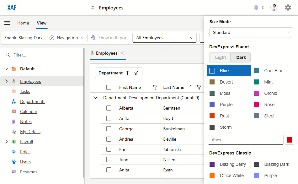
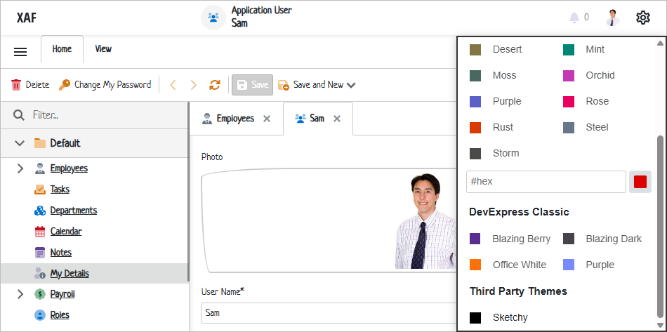
- DevExpress Classic themes (Blazing Berry, Blazing Dark, Purple, and Office White).
The DevExpress.ExpressApp.Blazor package ships with Generic Light and Generic Dark themes. The stylesheet for the Generic Dark theme (dx.dark.css) is used with the Blazing Dark and Fluent Dark themes. The stylesheet for the Generic Light theme (dx.light.css) is applied to all custom themes and other XAF themes.
For more information about about DevExpress Blazor Themes, refer to the following topic: Themes.
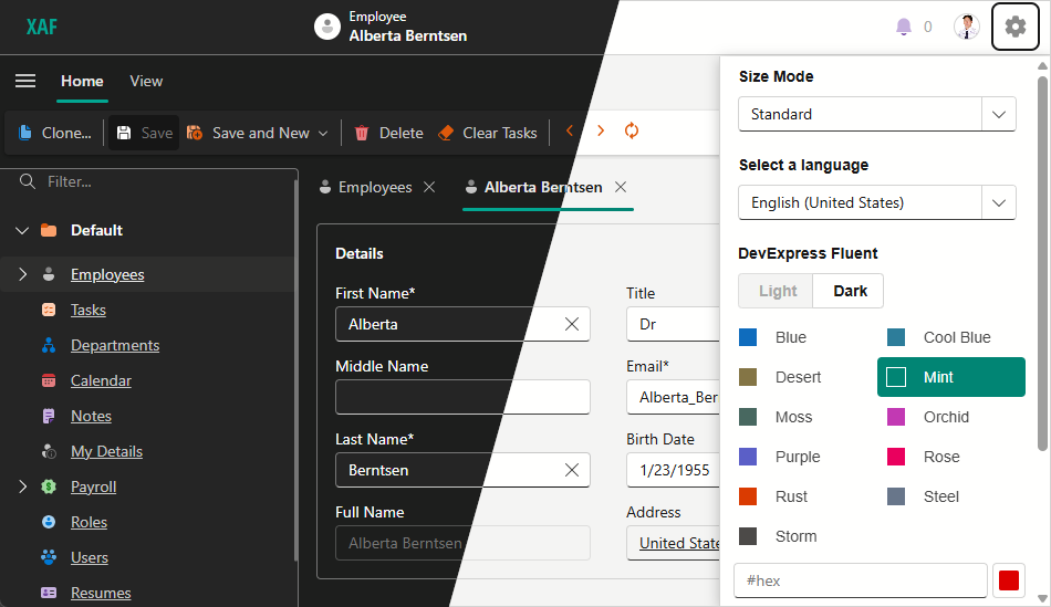
Theme Switcher
The application configuration file (MySolution.Blazor.Server\appsettings.json) includes the ThemeSwitcher section that specifies the switcher’s settings and available themes.
Root level options
DefaultItemNamespecifies the default theme’s name.ShowSizeModeSwitcherspecifies whether the Size Mode switcher is visible.Groupscontains a collection of theme groups. Each group must have a caption and a collection of themes.
Fluent group options
IsFluentspecifies whether the current group contains Fluent theme settings.ShowCustomColorSelectorspecifies whether the custom color selector is visible.ShowModeSwitcherspecifies whether the Light/Dark selector is visible.DefaultModespecifies the default fluent theme mode.Captionspecifies the group name in the Theme Switcher.Itemscontains a collection of themes in the group.CustomUrlscontains a collection of custom stylesheets used with the Fluent theme.
Fluent item options
Captionspecifies the theme’s name in the Theme Switcher.Colorspecifies the theme’s accent color in the hexadecimal format or a ThemeFluentAccentColor enumeration value.
Classic group options
Captionspecifies the group name in the Theme Switcher.Itemscontains a collection of themes in the group.
Classic Item options
Captionspecifies the theme’s name in the Theme Switcher.Colorspecifies square icon color for the Theme Switcher.Urlspecifies a link to the theme’s CSS file.CustomUrlscontains a collection of custom stylesheets used with the theme.
"DevExpress": {
  "ExpressApp": {
    "Languages": "en-US;",
    "ShowLanguageSwitcher": false,
    "Security": {
      // ...
    },
    "ThemeSwitcher": {
      "DefaultItemName": "DevExpress Fluent",
      "ShowSizeModeSwitcher": true,
      "Groups": [
        {
          "IsFluent": true,
          "ShowModeSwitcher": false,
          "ShowCustomColorSelector": false,
          "DefaultMode": "Dark",
          "Caption": "DevExpress Fluent",
          "Items": [
            {
              "Caption": "Blue",
              "Color": "Blue"
            },
            {
              "Caption": "Cool Blue",
              "Color": "CoolBlue"
            },
            {
              "Caption": "Desert",
              "Color": "Desert"
            },
            {
              "Caption": "Mint",
              "Color": "Mint"
            },
            {
              "Caption": "Moss",
              "Color": "Moss"
            },
            {
              "Caption": "Orchid",
              "Color": "Orchid"
            },
            {
              "Caption": "Purple",
              "Color": "Purple"
            },
            {
              "Caption": "Rose",
              "Color": "Rose"
            },
            {
              "Caption": "Rust",
              "Color": "Rust"
            },
            {
              "Caption": "Steel",
              "Color": "Steel"
            },
            {
              "Caption": "Storm",
              "Color": "Storm"
            }
          ]
        },
        {
          "Caption": "DevExpress Classic",
          "Items": [
            {
              "Caption": "Blazing Berry",
              "Url": "_content/DevExpress.Blazor.Themes/blazing-berry.bs5.min.css",
              "Color": "#5c2d91"
            },
            {
              "Caption": "Blazing Dark",
              "Url": "_content/DevExpress.Blazor.Themes/blazing-dark.bs5.min.css",
              "Color": "#46444a"
            },
            {
              "Caption": "Office White",
              "Url": "_content/DevExpress.Blazor.Themes/office-white.bs5.min.css",
              "Color": "#fe7109"
            },
            {
              "Caption": "Purple",
              "Url": "_content/DevExpress.Blazor.Themes/purple.bs5.min.css",
              "Color": "#7989ff"
            }
          ]
        }
      ]
    }
  }
}
Disable the Theme Switcher
The application gear menu displays the Theme Switcher if your project has more than one theme. To hide the Theme Switcher, specify a single application theme in the appsettings.json file.
"DevExpress": {
  "ExpressApp": {
    "ThemeSwitcher": {
      "Groups": [
        {
          "Caption": "DevExpress Themes",
          "Items": [
            {
              "Caption": "Office White",
              "Url": "_content/DevExpress.Blazor.Themes/office-white.bs5.min.css",
              "Color": "#fe7109"
            }
          ]
        }
      ]
    }
  }
}
If the ThemeSwitcher section does not specify any themes, the application uses the default Fluent Light Blue theme.
External Bootstrap Themes
You can apply external Bootstrap themes to your XAF ASP.NET Core Blazor application. The following code sample applies the Sketchy theme from the Bootswatch theme set. For more information about Bootswatch themes, refer to the Bootswatch documentation.
"DevExpress": {
  "ExpressApp": {
    //...
    "ThemeSwitcher": {
      "DefaultItemName": "DevExpress Fluent",
      "ShowSizeModeSwitcher": true,
      "Groups": [
        {
          "Caption": "DevExpress Themes",
          "Items": [
            // ...
          ]
        },
        {
          "Caption": "Third Party Themes",
          "Items": [
            {
              "Caption": "Sketchy",
              "Url": "https://cdn.jsdelivr.net/npm/bootswatch@5.1.3/dist/sketchy/bootstrap.min.css",
              "Color": "#000"
            }
          ]
        }
      ]
    }
  }
}
Switch Themes in Code
You can use the IThemeService interface to obtain the current theme, change a theme, and track theme changes.
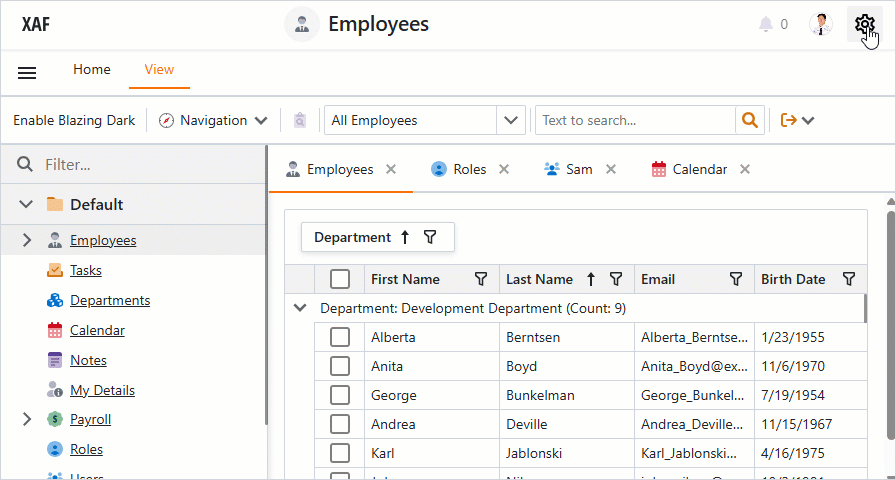
The following steps describe how to implement an Action that changes your XAF application’s theme to Blazing Dark.
Use the Template Kit to create the new BlazingDarkController.cs Window Controller in the MySolution.Blazor.Server/Controllers folder.
Replace automatically generated file content with the following code:
using DevExpress.ExpressApp;
using DevExpress.ExpressApp.Actions;
using DevExpress.ExpressApp.Blazor.Services;
namespace MySolution.Blazor.Server.Controllers;

public partial class BlazingDarkController : WindowController {
    public BlazingDarkController() {
        TargetWindowType = WindowType.Main;
        // Create a Simple Action.
        new SimpleAction(this, "EnableBlazingDark", "View", async (s, e) => {
            var themeService = Application.ServiceProvider.GetService<IThemeService>();
            // Obtain the Blazing Dark theme.
            var theme = themeService.GetThemeByCaption("Blazing Dark");
            // Set the current theme to Blazing Dark.
            await themeService.SetCurrentThemeAsync(theme);
        });
    }
}
Run the application. Click the Enable Blazing Dark Action to change the theme. Navigate to the gear menu: the Blazing Dark theme should be selected.
Custom Stylesheets
You can add your own stylesheet to a built-in or custom theme. The following code snippet loads custom stylesheets with the Blazing Berry theme:
// ...
{
  "Caption": "Blazing Berry",
  "Url": "_content/DevExpress.Blazor.Themes/blazing-berry.bs5.min.css",
  "Color": "#5c2d91",
  // The collection of stylesheets used with the theme.
  "CustomUrls": [
    // Add a link to the 'dx.light.css' or 'dx.dark.css' stylesheet
    // to ensure that XAF renders application components consistently
    "_content/DevExpress.ExpressApp.Blazor/dx.light.css",
    "css/custom1.css",
    "css/custom2.css"
  ]
},
// ...
Icon Type
In XAF applications, images help users identify UI elements, such as Actions, navigation control items, and Detail View captions. XAF provides separate icon sets for Fluent and Classic themes, automatically switching sets based on the chosen theme. You can use the IconType property to select the icon set. Available options include:
Auto- Default value. XAF switches icons according to the currently selected theme.
Blazor- XAF uses Blazor icons only.
Fluent- XAF uses Fluent icons only.
using DevExpress.ExpressApp;
using DevExpress.ExpressApp.Blazor;

public class MySolutionBlazorApplication : BlazorApplication {
    public MySolutionBlazorApplication() {
        // ...
        IconType = IconType.Fluent;
    }
}
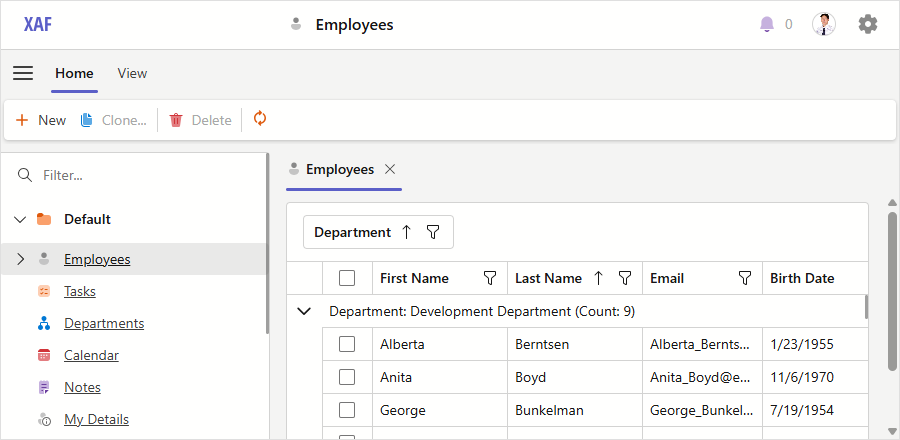
An XAF application with the Fluent icon set
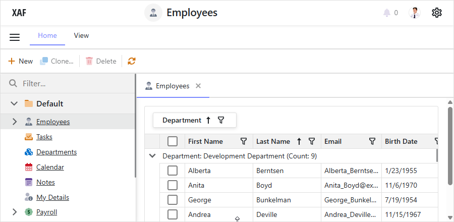
An XAF application with the Standard icon set
To learn how to replace built-in images with custom images, refer to the following topic: Add and Replace Icons.
Size Mode
XAF can display Blazor applications in different size modes. Users can select from Standard and Compact options in the Theme Switcher.
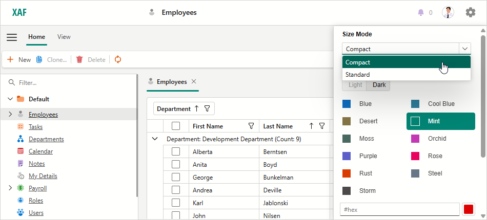
Hide Size Mode Switcher
When you create a new application, the Template Kit enables the Size Mode switcher in the MySolution.Blazor.Server\appsettings.json file. Set the ShowSizeModeSwitcher option to false (or remove the option) to hide the switcher.
// ...
"ThemeSwitcher": {
  // "ShowSizeModeSwitcher": true,
  // ...
Set Size Mode in Code
Use the GlobalOptions.SizeMode property to specify the size mode in code. The Compact option corresponds to the Small property value and the Standard option corresponds to the Medium value.
Customize UI Elements Using CSS
This section demonstrates how CSS classes can help you customize the appearance of various UI elements in XAF ASP.NET Core Blazor applications. You can use CSS to modify items like Actions or layout groups in a Detail View.

Examples in this topic apply customizations to the Employee Detail View from the MainDemo demo project. This project is installed as a part of the XAF package. The default project location is %PUBLIC%\Documents\DevExpress Demos 25.2\Components\XAF\MainDemo.NET.EFCore.
Common Steps to Apply a CSS Class to a UI Element
Set the
CustomCSSClassNameproperty of an appropriate element (IModelViewLayoutElementBlazor.CustomCSSClassName or IModelActionBlazor.CustomCSSClassName) to a new CSS class name in the Model Editor.
Run the application and use the page Inspector tools to locate the newly created class name on the corresponding Detail View page.

Fin the DOM elements you need to customize and review their CSS classes to build a proper selector.
Use Developer Tools to adjust CSS rules and edit the element according to your needs.
Add these rules with the appropriate selectors to the MySolution.Blazor.Server\wwwroot\css\site.css file.
The following sections describe several popular use cases.
Change a Group Header Color
This section explains how to change the font and background colors of the Details group header in the Employee Detail View.
Locate the following layout group in the Model Editor: Employee_DetailView > Layout > Main > SimpleEditors > Person. Set the
CustomCSSClassNameproperty toEmployeeInfoGroupStyle.Run the application and use the page Inspector tools to locate the newly created class name on the corresponding Detail View page.
Inspect the element’s markup to implement an appropriate CSS selector. This example customizes items with the
dxbl-textanddxbl-group-headerclasses.Add the following CSS rules to the site.css file:
  /* Change a header's font color */
.EmployeeInfoGroupStyle .dxbl-group .dxbl-group-header .dxbl-text {
      color: white;
  }

  /* Change a header's background color */
.EmployeeInfoGroupStyle .dxbl-group .dxbl-group-header {
      background-color: purple;
  }
Save your changes and refresh the Employee Detail View page to see the result.

Customize a Property Editor’s Label and Text Box Appearance
This section explains how to customize Property Editors displayed in a Detail View. The example below changes settings for the label and edit box of the First Name Property Editor. This editor is displayed in the Employee Detail View.
Locate the following layout element in the Model Editor: Employee_DetailView > Layout > Main > SimpleEditors > Person > Person_inner > Person_col1 > Person_col1a > FirstName. Set the
CustomCSSClassNameproperty toEmployeeFirstNameStyle.Run the application and use the page Inspector tools to locate the newly created class name on the corresponding Detail View page.
Inspect the element’s markup to implement an appropriate CSS selector. This example customizes items with the
.dxbl-textand.dxbl-text-editclasses.Add the following CSS rules to the site.css file:
  /* Change a captions's font */
.EmployeeFirstNameStyle .dxbl-text {
      font-weight: bold;
  }

  /* Change an editor's text and color settings */
.EmployeeFirstNameStyle .dxbl-text-edit {
      background-color: purple;
      color: white;
      font-size: 14px;
  }
Save your changes and refresh the Employee Detail View page to see the result.

Add Colons to Property Editor Labels
This section explains how to customize Property Editor labels. The example below walks you through the steps needed to add a colon (:) to all editor labels displayed in the Employee Detail View.
Locate the following layout group in the Model Editor: Employee_DetailView > Layout > Main. Set the
CustomCSSClassNameproperty toEmployeePropertyEditorCaptionStyle.Run the application and use the page Inspector tools to locate the newly created class name on the corresponding Detail View page.
Inspect the element’s markup to implement an appropriate CSS selector. This example customizes items with the
.labelclass.Add the following CSS rules to the site.css file:
  /* Change a captions's font */
.EmployeePropertyEditorCaptionStyle label::after {
      content: ":"
  }
Save your changes and refresh the Employee Detail View page to see the result.

Change Tab Color Settings
This section explains how to customize the appearance settings of active and inactive tabs in a tabbed layout group. The following example changes the background and caption colors of all tabs displayed in the Employee Detail View.
Locate the following tabbed group in the Model Editor: Employee_DetailView > Layout > Main > Tabs. Set the
CustomCSSClassNameproperty toEmployeeTabsStyle.Run the application and use the page Inspector tools to locate the newly created class name on the corresponding Detail View page.
Inspect element markup to implement an appropriate CSS selector. This example customizes items with the
.dxbl-active,.dxbl-text, and.dxbl-tabs-itemclasses.Add the following CSS rules to the site.css file:
  /* Change an active tab's background and text color */
  .EmployeeTabsStyle .dxbl-tabs .dxbl-scroll-viewer .dxbl-scroll-viewer-content .dxbl-active {
      background-color: purple !important;
  }

  .EmployeeTabsStyle .dxbl-tabs .dxbl-scroll-viewer .dxbl-scroll-viewer-content .dxbl-active .dxbl-text {
      color: white;
  }

  /* Change the background color for all inactive tabs */
  .EmployeeTabsStyle .dxbl-tabs .dxbl-scroll-viewer .dxbl-scroll-viewer-content .dxbl-tabs-item {
      background-color: thistle;
  }
Save your changes and refresh the Employee Detail View page to see the result.

Customize Action Appearance
This section describes two approaches used for Action customization.
- Specify the Action’s CustomCSSClassName property in the Model Editor to apply the CSS class to this Action in all the Views where it appears.
- Specify the CSS class name in a Controller to apply a CSS rule to the Action in a specified View only.
Use the CustomCssClassName Property
The following example changes the background and text colors of the New Action. This customization applies to all Views that display this action.
Locate the following Action node in the Model Editor: Main Demo > ActionDesign > Actions > New. Set the CustomCSSClassName property to
NewActionStyle.Run the application and use the page Inspector tools to locate the newly created class name on the corresponding Detail View page.
Inspect the element’s markup to implement an appropriate CSS selector. This example customizes items with the
.NewActionStyleclass.Add the following CSS rules to the site.css file:
/* Change an Action's background and text color */
.NewActionStyle {
    background: purple;
    color: white;
}
Save your changes and refresh the Employee Detail View page to see the result.

Use a Controller
The following example changes the New Action’s color settings in the Employee > Details Detail View only.
Add the following CSS rule to the
site.cssfile:/* Change an Action's background and text color */ .NewActionStyle { background: purple; color: white; }Create a new
CustomizeEmployeeDetailViewActionController. The created Controller should be a descendant of the Controller class.Handle the CustomizeControl event to apply the
NewActionStyleCSS class to the New Action.using DevExpress.ExpressApp; using DevExpress.ExpressApp.Actions; using DevExpress.ExpressApp.Blazor.Templates.Toolbar.ActionControls; using DevExpress.ExpressApp.SystemModule; public class CustomizeEmployeeDetailViewAction : Controller { const string EmployeeDetailViewId = "Employee_DetailView"; DxToolbarItemSingleChoiceActionControl? actionControl = null; NewObjectViewController? newObjectViewController; protected override void OnActivated() { base.OnActivated(); newObjectViewController = Frame.GetController<NewObjectViewController>(); if(newObjectViewController != null) { newObjectViewController.NewObjectAction.CustomizeControl += NewObjectAction_CustomizeControl; Frame.ViewChanged += Frame_ViewChanged; } } private void NewObjectAction_CustomizeControl(object? sender, CustomizeControlEventArgs e) { actionControl = (DxToolbarItemSingleChoiceActionControl)e.Control; CustomizeNewActionControl(); } private void Frame_ViewChanged(object? sender, ViewChangedEventArgs e) { CustomizeNewActionControl(); } private void CustomizeNewActionControl() { if(actionControl != null) { if(Frame.View?.Id == EmployeeDetailViewId) { actionControl.ToolbarItemModel.CssClass += " NewActionStyle"; } else if(actionControl.ToolbarItemModel.CssClass != null) { actionControl.ToolbarItemModel.CssClass = actionControl.ToolbarItemModel.CssClass.Replace(" NewActionStyle", string.Empty); } } } protected override void OnDeactivated() { base.OnDeactivated(); if(newObjectViewController != null) { newObjectViewController.NewObjectAction.CustomizeControl -= NewObjectAction_CustomizeControl; newObjectViewController = null; Frame.ViewChanged -= Frame_ViewChanged; } } }Save your changes and refresh the Employee Detail View page to see the result.

Enable CSS Isolation for Custom Components
Blazor CSS isolation allows you to you create styles specific to each component, preventing conflicts with other components or libraries. Refer to the following help topic for examples of using CSS isolation with DevExpress components: CSS Isolation.
XAF projects initially do not include component-specific styles, so the bundled stylesheet is not added. To enable isolated styles, uncomment or manually add the wizard-generated stylesheet link in Pages/Host.cshtml.
<!-- Uncomment this link to enable CSS isolation. For more information, refer to the following topic: -->
<!-- https://learn.microsoft.com/en-us/aspnet/core/blazor/components/css-isolation.-->
<link href="_MySolution.Blazor.Server.styles.css" rel="stylesheet">
Note
The MySolution.Blazor.Server.styles.css file is generated when at least one component in the _MySolution.Blazor.Server project contains a CSS file as described in the Microsoft documentation: Enable CSS isolation. Otherwise, the 404 (Not Found) error occurs.