XRCheckBox.GlyphOptions Property
Provides access to a control’s glyph options.
Namespace: DevExpress.XtraReports.UI
Assembly: DevExpress.XtraReports.v21.2.dll
NuGet Package: DevExpress.Reporting.Core
Declaration
[SRCategory(ReportStringId.CatAppearance)]
public CheckBoxGlyphOptions GlyphOptions { get; }Property Value
| Type | Description |
|---|---|
| CheckBoxGlyphOptions | Control’s glyph options |
Remarks
Style: specifies a predefined glyph style:
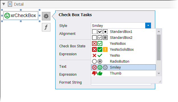
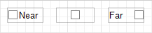
Alignment: specifies the glyph alignment within the control:
Size: specifies the glyph size;
- CustomGlyphs: specifies a custom glyph image for each checkbox state (Checked/Unchecked/Indeterminate).
Example
The code sample below illustrates how to create a checkbox and customize its size, style and alignment.
using DevExpress.XtraReports.UI;
using DevExpress.XtraPrinting.Drawing;
using DevExpress.XtraPrinting;
// ...
public XRCheckBox CreateXRCheckBox() {
    // Create an XRCheckBox object.
    XRCheckBox xrCheckBox1 = new XRCheckBox();

    // Set the glyph size
    xrCheckBox1.GlyphOptions.Size = new SizeF(18, 18);
    // Set the glyph style
    xrCheckBox1.GlyphOptions.Style = DevExpress.XtraPrinting.GlyphStyle.Thumb;
    // Align the glyph to the right
    xrCheckBox1.GlyphOptions.Alignment = DevExpress.Utils.HorzAlignment.Far;

    // Add a glyph image for the Checked state
    xrCheckBox1.GlyphOptions.CustomGlyphs[CheckBoxState.Checked] = ImageSource.FromFile(".\\checkbox-checked.svg");
    // Add a glyph image for the Unchecked state
    xrCheckBox1.GlyphOptions.CustomGlyphs[CheckBoxState.Unchecked] = ImageSource.FromFile(".\\checkbox-unchecked.svg");
    // Add a glyph image for the Indeterminate state
    xrCheckBox1.GlyphOptions.CustomGlyphs[CheckBoxState.Indeterminate] = ImageSource.FromFile(".\\checkbox-indeterminate.svg");

    return xrCheckBox1;
}
See Also