Customize the Document Viewer Color Scheme
- 5 minutes to read
Choose a Predefined Color Scheme
The Web Document Viewer provides predefined color schemes that specify the control’s appearance.
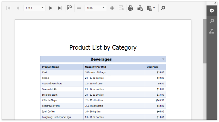
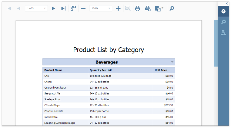
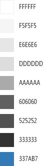
Light (Default)
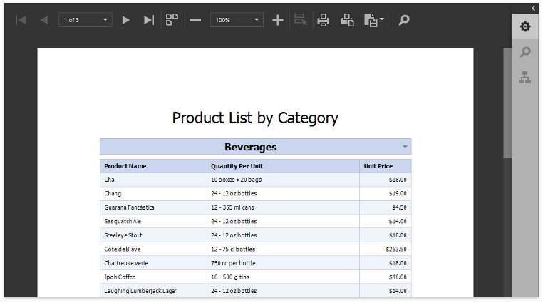
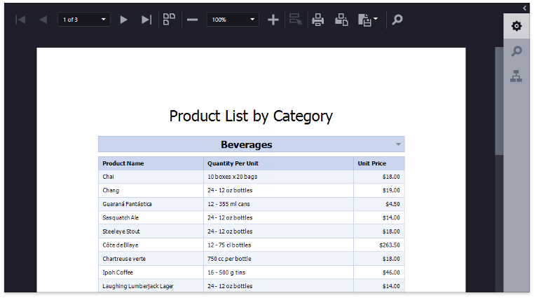
Dark
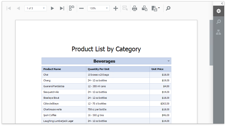
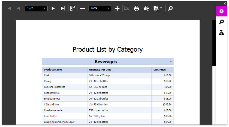
Carmine
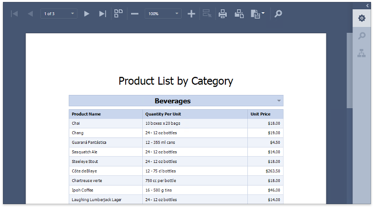
Dark Moon
Soft Blue
Dark Violet
Green Mist
Contrast
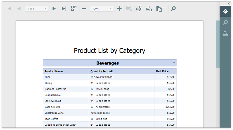
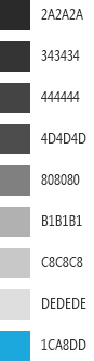
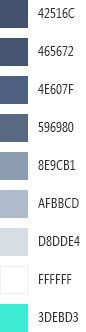
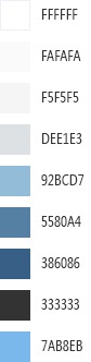
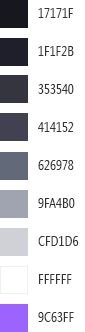
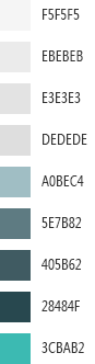
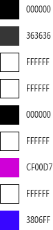
Each color scheme consists of nine colors. The following table illustrates the available palettes:
Light | Dark | Carmine | Dark Moon | Soft Blue | Dark Violet | Green Mist | Contrast | |
|---|---|---|---|---|---|---|---|---|
|
|
|
|
|
|
|
|
|


To specify the Document Viewer’s color scheme, link the schema’s CSS file in the View. The file name is dx-analytics.{color_scheme}.css, where {color_scheme} is the color scheme’s name (light, carmine, contrast, dark, darkmoon, darkviolet, greenmist, softblue).
The schema CSS files are contained in the node_modules@devexpress\analytics-core\dist\css folder. Copy the schema file to the wwwroot\css folder and link it in the View page markup.
The following code illustrates how to apply the Dark Violet color scheme:
<link rel="stylesheet" href="~/css/viewer.part.bundle.css" />

<link rel="stylesheet" href="~/css/dx-analytics.darkviolet.css" />

<script src="~/js/viewer.part.bundle.js"></script>

@Html.DevExpress().WebDocumentViewer("DocumentViewer").Height("1000px").Bind("TestReport")
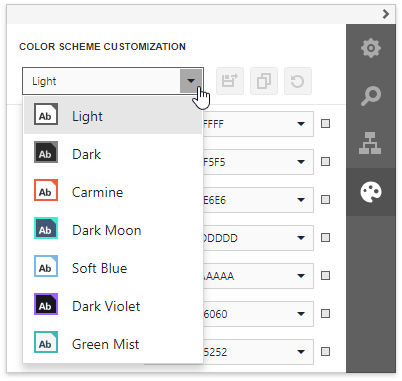
Create a Custom Color Scheme in the Demo Application
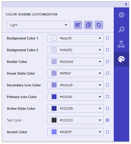
You can use the Color Scheme Customization online demo to create a color scheme based on a predefined color scheme.
In this demo, select a base color scheme from the Color Scheme Customization tab’s drop-down menu.
You can use the color picker or specify a color value to change a color. Changes are instantly applied to all the corresponding elements.
After you complete customization, click the Save Changes button to download a ZIP archive.
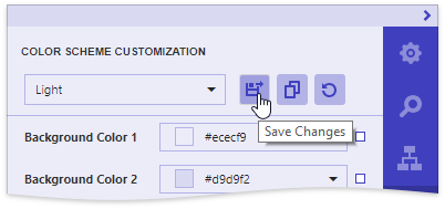
This archive has the {color_scheme}.customization.zip name, where {color_scheme} is the applied color scheme’s name (for instance, light.customization.zip).
The archive includes the following files:
reporting.{color_scheme}.custom.css (in this example, reporting.light.custom.css)
Contains changed styles that define the Document Viewer’s common appearance.
devextreme.{color_scheme}.custom.css (in this example, devextreme.light.custom.css)
Contains changed styles for DevExtreme UI widgets used in the Document Viewer.
dx.themebuilder.metadata.json
Contains metadata that you can use in the Theme Builder to customize DevExtreme widgets.
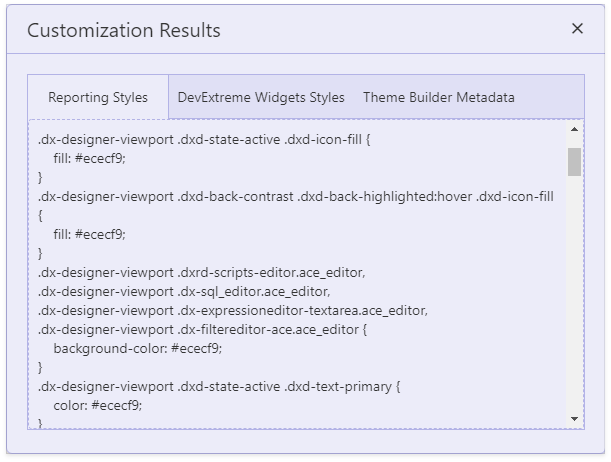
You can also click the View Changes  button to invoke the Customization Results dialog. This dialog’s tabs provide the same changed CSS classes and Theme Builder metadata.
The Reset Changes  button resets all the changes.
Once you saved the resulting files, you can apply the created color scheme to your Document Viewer control:
Open an ASP.NET Core application that contains the Document Viewer.
Select and apply the base predefined color scheme, as described in the previous section.
Copy the reporting and DevExtreme CSS files to the wwwroot/css folder and link them in the View.
The resulting View HTML code is shown below:
<link rel="stylesheet" href="~/css/viewer.part.bundle.css" />

@*The following link to the dx-analytics.light.css file is unnecessary because the default light theme is referenced in the viewer.part.bundle.css.
However, a link to the dx-analytics.{theme name}.css file is required for other themes.*@
<link rel="stylesheet" href="~/css/dx-analytics.light.css" />

<link href="~/css/devextreme.light.custom.css" rel="stylesheet" />
<link href="~/css/reporting.light.custom.css" rel="stylesheet" />

<script src="~/js/viewer.part.bundle.js"></script>

@Html.DevExpress().WebDocumentViewer("DocumentViewer").Height("1000px").Bind("TestReport")
Run the application to see the result.
Create a Custom Color Scheme Manually
You can customize the Document Viewer CSS classes to create a custom color scheme.
1. Customize the DevExtreme CSS Classes
Change the CSS classes for the Web Document Viewer’s internal DevExtreme UI widgets.
Use the DevExtreme Theme Builder to change the colors and save the customization results (the generic.light.custom.css file is for the light color scheme etc.).
Refer to the documentation topic for information on how to use the Theme Builder.
2. Customize the Document Viewer CSS Classes
The following tables list the classes that define the Document Viewer’s common appearance grouped by categories. These classes correspond to colors in the base palettes.
Color | Background | Borders | |
|---|---|---|---|
1 | .dxd-back-primary2 | ||
2 | .dxd-back-primary .dxd-back-highlighted:hover:not(.dxd-state-no-hover) | ||
3 | .dxd-back-secondary | .dxd-border-primary | |
4 | .dxd-back-highlighted.dxd-state-normal:hover:not(.dxd-state-no-hover) .dxd-back-highlighted.dxd-state-selected .dxd-back-highlighted.dxd-state-selected:hover | .dxd-border-secondary | |
5 | .dxd-back-highlighted.dxd-state-active | ||
6 | .dxd-back-contrast .dxd-back-highlighted.dxd-state-active:hover:not(.dxd-state-no-hover) | ||
7 | .dxd-back-contrast .dxd-back-highlighted:hover .dxd-back-contrast .dxd-back-highlighted.dxd-state-active | ||
9 | .dxd-back-accented | .dxd-border-accented |
Color | Icons | Text | |
|---|---|---|---|
1 | .dxd-state-active .dxd-icon-fill .dxd-back-contrast .dxd-state-active .dxd-icon-fill | .dxd-state-active .dxd-text-primary | |
5 | .dxd-back-contrast .dxd-icon-fill | ||
6 | .dxd-icon-fill | ||
7 | .dxd-text-info | ||
8 | .dxd-text-primary | ||
9 | .dxd-text-accented |
Important
Add the “.dx-designer-viewport “ selector to the reporting CSS style name to raise its priority over DevExtreme style within the color swatch. Otherwise, the DevExtreme style is applied.
The following code snippet demonstrates how to specify colors for each category (for instance, in the viewer.light.custom.css file):
.dx-designer-viewport .dxd-back-primary {
    background-color: #d9d9f2;
}

.dx-designer-viewport .dxd-border-primary {
    border-color: #b3b3e6;
}

.dx-designer-viewport .dxd-icon-fill {
    fill: #4040bf;
}

.dx-designer-viewport .dxd-text-info {
    color: #333399;
}

// ...
You can also specify styles for individual Document Viewer elements. Use a browser’s Developer Tools, locate the corresponding UI element in the page markup…
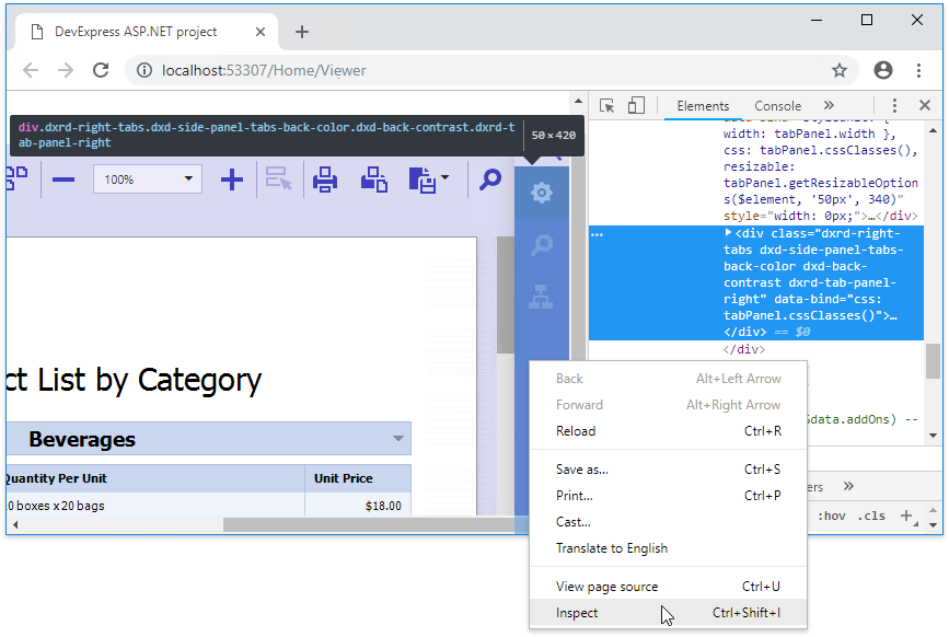
… and declare the assigned CSS class in your CSS file as follows:
// ...

.dx-designer-viewport .dxd-side-panel-tabs-back-color {
    background-color: #333399;
}
3. Apply CSS files to Document Viewer
Open the web page that renders the Document Viewer control and link the DevExtreme (generic.light.custom.css) and Document Viewer (viewer.light.custom.css) CSS files as shown below:
<!-- Link other required resources -->
<!-- ... -->

<link href="~/node_modules/devextreme/dist/css/dx.common.css" rel="stylesheet" />
<link href="~/node_modules/devextreme/dist/css/dx.light.css" rel="stylesheet" />

<link href="~/node_modules/@@devexpress/analytics-core/dist/css/dx-analytics.common.css" rel="stylesheet" />
<link href="~/node_modules/@@devexpress/analytics-core/dist/css/dx-analytics.light.css" rel="stylesheet" />
<link href="~/node_modules/devexpress-reporting/dist/css/dx-webdocumentviewer.css" rel="stylesheet" />
<link href="~/css/generic.light.custom.css" rel="stylesheet" />
<link href="~/css/viewer.light.custom.css" rel="stylesheet" />
Upgrade from Previous Versions
If you use the .dx-swatch DevExtreme selector to stylize a part of your application, a color swatch’s CSS styles are applied to the Report Designer/DocumentViewer widgets. A custom reporting color scheme has no effect.
To resolve the issue, add the following selector prefix:
.dx-designer-viewport
to the names of the reporting CSS styles to raise their priority over DevExtreme styles in the color swatch, as in the following sample class definition:
.dx-designer-viewport .dxd-back-primary {
    background-color: #d9d9f2;
}
.dx-designer-viewport .dxd-back-primary2 {
    background-color: #ececf9;
}
You can also use our online demo to generate the correct style definitions.