RibbonDropdownButton Class
A RibbonControl‘s button that includes a dropdown (a FlyoutBase class instance).
Namespace: DevExpress.WinUI.Ribbon
Assembly: DevExpress.WinUI.Ribbon.v23.2.dll
NuGet Package: DevExpress.WinUI
#Declaration
public class RibbonDropdownButton :
RibbonButtonBase#Remarks
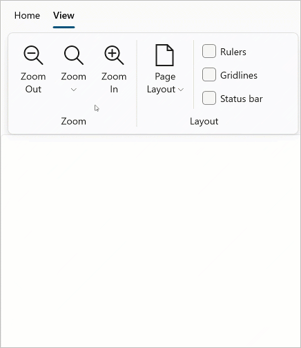
The following code sample displays the RibbonDropdownButton that is shown in the image above:
<Window ...
    xmlns:dxr="using:DevExpress.WinUI.Ribbon">
    <Grid>
        <dxr:RibbonControl>
            <dxr:RibbonControl.Tabs>
              <dxr:RibbonTab Caption="Home" >
                  <dxr:RibbonGroup Caption="File">
                      <dxr:RibbonDropdownButton Content="Zoom" ItemType="Large">
                            <dxr:RibbonDropdownButton.LargeIcon>
                                <dxc:DXSymbolIconSource Symbol="Zoom"/>
                            </dxr:RibbonDropdownButton.LargeIcon>
                            <dxr:RibbonDropdownButton.Flyout>
                                <MenuFlyout>
                                    <RadioMenuFlyoutItem GroupName="Zoom" Text="10%"/>
                                    <RadioMenuFlyoutItem GroupName="Zoom" Text="25%"/>
                                    <RadioMenuFlyoutItem GroupName="Zoom" Text="50%"/>
                                    <RadioMenuFlyoutItem GroupName="Zoom" Text="75%"/>
                                    <RadioMenuFlyoutItem GroupName="Zoom" Text="100%"/>
                                    <RadioMenuFlyoutItem GroupName="Zoom" Text="150%"/>
                                    <RadioMenuFlyoutItem GroupName="Zoom" Text="200%"/>
                                    <RadioMenuFlyoutItem GroupName="Zoom" Text="500%"/>
                                    <MenuFlyoutSeparator/>
                                    <RadioMenuFlyoutItem GroupName="Zoom" Text="Whole Page"/>
                                    <RadioMenuFlyoutItem GroupName="Zoom" Text="Page Width"/>
                                </MenuFlyout>
                            </dxr:RibbonDropdownButton.Flyout>
                        </dxr:RibbonDropdownButton>
                  </dxr:RibbonGroup>
              </dxr:RibbonTab>
            </dxr:RibbonControl.Tabs>
        </dxr:RibbonControl>
        <!-- ... -->
    </Grid>
</Window>
#Content/Menu
Specify the RibbonButtonBase.Content property to display text next to the button icon.
Use the RibbonDropdownButton.Flyout property to specify the flyout menu that is displayed when you click the RibbonDropdownButton.
#Commands
Use the Command property to specify a command that is invoked when a user clicks a RibbonDropdownButton.
The RibbonControl includes the CommandParameter property that allows you to specify a command’s parameter.
#Button Icon
You can use the following properties to display a button icon:
| Property | Description | Image |
|---|---|---|
| Small |
Gets or sets the ribbon button’s small icon (16x16 px). This is a dependency property. |  |
| Large |
Gets or sets the ribbon button’s large icon (32x32 px). This is a dependency property. |  |
#Customize Appearance
#Display Modes
The RibbonDropdownButton class contains the DisplayMode property that defines the button size and text settings.
| Property | Description | Image |
|---|---|---|
| Default | If active, a ribbon item can be displayed as a large image with a caption. | |
| Large | If active, a ribbon item can be displayed as a large image with a caption. |
|
| Small |
If active, a ribbon item can be displayed as a small image. |
 |
| Small |
If active, a ribbon item can be displayed as a small image with a caption. |
|
#Appearance Settings
To customize a RibbonDropdownButton‘s appearance settings, you can use the following StyleSettings:
| Property | Description |
|---|---|
| Border |
Gets or sets a ribbon button’s border thickness. This is a dependency property. |
| Corner |
Gets or sets a corner radius of the ribbon button’s border. This is a dependency property. |
| Disabled |
Gets or sets a ribbon button’s disabled state background. This is a dependency property. |
| Disabled |
Gets or sets a ribbon button’s disabled state border brush. This is a dependency property. |
| Disabled |
Gets or sets a ribbon button’s disabled state foreground. This is a dependency property. |
| Hover |
Gets or sets a ribbon button’s hovered state background. This is a dependency property. |
| Hover |
Gets or sets a ribbon button’s hovered state border brush. This is a dependency property. |
| Hover |
Gets or sets a ribbon button’s hovered state foreground. This is a dependency property. |
| Normal |
Gets or sets a ribbon button’s normal state background. This is a dependency property. |
| Normal |
Gets or sets a ribbon button’s normal state border brush. This is a dependency property. |
| Normal |
Gets or sets a ribbon button’s normal state foreground. This is a dependency property. |
| Pressed |
Gets or sets a ribbon button’s pressed state background. This is a dependency property. |
| Pressed |
Gets or sets a ribbon button’s pressed state border brush. This is a dependency property. |
| Pressed |
Gets or sets a ribbon button’s pressed state foreground. This is a dependency property. |
#Tool Tip
You can use the following properties to display a RibbonDropdownButton‘s tooltip:
| Property | Description |
|---|---|
| Tool |
Gets or sets the ribbon button’s tooltip. This is a dependency property. |
| Tool |
Gets or sets the ribbon button’s tooltip description text that is displayed under the Tool |
| Tool |
Gets or sets the ribbon button’s tooltip title text. This is a dependency property. |