RibbonCheckBox Class
A checkbox within a RibbonControl.
Namespace: DevExpress.WinUI.Ribbon
Assembly: DevExpress.WinUI.Ribbon.v23.2.dll
NuGet Package: DevExpress.WinUI
#Declaration
[ContentProperty(Name = "Text")]
public class RibbonCheckBox :
    RibbonItem<RibbonCheckBoxStyleSettings>,
ISupportToolTip#Remarks
Use the IsChecked property to specify a checkbox’s state.
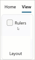
The following code sample displays the RibbonCheckBox that is shown in the image above:
<Window ...
    xmlns:dxr="using:DevExpress.WinUI.Ribbon">
    <Grid>
        <dxr:RibbonControl>
            <dxr:RibbonControl.Tabs>
                <dxr:RibbonTab Caption="View">
                    <dxr:RibbonGroup Caption="Layout">
                        <dxr:RibbonCheckBox Text="Rulers"/>
                    </dxr:RibbonGroup>
                </dxr:RibbonTab>
            </dxr:RibbonControl.Tabs>
        </dxr:RibbonControl>
    </Grid>
</Window>
#Enable Indeterminate State
Set the IsThreeState property to true to allow users to set the indeterminate state. In this case, users can change the state in the following order: Checked -> Indeterminate -> Unchecked -> Checked, and so on.
The following sample creates a ribbon checkbox with the indeterminate state:
<Window ...
    xmlns:dxr="using:DevExpress.WinUI.Ribbon">
    <Grid>
        <dxr:RibbonControl>
            <dxr:RibbonControl.Tabs>
                <dxr:RibbonTab Caption="View">
                    <dxr:RibbonGroup Caption="Layout">
                        <dxr:RibbonCheckBox Text="Rulers" IsThreeState="True"/>
                    </dxr:RibbonGroup>
                </dxr:RibbonTab>
            </dxr:RibbonControl.Tabs>
        </dxr:RibbonControl>
    </Grid>
</Window>
#Bind a RibbonCheckBox to a ViewModel Property
#Customize Appearance
You can use the following properties to customize the RibbonCheckBox appearance:
| Property | Description |
|---|---|
| Checked |
Gets or sets a Ribbon |
| Checked |
Gets or sets a Ribbon |
| Checked |
Gets or sets a Ribbon |
| Checked |
Gets or sets a Ribbon |
| Checked |
Gets or sets a Ribbon |
| Checked |
Gets or sets a Ribbon |
| Checked |
Gets or sets a Ribbon |
| Checked |
Gets or sets a Ribbon |
| Checked |
Gets or sets a Ribbon |
| Checked |
Gets or sets a Ribbon |
| Checked |
Gets or sets a Ribbon |
| Checked |
Gets or sets a Ribbon |
| Corner |
Gets or sets a corner radius of the Ribbon |
| Disabled |
Gets or sets a Ribbon |
| Disabled |
Gets or sets a Ribbon |
| Disabled |
Gets or sets a Ribbon |
| Hover |
Gets or sets a Ribbon |
| Hover |
Gets or sets a Ribbon |
| Hover |
Gets or sets a Ribbon |
| Normal |
Gets or sets a Ribbon |
| Normal |
Gets or sets a Ribbon |
| Normal |
Gets or sets a Ribbon |
| Pressed |
Gets or sets a Ribbon |
| Pressed |
Gets or sets a Ribbon |
| Pressed |
Gets or sets a Ribbon |
#ToolTip
You can use the following properties to display a RibbonCheckBox‘s tooltip:
| Property | Description |
|---|---|
| Tool |
Gets or sets the ribbon check box’s tooltip. This is a dependency property. |
| Tool |
Gets or sets the ribbon checkbox’s tooltip description text that is displayed under the Tool |
| Tool |
Gets or sets the ribbon checkbox’s tooltip title text. This is a dependency property. |