RibbonControl Class
In This Article
The Ribbon Control.
Namespace: DevExpress.WinUI.Ribbon
Assembly: DevExpress.WinUI.Ribbon.v23.2.dll
NuGet Package: DevExpress.WinUI
#Declaration
public class RibbonControl :
    ContentControl,
ILogicalOwner#Remarks
Use the RibbonControl to create an application menu that organizes items into tabs and groups.

#Add a RibbonControl to a Project
Follow the steps below to add a RibbonControl to an application:
- Reference the
DevExpress.WinUINuGet package. Refer to the following topic for more information: Get Started. - Reference the
xmlns:dxr="using:DevExpress.WinUI.Ribbon"assembly in the Window or UserControl section. - Add the
<dxr:RibbonControl>…</dxr:RibbonControl>markup to a XAML page. - Add ribbon tabs, groups, and items (see the sections below).
#RibbonControl Structure
RibbonControl
#Tabs and Groups
RibbonControl organizes content into multiple Tabs. Each tab contains Groups of command Items.
The following code sample populates the RibbonControl with Tabs, Groups, and items:
Show Code Sample
<Window ...
xmlns:dxr="using:DevExpress.WinUI.Ribbon"
xmlns:dxc="using:DevExpress.WinUI.Core">
<Grid>
<dxr:RibbonControl>
<dxr:RibbonControl.Tabs>
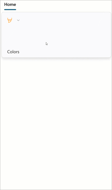
<dxr:RibbonTab Caption="Home">
<dxr:RibbonGroup Caption="File">
<dxr:RibbonButton Content="Open" ItemType="Large"
ToolTipDescription="Open an existing document.">
<dxr:RibbonButton.LargeIcon>
<dxc:DXSymbolIconSource Symbol="OpenFile" />
</dxr:RibbonButton.LargeIcon>
</dxr:RibbonButton>
<dxr:RibbonButton Content="Save" ItemType="SmallWithText"
ToolTipDescription="Save the active document.">
<dxr:RibbonButton.SmallIcon>
<dxc:DXSymbolIconSource Symbol="Save" />
</dxr:RibbonButton.SmallIcon>
</dxr:RibbonButton>
</dxr:RibbonGroup>
<dxr:RibbonGroup Caption="Zoom">
<dxr:RibbonDropdownButton Content="Zoom" ItemType="Large">
<dxr:RibbonDropdownButton.LargeIcon>
<dxc:DXSymbolIconSource Symbol="Zoom" />
</dxr:RibbonDropdownButton.LargeIcon>
<dxr:RibbonDropdownButton.Flyout>
<MenuFlyout>
<RadioMenuFlyoutItem GroupName="Zoom" Text="10%" />
<RadioMenuFlyoutItem GroupName="Zoom" Text="25%" />
<RadioMenuFlyoutItem GroupName="Zoom" Text="50%" />
<RadioMenuFlyoutItem GroupName="Zoom" Text="75%" />
<RadioMenuFlyoutItem GroupName="Zoom" Text="100%" />
<RadioMenuFlyoutItem GroupName="Zoom" Text="150%" />
<RadioMenuFlyoutItem GroupName="Zoom" Text="200%" />
<RadioMenuFlyoutItem GroupName="Zoom" Text="500%" />
<MenuFlyoutSeparator />
<RadioMenuFlyoutItem GroupName="Zoom" Text="Whole Page" />
<RadioMenuFlyoutItem GroupName="Zoom" Text="Page Width" />
</MenuFlyout>
</dxr:RibbonDropdownButton.Flyout>
</dxr:RibbonGroup>
<dxr:RibbonGroup Caption="Layout">
<dxr:RibbonDropdownButton Content="Page Layout" ItemType="Large">
<dxr:RibbonDropdownButton.LargeIcon>
<dxc:DXFontIconSource FontFamily="Segoe MDL2 Assets" Glyph="" />
</dxr:RibbonDropdownButton.LargeIcon>
<dxr:RibbonDropdownButton.Flyout>
<MenuFlyout>
<RadioMenuFlyoutItem GroupName="PageLayout" Text="Single Page">
<RadioMenuFlyoutItem.Icon>
<SymbolIcon Symbol="Page2" />
</RadioMenuFlyoutItem.Icon>
</RadioMenuFlyoutItem>
<RadioMenuFlyoutItem GroupName="PageLayout" Text="Two Page">
<RadioMenuFlyoutItem.Icon>
<SymbolIcon Symbol="TwoPage" />
</RadioMenuFlyoutItem.Icon>
</RadioMenuFlyoutItem>
<RadioMenuFlyoutItem GroupName="PageLayout" Text="Wrap Pages" />
<MenuFlyoutSeparator />
<ToggleMenuFlyoutItem Text="Enable Continuous Scrolling" />
<ToggleMenuFlyoutItem Text="Show Cover Page" />
</MenuFlyout>
</dxr:RibbonDropdownButton.Flyout>
</dxr:RibbonDropdownButton>
<dxr:RibbonSeparator />
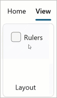
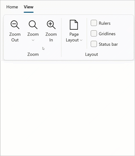
<dxr:RibbonCheckBox Text="Ruler" ToolTipDescription="Show or hide ruler." />
<dxr:RibbonCheckBox Text="Gridlines" ToolTipDescription="Show or hide grid lines." />
<dxr:RibbonCheckBox Text="Status bar" ToolTipDescription="Show or hide status bar." />
</dxr:RibbonGroup>
</dxr:RibbonTab>
<dxr:RibbonTab Caption="View">
<!-- ... -->
</dxr:RibbonTab>
</dxr:RibbonControl.Tabs>
<RichEditBox ... />
</dxr:RibbonControl>
</Grid>
</Window>
#Items
| Class | Description | Image |
|---|---|---|
| Ribbon |
A button within a Ribbon |
 |
| Ribbon |
A checkbox within a Ribbon |
 |
| Ribbon |
A custom item within a RibbonRibbon‘s custom item. |
 |
| Ribbon |
A Ribbon |
 |
| Ribbon |
A line that separates neighboring Ribbon |
 |
| Ribbon |
A Ribbon |
 |
| Ribbon |
A toggle button within a Ribbon |
 |
#Display a Specific Tab from Code
Set the SelectedTabIndex property to a ribbon tab’s index to display the tab in the RibbonControl.
#Inheritance
See Also