DataControlBase.RowIndicatorTemplate Property
Gets or sets a template that defines the appearance of row indicator cells.
Namespace: DevExpress.WinUI.Grid
Assembly: DevExpress.WinUI.Grid.v22.1.dll
NuGet Package: DevExpress.WinUI
Declaration
[DP(null, Handler = "UpdateIndicator")]
public DataTemplate RowIndicatorTemplate { get; set; }Property Value
| Type | Description |
|---|---|
| DataTemplate | A template that defines the appearance of row indicator cells. The template’s data context is a RowDataBase object. |
Remarks
Set the DataControlBase.ShowRowIndicator property to true to display the Row Indicator Panel.
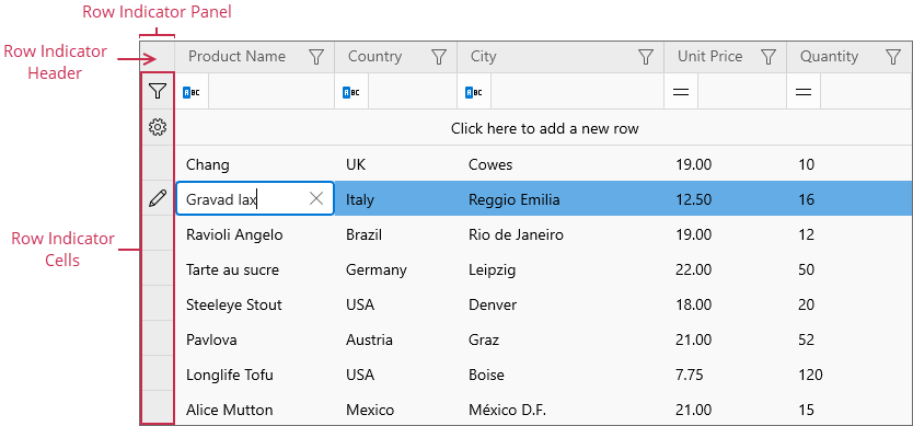
Use the DataControlBase.RowIndicatorHeaderTemplate property to customize the row indicator header.
Example
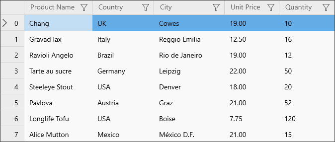
The following code sample displays row handles in the Row Indicator Panel and preserves the panel’s standard behavior:
<dxg:GridControl ...
                 ShowRowIndicator="True"
                 RowIndicatorWidth="48">
    <dxg:GridControl.RowIndicatorTemplate>
        <DataTemplate x:DataType="dxg:RowDataBase">
            <Grid ToolTipService.ToolTip="{x:Bind RowHandle, Mode=OneWay}">
                <Grid.ColumnDefinitions>
                    <ColumnDefinition Width="Auto"/>
                    <ColumnDefinition Width="*"/>
                </Grid.ColumnDefinitions>
                <dxg:RowIndicatorImage/>
                <TextBlock Text="{x:Bind RowHandle, Mode=OneWay}"
                           VerticalAlignment="Center"
                           HorizontalAlignment="Center"
                           Grid.Column="1"/>
            </Grid>
        </DataTemplate>
    </dxg:GridControl.RowIndicatorTemplate>
    <!-- -->
</dxg:GridControl>
See Also