DataControlBase.RowIndicatorHeaderTemplate Property
Gets or sets a template that defines the appearance of the row indicator header.
Namespace: DevExpress.WinUI.Grid
Assembly: DevExpress.WinUI.Grid.v22.1.dll
NuGet Package: DevExpress.WinUI
Declaration
[DP(null, Handler = "UpdateIndicator")]
public DataTemplate RowIndicatorHeaderTemplate { get; set; }Property Value
| Type | Description |
|---|---|
| DataTemplate | A template that defines the appearance of the row indicator header. The template’s data context is a HeaderRowData object. |
Remarks
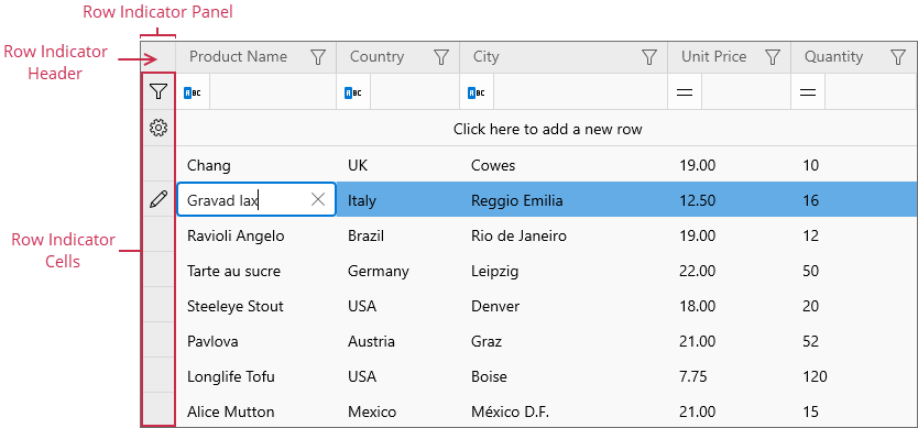
Set the DataControlBase.ShowRowIndicator property to true to display the Row Indicator Panel.
Example
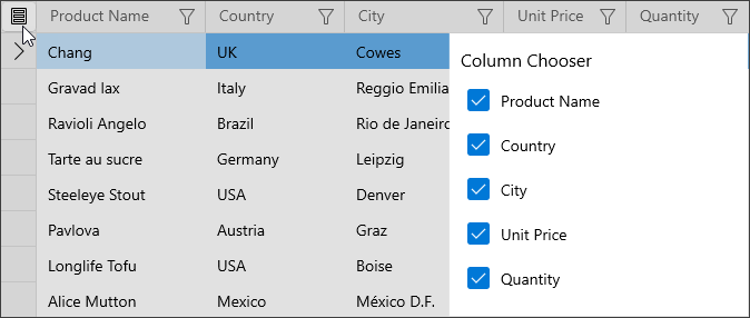
The following code sample adds the Show Column Chooser button to the row indicator header:
<dxg:GridControl ...
                 ShowRowIndicator="True">
    <dxg:GridControl.RowIndicatorHeaderTemplate>
        <DataTemplate x:DataType="dxg:HeaderRowData">
            <Button HorizontalAlignment="Stretch"
                    VerticalAlignment="Stretch"
                    Padding="7,4,7,5"
                    ToolTipService.ToolTip="Show Column Chooser"
                    Command="{x:Bind ((dxg:GridControl)DataControl).Commands.ShowColumnChooser}">
                <Image Source="ms-appx:///DevExpress.WinUI.Grid.v22.1/Themes/Icons/Light/ContextMenu/ShowColumnChooser.svg"/>
            </Button>
        </DataTemplate>
    </dxg:GridControl.RowIndicatorHeaderTemplate>
    <!-- -->
</dxg:GridControl>
See Also