BarSplitButtonItem.PopupControl Property
Gets or sets a drop-down control for the BarSplitButtonItem.
Namespace: DevExpress.Xpf.Bars
Assembly: DevExpress.Xpf.Core.v19.1.dll
Declaration
Property Value
| Type | Description |
|---|---|
| DevExpress.Xpf.Bars.IPopupControl | An IPopupControl object that represents a control displayed in the drop-down window. |
Remarks
You can set the PopupControl property to any of these objects:
- PopupMenu - A regular popup menu.
- PopupControlContainer - A panel that can contain any controls.
Example
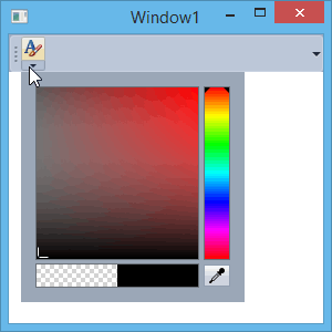
This example shows how to create a BarSplitButtonItem, which represents a button with the drop-down functionality. Clicking the button’s Down Arrow displays a popup window. To add a custom content into the popup, use the PopupControlContainer as the PopupControl. To add other bar items, use the PopupMenu.
The following image shows the result:
Note
A complete sample project is available at https://github.com/DevExpress-Examples/how-to-create-a-barsplitbuttonitem-e1567.
private void btnFontColor_ItemClick(object sender, DevExpress.Xpf.Bars.ItemClickEventArgs e) {
    PopupControlContainer pcc = (e.Item as DevExpress.Xpf.Bars.BarSplitButtonItem).PopupControl as PopupControlContainer;
    Color color = ((pcc.Content as UserControl).Content as ColorChooser).Color;
    MessageBox.Show("Color is applied: " + color.ToString());
}
Related GitHub Examples
The following code snippets (auto-collected from DevExpress Examples) contain references to the PopupControl property.
Note
The algorithm used to collect these code examples remains a work in progress. Accordingly, the links and snippets below may produce inaccurate results. If you encounter an issue with code examples below, please use the feedback form on this page to report the issue.