BarLinkContainerItem Class
Represents a container of bar item links.
Namespace: DevExpress.Xpf.Bars
Assembly: DevExpress.Xpf.Core.v19.1.dll
Declaration
public class BarLinkContainerItem :
    BarItem,
    ILinksHolder,
    IMultipleElementRegistratorSupport,
    IBarNameScopeSupport,
    IInputElement,
    ILogicalChildrenContainer,
IInplaceLinksHolderRelated API Members
The following members return BarLinkContainerItem objects:
Remarks
If you need to display the same group of bar items in two or more places, you can use the BarLinkContainerItem bar item. It represents a container of bar item links.
You can create a BarLinkContainerItem item, populate it with specific item links via the BarLinkContainerItem.ItemLinks collection and then add it to a bar and/or menu. As a result, the contents of the ItemLinks collection will be displayed in the bar/menu. Changes to the BarLinkContainerItem’s ItemLinks collection will be in effect in all places where the BarLinkContainerItem has been added.
Example
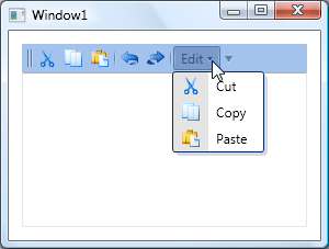
This example shows how to create a BarLinkContainerItem, which is a container of item links. The BarLinkContainerItem contains Cut, Copy and Paste commands. The contents of the BarLinkContainerItem appear in the example in two places: in a bar and within a sub-menu.In the example, the bar is docked to the BarContainerControl which is created implicitly by setting the BarManager.CreateStandardLayout option to true.
The following image shows the result:
Note
A complete sample project is available at https://github.com/DevExpress-Examples/how-to-create-a-barlinkcontaineritem-e1562.
<dxb:BarManager CreateStandardLayout="True" Margin="12" Name="barManager1">

    <dxb:BarManager.Items>
        <dxb:BarButtonItem x:Name="itemCut" Content="Cut" Glyph="pack://application:,,,/Images/cut16x16.png" />
        <dxb:BarButtonItem x:Name="itemCopy" Content="Copy" Glyph="pack://application:,,,/Images/copy16x16.png" />
        <dxb:BarButtonItem x:Name="itemPaste" Content="Paste" Glyph="pack://application:,,,/Images/paste16x16.png" />
        <dxb:BarButtonItem x:Name="itemUndo" Content="Undo" Glyph="pack://application:,,,/Images/undo16x16.png" />
        <dxb:BarButtonItem x:Name="itemRedo" Content="Redo" Glyph="pack://application:,,,/Images/redo16x16.png" />
        <!--Create a BarLinkContainerItem to display three edit commands-->
        <dxb:BarLinkContainerItem x:Name="linkContainerItem1" Content="Edit Commands">
            <dxb:BarLinkContainerItem.ItemLinks>
                <dxb:BarButtonItemLink BarItemName="itemCut" />
                <dxb:BarButtonItemLink BarItemName="itemCopy" />
                <dxb:BarButtonItemLink BarItemName="itemPaste" />
            </dxb:BarLinkContainerItem.ItemLinks>
        </dxb:BarLinkContainerItem>
        <!--Create a sub-menu displaying the BarLinkContainerItem's contents-->
        <dxb:BarSubItem Content="Edit" x:Name="subMenu1">
            <dxb:BarSubItem.ItemLinks>
                <dxb:BarLinkContainerItemLink BarItemName="linkContainerItem1" />
            </dxb:BarSubItem.ItemLinks>
        </dxb:BarSubItem>

    </dxb:BarManager.Items>

    <!--Create a bar and display the BarLinkContainerItem and SubMenu in the bar-->
    <dxb:BarManager.Bars>
        <dxb:Bar x:Name="bar1" Caption="Bar 1">
            <dxb:Bar.DockInfo>
                <dxb:BarDockInfo ContainerType="Top" />
            </dxb:Bar.DockInfo>
            <dxb:Bar.ItemLinks>
                <dxb:BarLinkContainerItemLink BarItemName="linkContainerItem1" />
                <!--Create a separator between links-->
                <dxb:BarItemLinkSeparator />
                <dxb:BarButtonItemLink BarItemName="itemUndo" />
                <dxb:BarButtonItemLink BarItemName="itemRedo" />
                <!--Create a separator between links-->
                <dxb:BarItemLinkSeparator />
                <dxb:BarSubItemLink BarItemName="subMenu1" />
            </dxb:Bar.ItemLinks>
        </dxb:Bar>

    </dxb:BarManager.Bars>
    <RichTextBox></RichTextBox>
</dxb:BarManager>
Related GitHub Examples
The following code snippets (auto-collected from DevExpress Examples) contain references to the BarLinkContainerItem class.
Note
The algorithm used to collect these code examples remains a work in progress. Accordingly, the links and snippets below may produce inaccurate results. If you encounter an issue with code examples below, please use the feedback form on this page to report the issue.