TdxNavBarOfficeNavigationBar Class
An Outlook-inspired navigation bar, supporting integration with the NavBar control (also called Office Navigation Bar).
Declaration
TdxNavBarOfficeNavigationBar = class(
    TdxNavBarCustomOfficeNavigationBar
)
Remarks
The Office Navigation Bar control is capable of displaying navigation links (items), which can be clicked to invoke a specific functionality. Items can be added and accessed with the Items property. A click on an item can be handled via the Office Navigation Bar control’s OnSelectionChanging and/or OnSelectionChanged events.
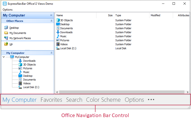
The main feature of the Office Navigation Bar control is its ability to integrate with the NavBar control. To accomplish this, assign the NavBar control to the ItemProvider property. Once linked, the Office Navigation Bar control displays group captions as its items, while the NavBar control displays the currently active group’s content. Both the controls are now synchronized, so that selecting a navigation bar item activates the corresponding group in the linked NavBar control.
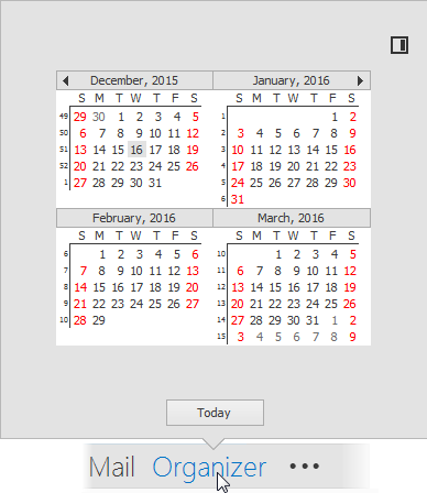
For Office Navigation Bar items, a popup Peek Form can be displayed to provide custom content for end-users. By default, the Peek Form is displayed when hovering over items. Handle the Office Navigation Bar control’s OnQueryPeekFormContent event to provide the Peek Form’s content (a TWinControl object).
With the OptionsView.CustomizationButtonVisibility option, you can switch the visibility of the Customization Button, which when clicked, invokes a dialog that allows end-users to change the order of bar items and customize their visibility. To adjust the number of simultaneously visible bar items, use the OptionsView.MaxVisibleItemCount property.
The TdxNavBarOfficeNavigationBar component does not introduce any new functionality except for initializing the Align property to alBottom and publishing properties and events inherited from its ancestor classes.