Theme Settings
- 2 minutes to read
You can use the  toolbar button to invoke the Theme Settings dialog.
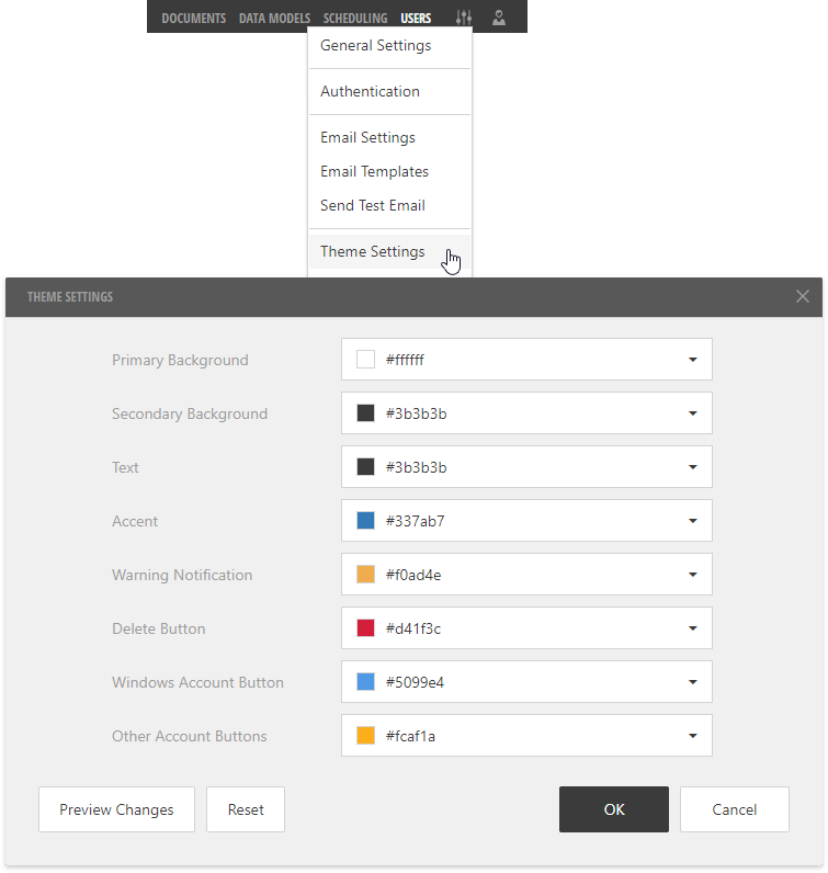
This dialog allows you to specify colors for the Administrative Panel’s interface elements:
Primary Background
A base background color for the Administrative Panel’s UI.
Secondary Background
A color to paint the Server’s toolbar, dialog captions, dialog backgrounds and other secondary parts.
Text
A color to display text elements.
Accent
The Server uses this color’s hues to paint selected and hovered table rows, action buttons, check boxes, and other specific UI elements.
Warning Notification
A color for warning messages, such as a security warning that appears when you create a new data model.
Delete Button
A color for the Delete button.
Windows Account Button
A color for the login screen’s Windows button that allows users to log in to the Report and Dashboard Server with the Windows account.
Other Account Buttons
A color for the login screen’s buttons that allow users to log in to the Report and Dashboard Server using the OpenID Connect or WS-Federation protocols.
The Preview Changes button allows you to temporary apply the specified colors to the Server’s UI in the dialog and background.
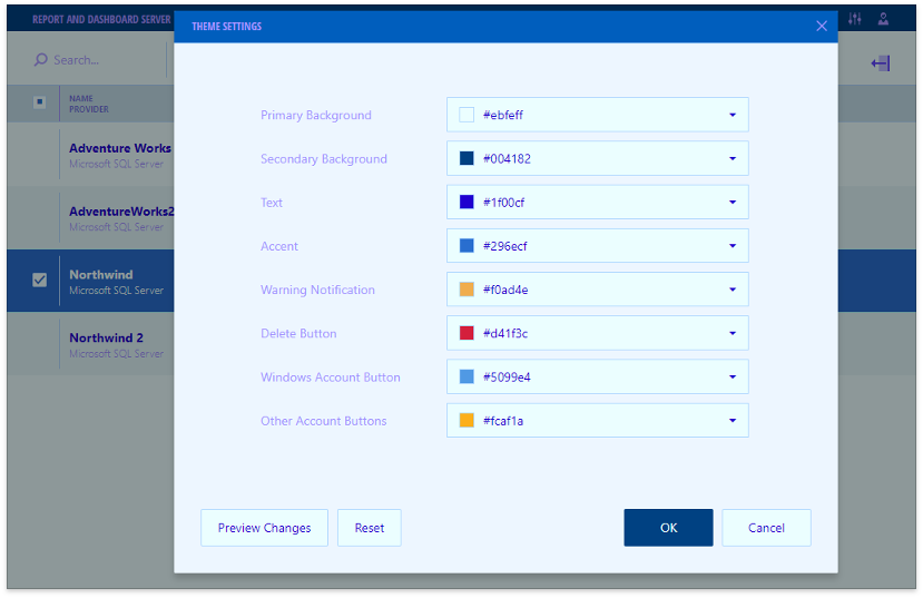
You can use the Reset button to restore all the original colors.
Click OK to apply all the changes and close the dialog.