DXCollectionView Class
A collection view.
Namespace: DevExpress.XamarinForms.CollectionView
Assembly: DevExpress.XamarinForms.CollectionView.dll
NuGet Package: DevExpress.XamarinForms.CollectionView
Declaration
public class DXCollectionView :
    View,
    IBindingContextParent
Remarks
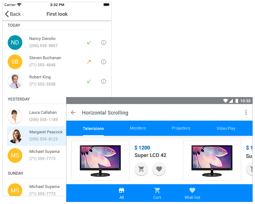
DXCollectionView is a view that displays a list of data items in a vertical or horizontal orientation.

Bind to Data
To populate the CollectionView with data, assign an object that implements the IList, IList<T>, IEnumerable or IEnumerable<T> interface to the ItemsSource property.
For example, the following XAML markup populates the CollectionView with strings from the array:
<dxcv:DXCollectionView>
    <dxcv:DXCollectionView.ItemsSource>
        <x:Array Type="{x:Type x:String}">
            <x:String>Alabama</x:String>
            <x:String>Arizona</x:String>
            <x:String>California</x:String>
            <x:String>Florida</x:String>
            <x:String>Indiana</x:String>
            <x:String>Louisiana</x:String>
            <x:String>Massachusetts</x:String>
            <x:String>Nevada</x:String>
            <x:String>New York</x:String>
            <x:String>Texas</x:String>
            <x:String>Washington</x:String>
        </x:Array>
    </dxcv:DXCollectionView.ItemsSource>
</dxcv:DXCollectionView>

You can also bind the CollectionView to a collection of custom objects.
<ContentPage ...>
    <ContentPage.BindingContext>
        <local:ViewModel/>
    </ContentPage.BindingContext>
    <dxcv:DXCollectionView ItemsSource="{Binding Data}"/>
</ContentPage>
using System.Collections.Generic;
using System.ComponentModel;
using System.Runtime.CompilerServices;
using Xamarin.Forms;

// ...

public class ViewModel : INotifyPropertyChanged {
    public List<Person> Data { get; }

    public ViewModel() {
        Data = new List<Person>() {
        new Person {Name = "Nancy Davolio", Phone = "(206) 555-9857", Location = "Seattle"},
        new Person {Name = "Andrew Fuller", Phone = "(206) 555-9482", Location = "Tacoma"},
        new Person {Name = "Janet Leverling", Phone = "(206) 555-3412", Location = "Kirkland"},
        new Person {Name = "Margaret Peacock", Phone = "(206) 555-8122", Location = "Redmond"},
        new Person {Name = "Steven Buchanan", Phone = "(71) 555-4848", Location = "London"},
        new Person {Name = "Michael Suyama", Phone = "(71) 555-7773", Location = "London"},
        new Person {Name = "Robert King", Phone = "(71) 555-5598", Location = "London"},
        new Person {Name = "Laura Callahan", Phone = "(206) 555-1189", Location = "Seattle"},
        new Person {Name = "Anne Dodsworth", Phone = "(71) 555-4444", Location = "London"},
      };
    }

    public event PropertyChangedEventHandler PropertyChanged;
    private void OnPropertyChanged([CallerMemberName] string propertyName = "") {
        PropertyChanged?.Invoke(this, new PropertyChangedEventArgs(propertyName));
    }
}

public class Person {
    public string Name { get; set; }
    public string Phone { get; set; }
    public string Location { get; set; }
}
Define Item Appearance
Use the following properties to define how the CollectionView’s data items look:
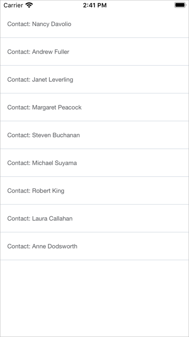
DisplayMember - a data source’s field whose values are displayed as list items.
DisplayFormat - a pattern used to format list items.<dxcv:DXCollectionView ItemsSource="{Binding Data}" DisplayMember="Name" DisplayFormat="Contact: {0}"> </dxcv:DXCollectionView>Show CollectionView -or -
-or -ItemTemplate - a template that defines the appearance of list items.
This template’s binding context is an object that specifies an item in the underlying data source.<dxcv:DXCollectionView ItemsSource="{Binding Data}"> <dxcv:DXCollectionView.ItemTemplate> <DataTemplate> <Grid> <Grid.RowDefinitions> <RowDefinition Height="40"/> <RowDefinition Height="30"/> <RowDefinition Height="Auto"/> </Grid.RowDefinitions> <Grid.ColumnDefinitions> <ColumnDefinition Width="170"/> <ColumnDefinition Width="Auto"/> </Grid.ColumnDefinitions> <Label Text="{Binding Name}" Padding="10, 15, 0, 0" FontAttributes="Bold"/> <Label Text="{Binding Phone}" Padding="10, 15, 0, 0" Grid.Row="0" Grid.Column="1"/> <Label Text="{Binding Location}" Padding="10, 0" Grid.Row="1" Grid.Column="1"/> <BoxView Grid.Row="2" Grid.ColumnSpan="3" BackgroundColor="#ebebeb" HeightRequest="2"/> </Grid> </DataTemplate> </dxcv:DXCollectionView.ItemTemplate> </dxcv:DXCollectionView>Show CollectionView
Specify Item Size
The CollectionView automatically adjusts the height (or width, if the Orientation property is set to Horizontal) of data items to display their entire content, but sets an item’s minimum size with the MinItemSize property. If you specify the ItemSize property, all data items have the same height (width).
The GroupHeaderSize property specifies the height of group headers.
Identify Items
Data items in the CollectionView visualize records from the data source.
When data is grouped, the CollectionView displays group headers - additional items that separate groups of data items. Users can tap group headers to expand and collapse groups.

Item Handles
Items (data items and group headers) in the CollectionView are identified by unique integer values - item handles. Each item has an item handle, regardless of whether an item is currently visible (for example, an item might be scrolled off-screen or hidden within a collapsed group).
An item handle depends on the item’s current position in the view and changes dynamically when items are reordered (for example, when data is sorted or grouped).
- Data item handles are zero-based indexes that correspond to item order from top to bottom (or from left to right, if the Orientation property is set to Horizontal).
- Group header handles are negative values that start with -1. The order matches group order from top to bottom (or from left to right, if the view orientation is horizontal).
Visible items can also be identified by their visible indexes. These indexes start from zero. Successive integers are assigned to all visible items (group headers and data items). An item is hidden if it is contained within a collapsed group.

The following methods allow you to obtain item handles:
Method | Description |
|---|---|
Returns the handle of the item by its visible index. | |
Returns the handle of the item at the specified position within the specified group. |
You can pass item handles as parameters to the following methods that work with items:
Method | Description |
|---|---|
Returns an object that specifies a record in the CollectionView’s underlying data source. | |
Scrolls the view to make the specified item visible. | |
Returns the visible index of the item by its handle. | |
Returns the data value for which the group is created. | |
Returns the number of data items in the group. | |
Checks whether the specified item is a group header. | |
Indicates whether the specified group of items is collapsed. | |
Collapses the specified group of items. | |
Expands the specified group of items. |
Item Count
To obtain the number of data items in the list, use the ItemCount property. The VisibleItemCount property returns the total number of group headers (if data is grouped) and data items that are not hidden within collapsed groups, including items outside the current viewport.
Select Items
The CollectionView supports single and multiple item selection from the UI (on tap) and code.

SelectionMode = None (default)
Items cannot be selected within the view.SelectionMode = Single
When a user selects (taps) an item, the SelectedItem property is set to an object that specifies the item from the data source that corresponds to the item selected in the list. When a user taps the selected item again, the selection is cleared and the SelectedItem property is set to null.
To select an item programmatically, assign the data source’s item object to the view model’s property and bind the SelectedItem property to it.- SelectionMode = Multiple
When a user selects (taps) items, the SelectedItems property is set to a collection of objects that specify items from the data source that correspond to items selected in the list.
To select multiple items programmatically, assign a collection of the data source’s item objects to the view model’s property and bind the SelectedItems property to it.
The SelectionChanged event occurs when the selection is changed from the UI (a user taps an item) or code (the SelectedItem or SelectedItems property value is changed).
To customize the selected item’s appearance, use the SelectedItemTemplate property or Xamarin.Forms Visual State Manager.
Sort Data
To sort items in the CollectionView:
- Create a SortDescription object and specify its FieldName and SortOrder properties.
- Add this object to the DXCollectionView.SortDescriptions collection.
You can sort list items by multiple data fields. To do this, create a SortDescription object for each field that should be sorted. The order in which you add these objects to the DXCollectionView.SortDescriptions collection defines the sorting sequence in a CollectionView.
<dxcv:DXCollectionView ItemsSource="{Binding Contacts}">
    <!--...-->

    <dxcv:DXCollectionView.SortDescriptions>
        <dxcv:SortDescription FieldName="Name" SortOrder="Descending"/>
    </dxcv:DXCollectionView.SortDescriptions>
</dxcv:DXCollectionView>
Group Data
The CollectionView allows you to arrange items with identical values in a specified field into collapsible groups. To expand or collapse a group, a user should tab its header.

To group data, set the DXCollectionView.GroupDescription property to a GroupDescription object with the specified FieldName and GroupInterval properties. Use the GroupHeaderTemplate property to specify the appearance of group headers.
<dxcv:DXCollectionView ItemsSource="{Binding Contacts}">
    <!--...-->

    <!--Group items.-->
    <dxcv:DXCollectionView.GroupDescription>
        <dxcv:GroupDescription FieldName="Name" GroupInterval="Alphabetical"/>
    </dxcv:DXCollectionView.GroupDescription>

    <!--Define the group header template.-->
    <dxcv:DXCollectionView.GroupHeaderTemplate>
        <DataTemplate>
            <StackLayout Margin="2, 0, 18, 10">
                <Label FontFamily="Roboto-Medium"
                       Margin="0,20,0,1"
                       TextColor="#55575c"
                       Text="{Binding Value}"/>
                <BoxView BackgroundColor="#ebebeb"
                         HeightRequest="1"/>
            </StackLayout>
        </DataTemplate>
    </dxcv:DXCollectionView.GroupHeaderTemplate>
</dxcv:DXCollectionView>
Related API
You can also use the following properties, methods, and events of the DXCollectionView object to manage groups of items.
Member | Description |
|---|---|
Gets the number of data item groups in a CollectionView. | |
Allow you to manage the height (or width if the Orientation property is set to Horizontal) of group headers. | |
Returns the data value for which the group is created. | |
Returns the number of data items in the group. | |
Returns the handle of the item at the specified position within the specified group. | |
Checks whether the specified item is a group header. | |
Specifies whether users can collapse and expand groups of items. | |
Indicates whether the specified group of items is collapsed. | |
Collapses the specified group of items. | |
Collapses all groups of items. | |
Expands the specified group of items. | |
Expands all groups of items. | |
Occurs before a group of items is collapsed. | |
Occurs after a group of items has been collapsed. | |
Occurs before a group of items is expanded. | |
Occurs after a group of items has been expanded. |
Filter Data
You can filter data in the CollectionView against single or multiple data fields. When a filter is applied, the view displays a subset of data items that meet the specified criteria.
Related API
Property | Description |
|---|---|
Gets or sets the CollectionView’s filter expression. | |
Gets or sets the CollectionView’s filter expression string. |
<dxcv:DXCollectionView ItemsSource="{Binding Recents}"
                       FilterString="StartsWith([Name], 'M')">
    <!-- ... -->
</dxcv:DXCollectionView>

Pull to Refresh
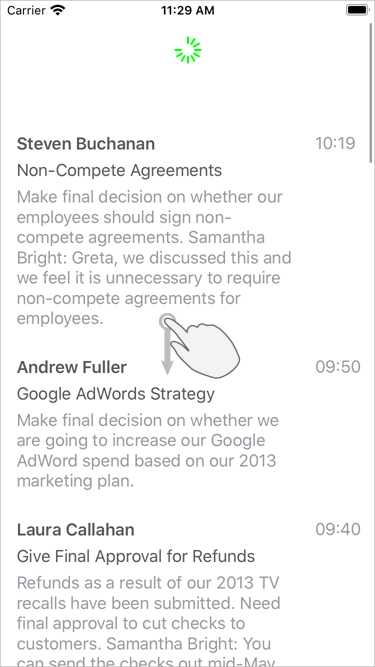
You can set up the CollectionView so that users can refresh content with a pull-down gesture.

To enable this functionality, set the IsPullToRefreshEnabled property to true. Then, either define a refresh command in a view model and bind it to the PullToRefreshCommand property, or handle the PullToRefresh event. Use the IsRefreshing property to notify the view that the pull-to-refresh activity is complete and the refresh indicator should be hidden.
Load More
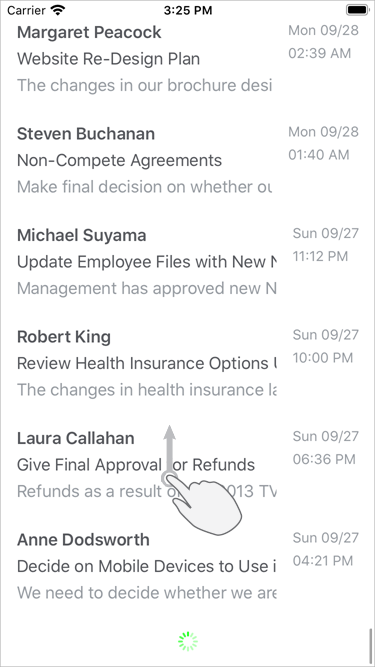
You can set up the CollectionView so that it adds a set of new data items when a user scrolls to the last item.

To enable this functionality, set the IsLoadMoreEnabled property to true. Then, either define a load-more command in a view model and bind it to the LoadMoreCommand property, or handle the LoadMore event. Use the IsRefreshing property to notify the view that the load-more activity is complete and the load indicator should be hidden. The IndicatorColor property allows you to change the indicator color.
Drag and Drop Items
The CollectionView has a set of properties and events that allow you to enable drag-and-drop operations and control them at different stages.
Related API
Property | Description |
|---|---|
Gets or sets whether a user is allowed to drag and drop items within the view. | |
Gets or sets whether a user is allowed to drag and drop items that are sorted or grouped. |
Event | Description |
|---|---|
Occurs when a user touches and holds an item to drag it. | |
Occurs each time an item is dragged over another item. | |
Occurs when a user drops an item. | |
Occurs after the drag-and-drop operation is completed. |