TabView Class
A view that organizes content into groups at the same hierarchy level and allows tab navigation between them.
Namespace: DevExpress.Maui.Controls
Assembly: DevExpress.Maui.Controls.dll
NuGet Package: DevExpress.Maui.Controls
Declaration
[ContentProperty("Items")]
public class TabView :
    View,
    IDXViewController,
    IAppearanceOwner,
    IVisualTreeElement
Remarks
The TabView component allows you to implement tab navigation through a collection of views (tab items) in a .NET MAUI application. A tab item has a header displayed within the header panel and a view displayed in the content area when a user selects an item. To navigate between tab items, a user can tap tab item headers or swipe left or right within the content area.
When a user switches between tabs, the TabView applies animation effects to tabs. You can use the ScrollAnimationEnabled property to enable and disable the animation.
You can populate a TabView with tab items as follows:
- Create Tab Items Manually
Add TabViewItem objects to the TabView.Items collection.
- Generate Tab Items from a Data Source
Assign a data source to the TabView.ItemsSource property, and use the TabView.ItemHeaderTemplate and TabView.ItemTemplate properties to define templates for a tab item’s header and content area.
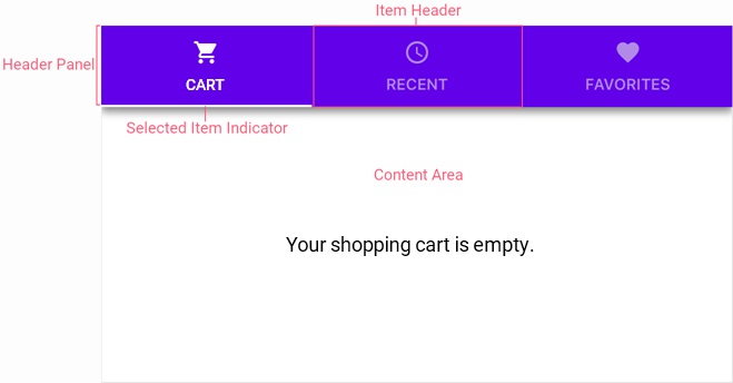
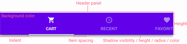
Header Panel
A header panel shows tab item headers (tabs) that users can tap to switch views in the content area. Use the HeaderPanelPosition property to specify the header panel position relative to the content area. A TabView also has properties to adjust the following appearance settings of the header panel:
Property | Description |
|---|---|
Gets or sets the background color of the view’s header panel. This is a bindable property. | |
Gets or sets a value that specifies how the view aligns item headers in the header panel. This is a bindable property. | |
Gets or sets the header panel’s width when the HeaderPanelPosition is set to Left or Right. This is a bindable property. | |
Gets or sets the header panel’s height when the HeaderPanelPosition is set to Top or Bottom. This is a bindable property. | |
Gets or sets spacing before the first item and the panel’s start edge. This is a bindable property. | |
Gets or sets the header panel’s maximum height when HeaderPanelPosition is Top or Bottom. This is a bindable property. | |
Gets or sets the header panel’s maximum width when HeaderPanelPosition is Left or Right. This is a bindable property. | |
Gets or sets the header panel’s minimum height when the HeaderPanelPosition is Top or Bottom. This is a bindable property. | |
Gets or sets the header panel’s minimum width when the HeaderPanelPosition is set to Left or Right. This is a bindable property. | |
Gets or sets the spacing between item headers. This is a bindable property. | |
Gets or sets whether the Header Panel’s shadow is visible. This is a bindable property. | |
Gets or sets the height of the header panel’s shadow. This is a bindable property. | |
Gets or sets the blur radius of the header panel’s shadow. This is a bindable property. | |
Gets or sets the color the Tab View uses to paint the header panel’s shadow. This is a bindable property. |
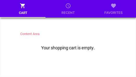
Content Area
In the content area, the TabView displays the main content of a selected tab item.
The property used to specify tab item content depends on the way in which you create tab items:
- TabViewItem.Content, if you create tab items manually.
- TabView.ItemTemplate, if you generate tab items from a data source.
Tab Item Header
A TabView’s item header is a tab displayed within the header panel. An item header can contain an icon and text to identify the tab item content. Use one of the following ways to specify icons and text for tab item headers depending on the way you add tab items to the TabView:
How you add tab items | How to specify icons and text for item headers |
|---|---|
Populate the TabView.Items collection with TabViewItem objects | Add icons for tabs (.svg files) to the project and set their Build Action property to MauiImage. |
Generate tab items from a data source assigned to the TabView.ItemsSource property | Use the TabView.ItemHeaderIconDataMember and TabView.ItemHeaderTextDataMember properties to specify data source fields that contain icons and text strings for headers of tab items. |
A TabView allows you to customize the appearance of a tab item header and its elements.
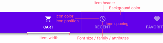
You can use properties of the TabView object to specify the same appearance settings for headers of all tab items, or use properties of TabViewItem objects to customize each tab item individually.
TabView’s Property | TabViewItem’s Property | Appearance Parameter |
|---|---|---|
An item header width. The TabView uses these properties only when its HeaderPanelPosition property is set to Top or Bottom. | ||
An item header height. The TabView uses these properties only when its HeaderPanelPosition property is set to Left or Right. | ||
An item header’s maximum width. | ||
An item header’s minimum width. | ||
An item header’s maximum height. | ||
An item header’s minimum height. | ||
Elements (an icon and/or text) that an item header displays. | ||
The font family to which the text font of an item header belongs. | ||
The font size of an item header. | ||
Font settings (bold, italic, both, or neither) of an item header. | ||
The color of item header text. | ||
The color of an item header icon. | ||
The position of an item header icon relative to text. | ||
The spacing between an item header icon and text. | ||
An item header padding. |
Selected Tab Item Header
A TabView can paint a selected tab item in different colors within the header panel.
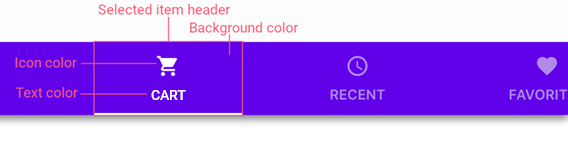
Use a TabView object’s properties to apply the same colors to any tab item when it is selected, or a TabViewItem object’s properties to specify a color for a single selected tab item.
TabView’s Property | TabItem’s Property | Appearance Parameter |
|---|---|---|
The background color of an item header when the item is selected. | ||
The icon color of an item header when the item is selected. | ||
The text color of an item header when the item is selected. |
Use SelectedItem and SelectedItemIndex properties to get or set the selected item and its index.
A TabView also displays a selected item indicator to highlight a header of a selected tab item:
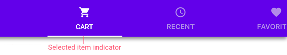
You can use the SelectedItemIndicatorColor and SelectedItemIndicatorHeight properties to customize this indicator appearance.
If you do not need to show the indicator, set the IsSelectedItemIndicatorVisible property to false.
Custom View for a Tab Item Header
If you need to specify a custom view for a tab item header, use the following properties depending on how you add tab items to the TabView:
- TabViewItem.HeaderContent if you create tab items manually.
- TabView.ItemHeaderTemplate if you generate tab items from a data source.
Related Scenario
The following featured scenario shows how you can use the TabView class:
Chip Filters for a CollectionView