Customize Appearance
- 3 minutes to read
This topic describes appearance customization techniques available in DevExpress .NET MAUI Controls:
- Change Appearance Properties at the Control Level
Customize Control Elements: Use AppearanceBase Descendants
Use Implicit Styles for Centralized Style Management
Refer to the following section to review the list of DevExpress controls that include appearance customization settings: Appearance Customization: Control-Specific Information.
Change Appearance Properties at the Control Level
The code sample below customizes the appearance of a SimpleButton control.
Button State | Default Appearance | Custom Appearance |
|---|---|---|
Default |
|
|
Pressed |
|
|
Disabled |
|
|


Add the delete.png icon file to the Resources/Images folder.
Use the following properties to adjust the button’s appearance:
<dxco:SimpleButton Text="Clear"
                   Icon="delete"
                   BorderThickness="2"
                   BorderColor="Black"
                   PressedBorderColor="DarkOrange"
                   DisabledBorderColor="DarkGray"
                   TextColor="Black"
                   PressedTextColor="White"
                   DisabledTextColor="DarkGray"
                   IconColor="Black"
                   PressedIconColor="White"
                   DisabledIconColor="DarkGray"
                   BackgroundColor="Beige"
                   DisabledBackgroundColor="Brown"
                   PressedBackgroundColor="Gray"
                   CornerMode = "Round"
                   CornerRadius="10"/>
Customize Control Elements: Use AppearanceBase Descendants
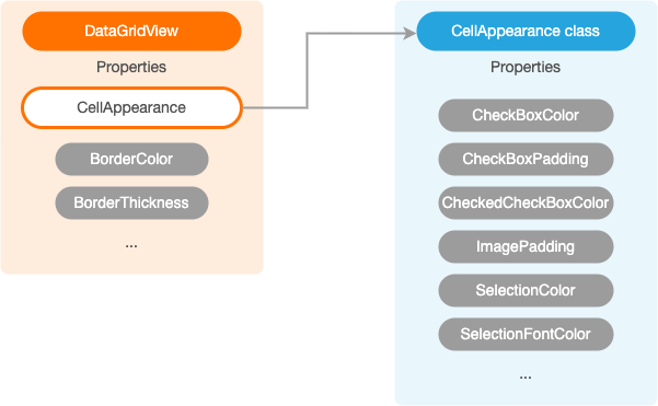
DevExpress .NET MAUI Controls store appearance settings for elements of a specific type (such as data cells or column headers).
The diagram below demonstrates different appearance properties available in a DataGridView. You can find appearance properties that apply to the control itself: BorderColor and BorderThickness. You can also find properties that define appearance for a specific element type. For example, the DataGridView.CellAppearance property stores settings that affect data cells. The property type is CellAppearance (an AppearanceBase descendant).
Example
The following code sample uses the CellAppearance object to modify the data cell appearance in a DataGridView:
<ContentPage ...
             xmlns:dxg="clr-namespace:DevExpress.Maui.DataGrid;assembly=DevExpress.Maui.DataGrid">
    <!-- ... -->
    <dxg:DataGridView ...>
        <!-- ... -->
        <dxg:DataGridView.CellAppearance>
            <dxg:CellAppearance SelectionColor="AliceBlue" CheckedCheckBoxColor="CadetBlue"/>
        </dxg:DataGridView.CellAppearance>
    </dxg:DataGridView>
</ContentPage>
Use Implicit Styles for Centralized Style Management
You can customize a control’s appearance within implicit styles to affect all elements with a specified type.
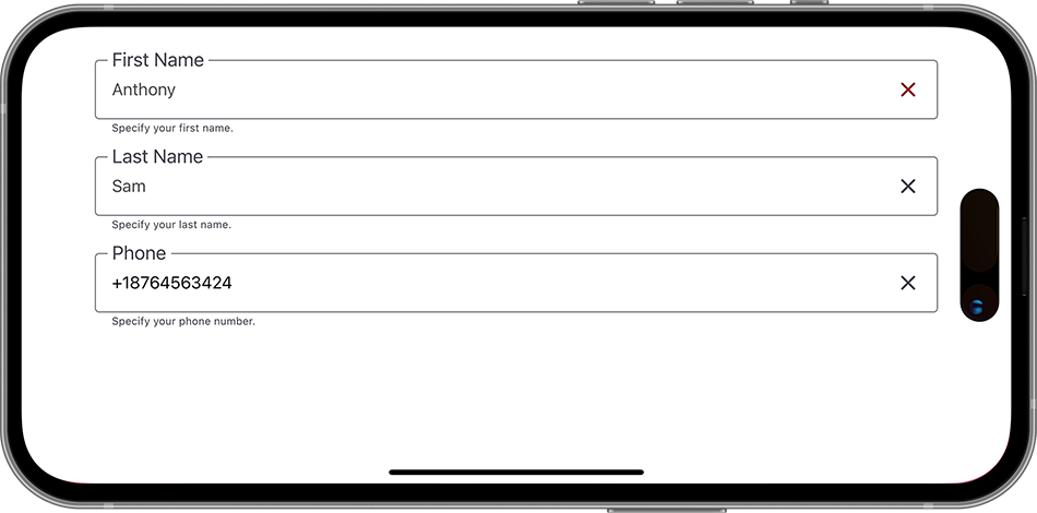
The following XAML code specifies the TextColor, LabelFontSize, and BottomTextFontSize properties for all TextEdit controls on a page:
<ContentPage ...
             xmlns:dxe="clr-namespace:DevExpress.Maui.Editors;assembly=DevExpress.Maui.Editors">
    <ContentPage.Resources>
        <Style TargetType="dxe:TextEdit">
            <Setter Property="TextColor" Value="#505050"/>
            <Setter Property="LabelFontSize" Value="18" />
            <Setter Property="BottomTextFontSize" Value="10" />
        </Style>
    </ContentPage.Resources>
    <VerticalStackLayout Spacing="10">
        <dxe:TextEdit Text="Anthony" LabelText="First Name" HelpText="Specify your first name." ClearIconColor="DarkRed"/>
        <dxe:TextEdit Text="Sam" LabelText="Last Name" HelpText="Specify your last name."/>
        <dxe:TextEdit Text="+18764563424" LabelText="Phone" TextColor="Black" HelpText="Specify your phone number."/>
    </VerticalStackLayout>
</ContentPage>
Customize AppearanceBase Objects in Styles
You can create styles whose TargetType property is set to an AppearanceBase type.
The code sample below uses implicit styles to specify the following properties of the CellAppearance object:
- The color of the DataGridView‘s selected cell (SelectionColor).
- The color of the DataGridView‘s checked checkbox (CheckedCheckBoxColor).
<ContentPage ...
             xmlns:dxg="clr-namespace:DevExpress.Maui.DataGrid;assembly=DevExpress.Maui.DataGrid">
    <ContentPage.Resources>
        <Style TargetType="dxg:CellAppearance">
            <Setter Property="SelectionColor" Value="AliceBlue"/>
            <Setter Property="CheckedCheckBoxColor" Value="CadetBlue"/>
        </Style>
    </ContentPage.Resources>
    <!-- ... -->
    <dxg:DataGridView ...>
        <!-- ... -->
    </dxg:DataGridView>
    <dxg:DataGridView ...>
        <!-- ... -->
    </dxg:DataGridView>
</ContentPage>
Limitation
You cannot specify an AppearanceBase object in a component’s style.
The following code sample illustrates the wrong way to specify the DataGridView.CellAppearance.SelectionColor property in implicit styles:
<ContentPage ...
             xmlns:dxg="clr-namespace:DevExpress.Maui.DataGrid;assembly=DevExpress.Maui.DataGrid">
    <ContentPage.Resources>
        <Style TargetType="dxg:DataGridView">
            <Setter Property="CellAppearance">
                <dxg:CellAppearance SelectionColor="Red"/>
            </Setter>
        </Style>
    </ContentPage.Resources>
    <!-- ... -->
    <dxg:DataGridView ...>
        <!-- ... -->
    </dxg:DataGridView>
    <dxg:DataGridView ...>
        <!-- ... -->
    </dxg:DataGridView>
</ContentPage>
Obtain Appearance Settings Applied to a Control
Use a control’s *ActualAppearance class to obtain the appearance settings.
Appearance Customization: Control-Specific Information
Refer to the following topics to get more information on how to customize the control’s appearance:
Data Grid & Collection View
Editors
- DataFormView
- AutoCompleteEdit
- AutoCompleteTokenEdit
- CheckEdit
- Chip
- ComboBoxEdit
- DateEdit
- MultilineEdit
- NumericEdit
- PasswordEdit
- TextEdit
- TimeEdit
- TokenEdit
Charts
- Charts for .NET MAUI. Color Gradients for Lines and Areas
- Charts for .NET MAUI. Series Point Colorizers