BottomSheet Class
A view that slides out from the bottom of the screen and shows an action list or other supplemental content.
Namespace: DevExpress.Maui.Controls
Assembly: DevExpress.Maui.Controls.dll
NuGet Package: DevExpress.Maui.Controls
Declaration
[ContentProperty("Content")]
public class BottomSheet :
    View,
    IDXViewController,
    IAppearanceOwner,
    IVisualTreeElement
Remarks
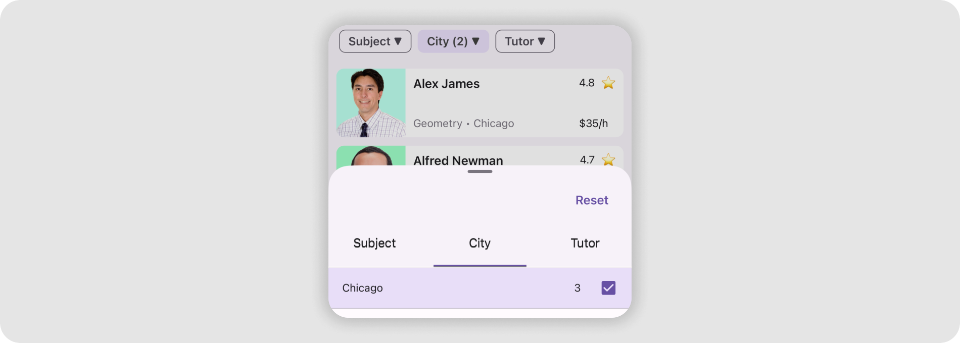
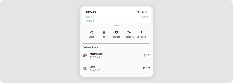
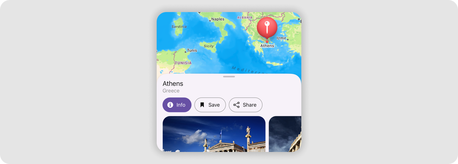
In the following image, the Bottom Sheet shows detail information for a tapped Collection View item:
Review our demo app on GitHub to try out the BottomSheet:
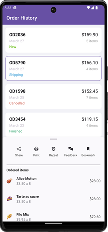
Bottom Sheet Elements (Anatomy)
The following figure shows basic elements of a bottom sheet:
Add a Bottom Sheet to the Page
Before you proceed, read the following topics:
- Get Started with DevExpress Controls for .NET Multi-platform App UI (.NET MAUI)
- Get Started with DevExpress Bottom Sheet for .NET MAUI
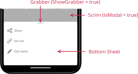
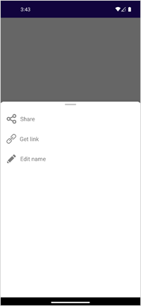
The following example shows an action sheet when a user swipes up the page:
<ContentPage xmlns="http://schemas.microsoft.com/dotnet/2021/maui"
             xmlns:x="http://schemas.microsoft.com/winfx/2009/xaml"
             xmlns:local="clr-namespace:BottomSheetSample"
             xmlns:dxc="clr-namespace:DevExpress.Maui.Controls;assembly=DevExpress.Maui.Controls"
             x:Class="BottomSheetSample.MainPage" Shell.TabBarIsVisible="False">
    <ContentPage.Resources>
        <Style TargetType="dxc:SimpleButton" x:Key="buttonStyle">
            <Setter Property="BackgroundColor" Value="{x:Null}" />
            <Setter Property="IconColor" Value="Gray" />
            <Setter Property="TextColor" Value="Gray" />
            <Setter Property="HorizontalContentAlignment" Value="Start"/>
        </Style>
    </ContentPage.Resources>
    <VerticalStackLayout>
        <VerticalStackLayout.GestureRecognizers>
            <SwipeGestureRecognizer Direction="Up" Swiped="SwipeGestureRecognizer_Swiped"/>
        </VerticalStackLayout.GestureRecognizers>
        <dxc:BottomSheet x:Name="bottomSheet"
                         CornerRadius="30"
                         BackgroundColor="White"
                         HalfExpandedRatio="0.3"
                         AllowDismiss="True"
                         ShowGrabber="True"
                         IsModal="True">
            <!--#region BottomSheetContent-->
            <VerticalStackLayout Padding="4,20,4,4">
                <dxc:SimpleButton Text="Share" Icon="share" Style="{x:StaticResource buttonStyle}" Clicked="SimpleButton_Clicked"/>
                <dxc:SimpleButton Text="Get link" Icon="hyperlink" Style="{x:StaticResource buttonStyle}" Clicked="SimpleButton_Clicked"/>
                <dxc:SimpleButton Text="Edit name" Icon="pencil" Style="{x:StaticResource buttonStyle}" Clicked="SimpleButton_Clicked"/>
            </VerticalStackLayout>
            <!--#endregion-->
        </dxc:BottomSheet>
    </VerticalStackLayout>
</ContentPage>
using DevExpress.Maui.Controls;
namespace BottomSheetSample;
public partial class MainPage : ContentPage {
    public MainPage() {
        InitializeComponent();
    }
    private void SwipeGestureRecognizer_Swiped(object sender, SwipedEventArgs e) {
        bottomSheet.State = BottomSheetState.HalfExpanded;
    }
    private void SimpleButton_Clicked(object sender, EventArgs e) {
        //...
    }
}
Change the Expanded State
Use the State property to specify the current state of the Bottom Sheet (FullExpanded, HalfExpanded, or Hidden). You can also call the BottomSheet.Show method to expand the bottom sheet.
Users can interact with the sheet’s upper edge to resize the sheet (“swipe up” gesture) or collapse it (“swipe down” gesture). You can disable the AllowDismiss property to prevent users from closing the bottom sheet with a swipe. For better usability, you can enable the ShowGrabber property to show the drag handle.
A user can also tap outside the bottom sheet to hide it (the State property value turns into Hidden).
To limit possible states, specify the AllowedState property. For example, you can select the All option to allow both HalfExpanded and FullExpanded states, or allow only one of them.
Respond to the State Change
Once the Bottom Sheet’s state is changed, the StateChanged event occurs. Handle the event to respond to state changes:
<dxc:BottomSheet ...
                 StateChanged="bottomSheet_StateChanged">
    <!--...-->
</dxc:BottomSheet>
using DevExpress.Maui.Core;
//...
    private void bottomSheet_StateChanged(object sender, DevExpress.Maui.Core.ValueChangedEventArgs<BottomSheetState> e) {
        // Code that runs when the Bottom Sheet's state changes.
    }
To receive the previous and current State property values, use the event arguments’ OldValue and NewValue properties.
Specify the Height in the Half Expanded State
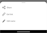
Define the HalfExpandedRatio property to set how much full screen height space the bottom sheet occupies in the Half-Expanded state:
| HalfExpandedRatio = 0.3 | HalfExpandedRatio = 0.7 |
|---|---|
 |
 |
Show as a Modal Dialog
If you enable the IsModal property, the Bottom Sheet acts as a dialog page. It blocks the rest of the app UI until dismissed by a user. Note that runtime changes to the IsModal property have no effect on bottom sheet behavior.
<dxc:BottomSheet ...
                 IsModal="True">
    <!--...-->
</dxc:BottomSheet>
Customize the Appearance
The BottomSheet component exposes the following properties that configure appearance settings:
BackgroundColor- Specifies the BottomSheet’s fill color.
- GrabberColor
- Defines the drag handle color.
- CornerRadius
Specifies the upper corner radius. Set the
CornerRadiusproperty to a value greater than 28 (default) for smoother and rounder corners:CornerRadius = 30 CornerRadius = 70 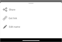
- Padding
- Specifies the space between the bottom sheet content and the edges.
<dxc:BottomSheet ...
                 BackgroundColor="White"
                 ShowGrabber="True"
                 GrabberColor="Gray"
                 CornerRadius="70"
                 Padding="30">
    <!--...-->
</dxc:BottomSheet>
Limitations
Errors may occur if you add a Button object to a Bottom Sheet. We recommend that you use a SimpleButton instead. Another option is a Label with a TapGestureRecognizer.
You cannot change the scrim color due to native component specifics.
iOS platform: the HalfExpandedRatio property value is in effect for iOS 16 and later. In earlier versions, the
HalfExpandedRatiovalue is always 0.5.
Related Scenarios
The following featured scenarios show how you can use the BottomSheet class:
Master-Detail View with BottomSheet Control
Google Maps-Inspired POI Details
Display Filtering UI Elements in a BottomSheet