.NET MAUI BottomSheet Custom Appearance
The BottomSheet contains the following properties that allow you to configure component appearance:
BackgroundColor- Specifies the BottomSheet’s background color.
- GrabberColor
Gets or sets the Bottom Sheet’s grabber color. This is a bindable property.
Use the ShowGrabber property to manage the grabber visibility.
- CornerRadius
Gets or sets the Bottom Sheet’s corner radius. This is a bindable property.
If you want to make upper corners smoother and rounder, set the
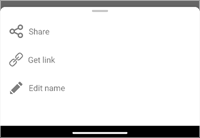
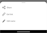
CornerRadiusproperty to a value greater than 28 (default).CornerRadius = 30 CornerRadius = 70 

- Padding
- Gets or sets the padding between Bottom Sheet edges and content. This is a bindable property.
This example demonstrates how to customize the BottomSheet‘s appearance:
<dxc:BottomSheet ...
                BackgroundColor="White"
                ShowGrabber="True"
                GrabberColor="Gray"
                CornerRadius="70"
                Padding="30">
    <!--...-->
</dxc:BottomSheet>