Charts for .NET MAUI. Series Point Colorizers
- 12 minutes to read
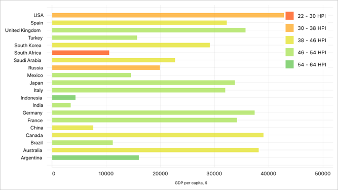
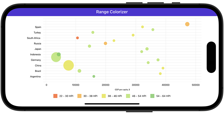
A series point colorizer helps you color-code series points to enhance data visualization. Use a series point colorizer to specify one or more conditions based on which a chart applies colors to series points. For example, point colors indicate the Happy Planet Index (HPI) on the following chart:
The ChartView component ships with point and value range colorizers that use predefined algorithms to select point colors. You can also implement a custom colorizer.
Point Colorizer
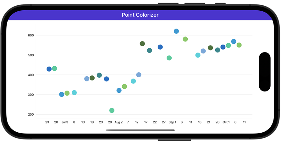
The predefined point colorizer uses colors from the default or custom palette to paint series points. Colors apply in the same order they appear in the palette.
To enable a point colorizer for a series, assign a ColorEachPointColorizer object to the series’s PointColorizer property.
Default Colors
The colorizer applies 7 default colors to points unless you explicitly specify the palette.
<dxc:PointSeries>
    <!-- Series Data -->
    <dxc:PointSeries.PointColorizer>
        <dxc:ColorEachPointColorizer/>
    </dxc:PointSeries.PointColorizer>
</dxc:PointSeries>
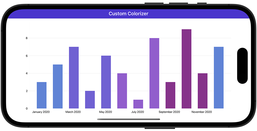
Custom Colors
Use the ColorEachPointColorizer.Palette property to specify custom colors.
<dxc:PointSeries>
    <!-- Series Data -->
    <dxc:PointSeries.PointColorizer>
        <dxc:ColorEachPointColorizer>
            <dxc:ColorEachPointColorizer.Palette>
                <x:Array Type="{x:Type Color}">
                    <Color>#006EC6</Color>
                    <Color>#18ce9a</Color>
                    <Color>#009ad6</Color>
                    <Color>#79cb5d</Color>
                    <Color>#0ed2dc</Color>
                    <Color>#71a9dd</Color>
                    <Color>#447238</Color>
                    <Color>#12898e</Color>
                </x:Array>
            </dxc:ColorEachPointColorizer.Palette>
        </dxc:ColorEachPointColorizer>
    </dxc:PointSeries.PointColorizer>
</dxc:PointSeries>
Custom Point Colorizers
The ChartView component can color series points based on point values/arguments or values in a specific data source field.
The table below lists supported custom colorizers. Create a class that implements a custom colorizer interface and assign an instance of this class to the series’s PointColorizer property.
| Series Type | Colorizer Interface | Colorizer Description |
|---|---|---|
| Area, RangeArea, Point, Bar, and Line | ICustomPointColorizer | The GetColor method’s info parameter of the ColoredPointInfo type contains information about the processed series point. |
| RangeBar | IRangeCustomPointColorizer | The GetColor method’s info parameter of the ColoredRangePointInfo type contains information about the processed series point. |
| StackedArea and StackedBar | IStackedCustomPointColorizer | The GetColor method’s info parameter of the ColoredStackedPointInfo type contains information about the processed series point. |
| Bubble | IWeightedCustomPointColorizer | The GetColor method’s info parameter of the ColoredWeightedPointInfo type contains information about the processed series point. |
| All series, except for financial and pie series | IIndexBasedCustomPointColorizer | The GetColor method’s pointIndex parameter specifies the data source index of the processed series point. If data aggregation is enabled, only the first point’s index is passed. |
Color Points by Their Arguments
In this example, a bar chart displays monthly values colored based on the season.
<ContentPage xmlns:x="http://schemas.microsoft.com/winfx/2009/xaml"
             xmlns:dxc="clr-namespace:DevExpress.Maui.Charts;assembly=DevExpress.Maui.Charts"
             xmlns:local="clr-namespace:ColorizerExample"
             x:Class="ColorizerExample.MainPage">
    <ContentPage.BindingContext>
        <local:ViewModel/>
    </ContentPage.BindingContext>
    <dxc:ChartView>
        <dxc:ChartView.Series>
            <dxc:BarSeries PointColorizer="{local:CustomColorizer}">
                <!-- Bind the series to the data source. -->
                <dxc:BarSeries.Data>
                    <dxc:SeriesDataAdapter DataSource="{Binding Data}"
                                           ArgumentDataMember="Argument">
                        <dxc:ValueDataMember Member="Value" Type="Value"/>
                    </dxc:SeriesDataAdapter>
                </dxc:BarSeries.Data>
            </dxc:BarSeries>
        </dxc:ChartView.Series>
        <dxc:ChartView.AxisX>
            <dxc:DateTimeAxisX MeasureUnit="Month"/>
        </dxc:ChartView.AxisX>
    </dxc:ChartView>
</ContentPage>
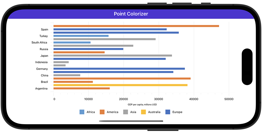
Color Points by Data Source Values
In this example, a bar chart visualizes GDP values for the G20 and color data points according to a country’s continent.
<ContentPage xmlns:x="http://schemas.microsoft.com/winfx/2009/xaml"
             xmlns:dxc="clr-namespace:DevExpress.Maui.Charts;assembly=DevExpress.Maui.Charts"
             x:Class="ColorizerExample.MainPage"
             xmlns:local="clr-namespace:ColorizerExample">
    <ContentPage.BindingContext>
        <local:ViewModel/>
    </ContentPage.BindingContext>
    <dxc:ChartView Rotated="True">
        <dxc:ChartView.Series>
            <dxc:BarSeries PointColorizer="{local:ColorizerByRegion}">
                <!-- Bind the series to the data source. -->
                <dxc:BarSeries.Data>
                    <dxc:SeriesDataAdapter DataSource="{Binding CountryStatisticsData}"
                                           ArgumentDataMember="Country">
                        <dxc:ValueDataMember Type="Value" Member="Gdp"/>
                    </dxc:SeriesDataAdapter>
                </dxc:BarSeries.Data>
            </dxc:BarSeries>
        </dxc:ChartView.Series>
        <!-- Specify axis and legend settings here. -->
    </dxc:ChartView>
</ContentPage>
Value Range Colorizers
You can color series points based on their Y-axis values. To do this, use a value range colorizer as follows:
- Assign a colorizer object to the series’s PointColorizer property.
- Populate the colorizer’s ColorStops collection with ColorStop objects. Each ColorStop object defines a value range (a pair of Y-axis values) and color. If a Y-axis value falls within the range, the point is painted with this color.
The following table lists series types and supported value range colorizers:
| Series Type | Value Range Colorizer |
|---|---|
| Area, RangeArea, Point, Bar, Line, StackedArea, StackedBar, and Bubble | ValueBandPointColorizer |
| RangeBar | RangeValueBandPointColorizer |
| StackedArea and StackedBar | StackedValueBandPointColorizer |
| Bubble | WeightedValueBandPointColorizer |
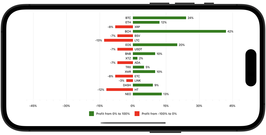
Example
In this example, a bar chart displays cryptocurrency portfolio yield. Series points are red for negative values and green for positive values. Note that this chart diagram is rotated.
<ContentPage xmlns:x="http://schemas.microsoft.com/winfx/2009/xaml"
             xmlns:dxc="clr-namespace:DevExpress.Maui.Charts;assembly=DevExpress.Maui.Charts"
             x:Class="ColorizerExample.MainPage"
             xmlns:local="clr-namespace:ColorizerExample">
    <ContentPage.BindingContext>
        <local:ViewModel/>
    </ContentPage.BindingContext>
    <dxc:ChartView x:Name="chart" Rotated="True">
        <dxc:ChartView.Series>
            <dxc:BarSeries LegendTextPattern="{}Profit from {CLV}% to {CHV}%">
                <!-- Bind the series to the data source. -->
                <dxc:BarSeries.Data>
                    <dxc:SeriesDataAdapter
                                DataSource="{Binding CryptocurrencyPortfolioData}"
                                ArgumentDataMember="Ticker">
                        <dxc:ValueDataMember Type="Value" Member="Profit"/>
                    </dxc:SeriesDataAdapter>
                </dxc:BarSeries.Data>

                <dxc:BarSeries.Label>
                    <dxc:BarSeriesLabel Position="Outside"
                                            Behavior="Cut"
                                            TextPattern="{}{V}%"/>
                </dxc:BarSeries.Label>

                <dxc:BarSeries.PointColorizer>
                    <dxc:ValueBandPointColorizer>
                        <dxc:ValueBandPointColorizer.ColorStops>
                            <dxc:ColorStop Color="Green" Value1="0" Value2="100"/>
                            <dxc:ColorStop Color="Red" Value1="0" Value2="-100"/>
                        </dxc:ValueBandPointColorizer.ColorStops>
                    </dxc:ValueBandPointColorizer>
                </dxc:BarSeries.PointColorizer>
            </dxc:BarSeries>
        </dxc:ChartView.Series>

        <!-- Specify axis and legend settings here. -->
    </dxc:ChartView>
</ContentPage>
Custom Value Range Colorizers
A predefined value range colorizer applies colors to points according to their Y-axis values. You can also color points based on a different data field than the one that contains the Y-axis values. To do this, implement a custom value range colorizer as follows:
- Assign a CustomValueBandPointColorizer object to a series’s PointColorizer property.
- Create a class that implements the ICustomColorizerNumericValueProvider interface and its GetValueForColorizer method. This method returns a value from the data source that specifies how a series point should be colored. Assign this class value to the colorizer’s ValueProvider property.
- Populate the colorizer’s ColorStops collection with ColorStop objects. Each ColorStop object defines a value range and color. If a value that the GetValueForColorizer method returns for a series point falls within the range, the point is painted with this color.
Note
You can use a custom value range colorizer for any series except for financial and pie series.
Example
In this example, the bubble chart displays GDP values for the G20. A point’s size indicates the country population and the color indicates the HPI.
<ContentPage xmlns:x="http://schemas.microsoft.com/winfx/2009/xaml"
             xmlns:dxc="clr-namespace:DevExpress.Maui.Charts;assembly=DevExpress.Maui.Charts"
             x:Class="ColorizerExample.MainPage"
             xmlns:local="clr-namespace:ColorizerExample">
    <ContentPage.BindingContext>
        <local:ViewModel/>
    </ContentPage.BindingContext>
    <dxc:ChartView Rotated="True">
        <dxc:ChartView.Series>
            <dxc:BubbleSeries LegendTextPattern="{}{CLV} - {CHV} HPI">
                <!-- Bind the series to the data source. -->
                <dxc:BubbleSeries.Data>
                    <dxc:SeriesDataAdapter DataSource="{Binding CountryStatisticsData}"
                                           ArgumentDataMember="Country">
                        <dxc:ValueDataMember Type="Value" Member="Gdp"/>
                        <dxc:ValueDataMember Type="Weight" Member="Population"/>
                    </dxc:SeriesDataAdapter>
                </dxc:BubbleSeries.Data>
                <dxc:BubbleSeries.PointColorizer>
                    <dxc:CustomValueBandPointColorizer ValueProvider="{local:HpiProvider}">
                        <dxc:CustomValueBandPointColorizer.ColorStops>
                            <dxc:ColorStop Color="#CCff5a19" Value1="22" Value2="30"/>
                            <dxc:ColorStop Color="#CCfead2d" Value1="30" Value2="38"/>
                            <dxc:ColorStop Color="#CCe5e335" Value1="38" Value2="46"/>
                            <dxc:ColorStop Color="#CCace45c" Value1="46" Value2="54"/>
                            <dxc:ColorStop Color="#CC6ec95b" Value1="54" Value2="64"/>
                        </dxc:CustomValueBandPointColorizer.ColorStops>
                    </dxc:CustomValueBandPointColorizer>
                </dxc:BubbleSeries.PointColorizer>
            </dxc:BubbleSeries>
        </dxc:ChartView.Series>
        <!-- Specify axis and legend settings here. -->
    </dxc:ChartView>
</ContentPage>
Bind Colorizers to Data Source Fields
You can bind a colorizer to a data source that stores colors for series points. To do this, use a color data adapter as follows:
- Assign a ColorDataAdapter object to a series’s PointColorizer property.
- Use the adapter’s DataSource, ColorDataMember, and LegendTextDataMember properties to set the data source and specify fields that contain colors and descriptions.
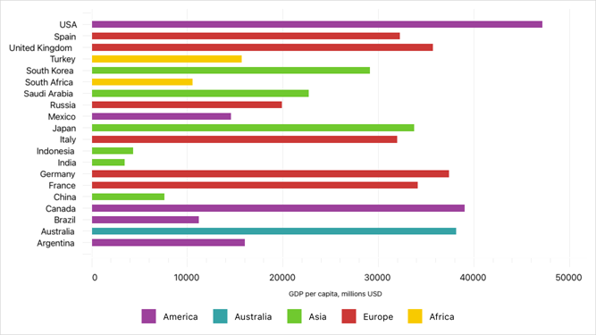
Example
In this example, a bar chart visualizes GDP values for the G20 and paints bars with colors from a specific data field. Legend titles are also stored in a separate data field.
<ContentPage xmlns:x="http://schemas.microsoft.com/winfx/2009/xaml"
             xmlns:dxc="clr-namespace:DevExpress.Maui.Charts;assembly=DevExpress.Maui.Charts"
             x:Class="ColorizerExample.MainPage"
             xmlns:local="clr-namespace:ColorizerExample">
    <ContentPage.BindingContext>
        <local:ViewModel/>
    </ContentPage.BindingContext>
    <dxc:ChartView Rotated="True">
        <dxc:ChartView.Series>
            <dxc:BarSeries>
                <!-- Bind the series to the data source. -->
                <dxc:BarSeries.Data>
                    <dxc:SeriesDataAdapter DataSource="{Binding CountryStatisticsData}"
                                           ArgumentDataMember="Country">
                        <dxc:ValueDataMember Type="Value" Member="Gdp"/>
                    </dxc:SeriesDataAdapter>
                </dxc:BarSeries.Data>

                <!-- Retrieve series point colors and legend items from the data source. -->
                <dxc:BarSeries.PointColorizer>
                    <dxc:ColorDataAdapter DataSource="{Binding CountryStatisticsData}"
                                          ColorDataMember="Color"
                                          LegendTextDataMember="Region"/>
                </dxc:BarSeries.PointColorizer>
            </dxc:BarSeries>
        </dxc:ChartView.Series>

        <!-- Specify axis and legend settings here. -->
    </dxc:ChartView>
</ContentPage>