ViewerApiExtensionOptions Interface
Provides options for customizing the ViewerApiExtension.
Declaration
export interface ViewerApiExtensionOptionsRemarks
-
Properties
onDashboardTitleToolbarUpdated Property
Specifies a handler for the event occurring before the dashboard title toolbar is updated.
Declaration
onDashboardTitleToolbarUpdated?: (args: DashboardTitleToolbarUpdatedEventArgs) => voidProperty Value
| Type | Description |
|---|---|
| (args: DashboardTitleToolbarUpdatedEventArgs) => void | A function that is executed when the dashboard title toolbar is updated. |
Remarks
You can handle the DashboardTitleToolbarUpdated event to customize the dashboard title. For instance, you can add custom command buttons, create additional menus, add static texts, etc. The DashboardItemCaptionToolbarOptions class contains options used to customize a dashboard title’s elements (the ViewerToolbarItem objects).
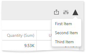
The following example shows how to add a toolbar item to the dashboard title. The code snippet below creates a custom button with a popup menu. The DashboardTitleToolbarUpdated event is used to customize the dashboard title. The button belongs to the actionItems collection and is displayed on the right (like the Export To and Parameters buttons).
The image below shows the result:
extensions: {
    'viewerApi': {
        onDashboardTitleToolbarUpdated: function (e) {
            e.options.actionItems.push({
                icon: 'grayTriangle',
                type: "menu",
                menu: {
                    title: 'Custom Menu',
                    type: 'list',
                    items: ['First Item', 'Second Item', 'Third Item'],
                    selectionMode: 'single',
                    itemClick: function (itemData, itemElement, index) {
                        alert(itemData.toString());
                    }
                }
            })
        },
    }
}
onItemActionAvailabilityChanged Property
Specifies a handler for the event occurring after the available interactivity actions have changed for the specific dashboard item.
Declaration
onItemActionAvailabilityChanged?: (args: ItemActionAvailabilityChangedEventArgs) => voidProperty Value
| Type | Description |
|---|---|
| (args: ItemActionAvailabilityChangedEventArgs) => void | A function that is executed after the available interactivity actions have changed for the specific dashboard item. |
onItemCaptionToolbarUpdated Property
Specifies a handler for the event occurring before the dashboard item caption toolbar is updated.
Declaration
onItemCaptionToolbarUpdated?: (args: ItemCaptionToolbarUpdatedEventArgs) => voidProperty Value
| Type | Description |
|---|---|
| (args: ItemCaptionToolbarUpdatedEventArgs) => void | A function that is executed when the dashboard item caption toolbar is updated. |
Remarks
You can handle the ItemCaptionToolbarUpdated event to customize the dashboard item’s caption. For instance, you can add custom command buttons, create additional menus, add static texts, etc. The DashboardItemCaptionToolbarOptions class contains options used to customize a dashboard item caption’s elements (the ViewerToolbarItem objects).
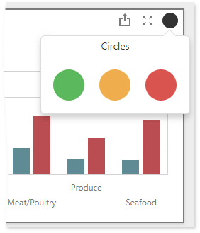
The following example shows how to add a toolbar item to the dashboard item caption. The code snippet below creates a custom button with a popup menu for the Chart dashboard item. The ItemCaptionToolbarUpdated event is used to customize the dashboard item caption. The button belongs to the actionItems collection and is displayed only when the mouse pointer hovers over the dashboard item caption. The popup menu contains three icon elements.
The image below shows the result:
extensions: {
  "viewerApi": {
      onItemCaptionToolbarUpdated: function (e) {
        if (e.itemName === "chartDashboardItem1") {
          e.options.actionItems.push({
            type: "menu",
            icon: "baseCircle",
            menu: {
              type: "icons",
              items: ["greenCircle","yellowCircle","redCircle"],
              selectionMode: "none",
              title: "Circles",
              itemClick: function (itemData, itemElement, index) {
                alert(itemData.toString());
              }
            }
          });
        }
      }
    }
  }
}
onItemClick Property
Specifies a handler for the event occurring when an end-user clicks a dashboard item.
Declaration
onItemClick?: (args: ItemClickEventArgs) => voidProperty Value
| Type | Description |
|---|---|
| (args: ItemClickEventArgs) => void | A function that is executed when an end-user clicks a dashboard item. |
onItemDrillDownStateChanged Property
Specifies a handler for the event occurring when a drill-down/drill-up is performed.
Declaration
onItemDrillDownStateChanged?: (args: ItemDrillDownStateChangedEventArgs) => voidProperty Value
| Type | Description |
|---|---|
| (args: ItemDrillDownStateChangedEventArgs) => void | A function that is executed when a drill-down is performed. |
Remarks
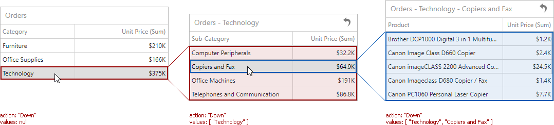
The ItemDrillDownStateChanged event is raised when an end-user performs drill-down or drill-up in a certain dashboard item. To determine the component name of this dashboard item, use the ItemName event parameter. Other event parameters include the following:
- ItemDrillDownStateChangedEventArgs.action returns the action performed in the dashboard item. For example, ‘Down’ identifies a drill-down while ‘Up’ identifies a drill-up.
- ItemDrillDownStateChangedEventArgs.values returns values from the current drill-down hierarchy. In OLAP mode, the ItemDrillDownStateChangedEventArgs.values property returns unique names instead of values.
onItemElementCustomColor Property
Specifies a handler for the event allowing you to color the required dashboard item elements using the specified colors.
Declaration
onItemElementCustomColor?: (args: ItemElementCustomColorEventArgs) => voidProperty Value
| Type | Description |
|---|---|
| (args: ItemElementCustomColorEventArgs) => void | A function that is executed when coloring the required dashboard item elements. |
onItemMasterFilterStateChanged Property
Specifies a handler for the event occurring when the master filter state is changed.
Declaration
onItemMasterFilterStateChanged?: (args: ItemMasterFilterStateChangedEventArgs) => voidProperty Value
| Type | Description |
|---|---|
| (args: ItemMasterFilterStateChangedEventArgs) => void | A function that is executed when the master filter state is changed. |
onItemSelectionChanged Property
Specifies a handler for the event occurring after the selection within the dashboard item is changed.
Declaration
onItemSelectionChanged?: (args: ItemSelectionChangedEventArgs) => voidProperty Value
| Type | Description |
|---|---|
| (args: ItemSelectionChangedEventArgs) => void | A function that is executed after the selection within the dashboard item is changed. |
onItemVisualInteractivity Property
Specifies a handler for the event allowing you to provide custom visual interactivity for data-bound dashboard items that support element selection and highlighting.
Declaration
onItemVisualInteractivity?: (args: ItemVisualInteractivityEventArgs) => voidProperty Value
| Type | Description |
|---|---|
| (args: ItemVisualInteractivityEventArgs) => void | A function that is executed when you provide custom visual interactivity for data-bound dashboard items that support element selection and highlighting. |
Remarks
The code snippet below shows how to add custom interactivity to dashboards:
onItemWidgetCreated Property
Specifies a handler for the event allowing you to access underlying UI/Data Visualization widgets.
Declaration
onItemWidgetCreated?: (args: ItemWidgetEventArgs) => voidProperty Value
| Type | Description |
|---|---|
| (args: ItemWidgetEventArgs) => void | A function that is executed when the client widget is created. |
Remarks
The Web Dashboard uses DevExtreme widgets to visualize dashboard items’ data. The onItemWidgetCreated property allows you to access these widgets and customize their settings. See Access to Underlying Widgets for details.
The ItemWidgetEventArgs.itemName property returns the component name of the dashboard item whose widget you can customize. Use the ItemWidgetEventArgs.getWidget property to access the corresponding underlying widget.
When the dashboard item is re-rendered, all events connected to dashboard item’s life cycle (onItemWidget…) are fired again.
Note
The onItemWidgetCreated event is not fired for a custom dashboard item.
onItemWidgetOptionsPrepared Property
Specifies a handler for the event allowing you to access underlying UI/Data Visualization widgets and configure their options.
Declaration
onItemWidgetOptionsPrepared?: (args: ItemWidgetOptionEventArgs) => voidProperty Value
| Type | Description |
|---|---|
| (args: ItemWidgetOptionEventArgs) => void | A function that is executed before the client widget is prepared. |
Remarks
Use the DashboardItemBaseEventArgs.dashboardItem property to get the dashboard item for which the event is raised. The options property provides access to its underlying widget’s options.
onItemWidgetUpdated Property
Specifies a handler for the event allowing you to access underlying UI/Data Visualization widgets.
Declaration
onItemWidgetUpdated?: (args: ItemWidgetEventArgs) => voidProperty Value
| Type | Description |
|---|---|
| (args: ItemWidgetEventArgs) => void | A function that is executed when the client widget is updated. |
Remarks
The Web Dashboard uses DevExtreme widgets to visualize dashboard items’ data. The onItemWidgetCreated property allows you to access these widgets and customize their settings. See Access to Underlying Widgets for details.
The ItemWidgetEventArgs.itemName property returns the component name of the dashboard item whose widget you can customize. Use the ItemWidgetEventArgs.getWidget property to access the corresponding underlying widget.
When the dashboard item is re-rendered, all events connected to dashboard item’s life cycle (onItemWidget…) are fired again.
Note
The onItemWidgetUpdated event is not fired for a custom dashboard item.
onItemWidgetUpdating Property
Specifies a handler for the event allowing you to access underlying UI/Data Visualization widgets.
Declaration
onItemWidgetUpdating?: (args: ItemWidgetEventArgs) => voidProperty Value
| Type | Description |
|---|---|
| (args: ItemWidgetEventArgs) => void | A function that is executed when the client widget is about to be updated. |
Remarks
The Web Dashboard uses DevExtreme widgets to visualize dashboard items’ data. The onItemWidgetCreated property allows you to access these widgets and customize their settings. See Access to Underlying Widgets for details.
The ItemWidgetEventArgs.itemName property returns the component name of the dashboard item whose widget can be customized. Use the ItemWidgetEventArgs.getWidget property to access the corresponding underlying widget.
When the dashboard item is re-rendered, all events connected to dashboard item’s life cycle (onItemWidget…) are fired again.
Note
The onItemWidgetUpdating event is not fired for a custom dashboard item.
onSelectedTabPageChanged Property
Specifies a handler for the event occurring when the selected tab page is changed.
Declaration
onSelectedTabPageChanged?: (args: SelectedTabPageChangedEventArgs) => voidProperty Value
| Type | Description |
|---|---|
| (args: SelectedTabPageChangedEventArgs) => void | A function that is executed when the selected tab page is changed. |