ViewerToolbarItemMenu Interface
A toolbar item’s menu.
Declaration
export interface ViewerToolbarItemMenuRemarks
Use the ViewerToolbarItem.menu property to add a popup for the viewer toolbar item.
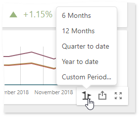
Toolbar items in the dashboard title and dashboard item caption can display a popup menu with text or icon elements:
Text Elements | Icons |
|---|---|
|
|
Use the ViewerToolbarItemMenu.type property to specify a popup menu’s type.
The following example shows how to add a toolbar item to the dashboard item caption. The code snippet below creates a custom button with a popup menu for the Chart dashboard item. The ItemCaptionToolbarUpdated event is used to customize the dashboard item caption. The button belongs to the actionItems collection and is displayed only when the mouse pointer hovers over the dashboard item caption. The popup menu contains three icon elements.
The image below shows the result:
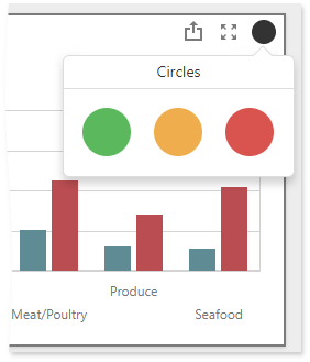
extensions: {
  "viewerApi": {
      onItemCaptionToolbarUpdated: function (e) {
        if (e.itemName === "chartDashboardItem1") {
          e.options.actionItems.push({
            type: "menu",
            icon: "baseCircle",
            menu: {
              type: "icons",
              items: ["greenCircle","yellowCircle","redCircle"],
              selectionMode: "none",
              title: "Circles",
              itemClick: function (itemData, itemElement, index) {
                alert(itemData.toString());
              }
            }
          });
        }
      }
    }
  }
}
Properties
columnCount Property
Specifies the number of columns in the pop-up menu.
Declaration
columnCount?: numberProperty Value
| Type | Description |
|---|---|
| number | An integer value that specifies the number of columns displayed in the pop-up menu. |
Remarks
You can specify a number of columns to arrange icons in the popup menu. This property is in effect only when the type is icons.
itemClick Property
Specifies a custom function that is executed when a click on the specified item occurs.
Declaration
itemClick?: (itemData: Object, itemElement: dxElement, itemIndex: number) => voidProperty Value
| Type | Description |
|---|---|
| (itemData: Object, itemElement: dxElement, itemIndex: number) => void | A function that is executed when a click on the specified item occurs. You can use an item, a JQuery element and an item index as arguments. |
Remarks
The itemClick property raises the click event when the toolbar item’s type is menu. If the toolbar item’s type is button, use the ViewerToolbarItem.click property to raise the click event.
items Property
Specifies items displayed in the pop-up menu.
Declaration
items?: Array<string>Property Value
| Type | Description |
|---|---|
| Array<string> | An array of string values that specify the text items or icon names. |
Remarks
The popup menu can consist of the text elements or icons. The items property specifies the following values according to the element’s type:
- Text elements: an array of string values that defines text elements.
- Icons: string value is the icon’s id from the SVG definition.
For icons, place the SVG definition on the page containing the Web Dashboard and set the icon’s color to dx-dashboard-icon to support colors of the Web Dashboard. The recommended icon size is 48 x 48 px.
itemTemplate Property
Declaration
itemTemplate?: (itemData: Object, itemElement: dxElement, itemIndex: number) => JQuery | Element | stringProperty Value
| Type |
|---|
| (itemData: Object, itemElement: dxElement, itemIndex: number) => JQuery | Element | string |
selectedItems Property
Specifies the items being selected.
Declaration
selectedItems?: Array<string>Property Value
| Type | Description |
|---|---|
| Array<string> | An array of items values that defines items being selected. |
selectionMode Property
Specifies the selection mode for a popup menu.
Declaration
selectionMode?: 'none' | 'single' | 'multiple'Property Value
| Name | Description |
|---|---|
| "none" | The selection is disabled. |
| "single" | Allows selecting a single element within the popup menu and disallows clearing this selection. |
| "multiple" | Allows selecting multiple items within the popup menu. |
title Property
Specifies a title of the popup menu with icons.
Declaration
title?: stringProperty Value
| Type | Description |
|---|---|
| string | A string that specifies a title of the popup menu with icons. |
Remarks
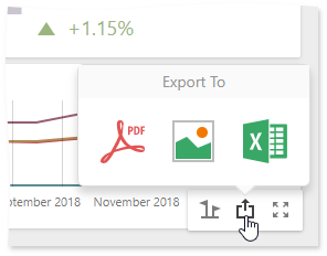
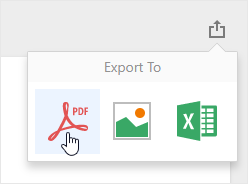
The title property is in effect when the ViewerToolbarItemMenu.type is set to icons. The image below displays a popup menu where a title is “Export To”:
type Property
Specifies a type of the dashboard toolbar menu.
Declaration
type: 'list' | 'icons'Property Value
| Name | Description |
|---|---|
| "list" | Defines a vertical popup menu with text elements. |
| "icons" | Defines a horizontal popup menu with icon elements. |
Remarks
The dashboard title and dashboard item caption can display a popup menu with text or icon elements. The recommended icon size is 48 x 48 px.