ViewerToolbarItem Interface
A toolbar item.
Declaration
export interface ViewerToolbarItemRemarks
The Web Dashboard allows customizing the dashboard item caption and dashboard title. For instance, you can add custom command buttons, create additional popup menus, add static texts, etc. Use the DashboardItemCaptionToolbarOptions and DashboardTitleToolbarOptions classes to create a toolbar item of the specified type (like custom buttons or static text). The ViewerToolbarItem object represents a toolbar item.
Use the ViewerApiExtensionOptions.onItemCaptionToolbarUpdated and ViewerApiExtensionOptions.onDashboardTitleToolbarUpdated handlers to customize the dashboard item’s caption and dashboard title.
You can use predefined colors for toolbar icons to make the icons consistent with the entire dashboard application. For example, you can use the predefined color for a new toolbar button. In this case, the button’s color depends on the selected Web Dashboard theme.
The table below lists the available predefined color classes:
| Predefined Color | Description |
|---|---|
| dx-dashboard-icon | The theme’s primary color. |
| dx-dashboard-contrast-icon | The theme’s additional color. |
| dx-dashboard-accent-icon | The theme’s accent color. |
| dx-dashboard-green-icon | A green hue based on the theme. |
| dx-dashboard-red-icon | A red hue based on the theme. |
| dx-dashboard-yellow-icon | A yellow hue based on the theme. |
Use the class="colorName" attribute in the icon’s svg definition to specify the icon’s color. If you want to change an icon’s color when it is hovered, add the style="fill: currentColor" attribute to the svg definition.
The code snippet below defines an icon that changes its color depending on the theme’s primary color and when you hover over it:
<svg id="baseCircle" class="dx-dashboard-icon" style="fill: currentColor" viewBox="0 0 24 24" width="24" height="24"><circle cx="12" cy="12" r="11" /></svg>
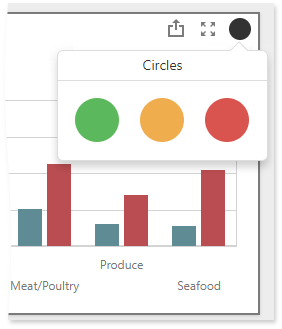
The following example shows how to add a toolbar item to the dashboard item caption. The code snippet below creates a custom button with a popup menu for the Chart dashboard item. The ItemCaptionToolbarUpdated event is used to customize the dashboard item caption. The button belongs to the actionItems collection and is displayed only when the mouse pointer hovers over the dashboard item caption. The popup menu contains three icon elements.
The image below shows the result:
extensions: {
  "viewerApi": {
      onItemCaptionToolbarUpdated: function (e) {
        if (e.itemName === "chartDashboardItem1") {
          e.options.actionItems.push({
            type: "menu",
            icon: "baseCircle",
            menu: {
              type: "icons",
              items: ["greenCircle","yellowCircle","redCircle"],
              selectionMode: "none",
              title: "Circles",
              itemClick: function (itemData, itemElement, index) {
                alert(itemData.toString());
              }
            }
          });
        }
      }
    }
  }
}
Properties
checked Property
Specifies a value indicating whether the toolbar item is enabled.
Declaration
checked?: booleanProperty Value
| Type | Description |
|---|---|
| boolean | true, if the toolbar item is enabled; otherwise, false. |
click Property
Specifies a custom function that is executed when a button click occurs.
Declaration
click?: (element: dxElement) => voidProperty Value
| Type | Description |
|---|---|
| (element: dxElement) => void | A function that is executed when a button click occurs. |
Remarks
The click event is raised for the toolbar item when its ViewerToolbarItem.type is button. For the menu value, use the ViewerToolbarItemMenu.itemClick property to raise the click event for a specific popup menu item.
disabled Property
Specifies whether the current toolbar item is disabled and cannot be clicked.
Declaration
disabled?: booleanProperty Value
| Type | Description |
|---|---|
| boolean | true, to disable a toolbar item; otherwise, false. |
hint Property
Specifies the text displayed as a toolbar item’s hint.
Declaration
hint?: stringProperty Value
| Type | Description |
|---|---|
| string | A string value that is a toolbar item’s hint. |
Remarks
The hint property displays a simple popup hint with additional information about the item being hovered over. To provide a complex tooltip, use the tooltip property.
icon Property
Specifies the id from the icon’s SVG definition.
Declaration
icon?: stringProperty Value
| Type | Description |
|---|---|
| string | A string that is the id from the icon’s SVG definition. |
Remarks
Web Dashboard supports icons in the SVG format. To provide an icon for the toolbar item, add the SVG definition onto the page and assign the id value from the definition to the icon property.
See Predefined Colors for information on which color constants you can use to natively embed an icon in the Web Dashboard application.
The recommended icon size is 24 x 24 px.
Note
The dashboard toolbar item is not displayed in the caption / title if neither the text nor icon properties are set.
menu Property
Specifies a toolbar item’s menu.
Declaration
menu?: ViewerToolbarItemMenuProperty Value
| Type | Description |
|---|---|
| ViewerToolbarItemMenu | A ViewerToolbarItemMenu object that is a toolbar item’s menu. |
name Property
Specifies a toolbar item’s unique name.
Declaration
name?: stringProperty Value
| Type | Description |
|---|---|
| string | A string value that is a toolbar item’s unique name. |
Remarks
Go to dashboardToolbarItemNames to get a list of predefined names.
template Property
Specifies a template used to customize a toolbar item.
Declaration
template?: () => JQuery | Element | stringProperty Value
| Type | Description |
|---|---|
| () => JQuery | Element | string | An object that defines a template or specifies its name. |
text Property
Specifies a text you can display in the toolbar item.
Declaration
text?: stringProperty Value
| Type | Description |
|---|---|
| string | A string value that is a toolbar item’s title. |
Remarks
Note
The text property is not in effect if you set the icon property.
Note
The dashboard toolbar item is not displayed in the caption / title if neither the text nor icon properties are set.
tooltip Property
Specifies the text displayed as a toolbar item’s tooltip.
Declaration
tooltip?: ViewerToolbarItemTooltip | stringProperty Value
| Type | Description |
|---|---|
| ViewerToolbarItemTooltip | A ViewerToolbarItemTooltip object that is a tooltip. |
| string | A string value that is a toolbar item’s tooltip. |
Remarks
The tooltip property displays a customized popup hint with additional information about the item being hovered over. You can create a specified template to display a complex tooltip.
To provide a simple hint, use the hint property.
type Property
Specifies the type of the dashboard toolbar item.
Declaration
type?: 'button' | 'menu' | 'text'Property Value
| Name | Description |
|---|---|
| "button" | Defines a clickable button. |
| "menu" | Defines a pop-up menu. |
| "text" | Defines an additional text you can display in the caption / title. |
Remarks
The following properties are not in effect for the text dashboard toolbar item: