Dashboard Title
- 5 minutes to read
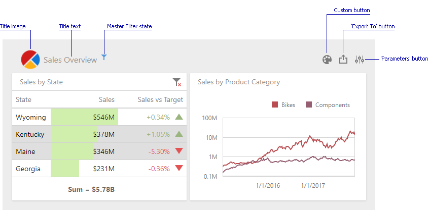
The Dashboard Title is located at the top of the dashboard surface and can contain static text, svg images, and command buttons. These elements are called toolbar items:
Title Settings
To change title settings, invoke the dashboard menu and open the Title page.
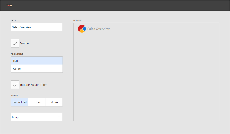
Here you can specify the following options.
Option | Description |
|---|---|
Text | Specifies the dashboard title text. |
Visible | Specifies whether the dashboard title is visible. |
Alignment | Specifies the alignment of the dashboard title. |
Include Master Filter | Specifies whether to show the state of master filter items in the dashboard title. When an end-user hovers over the filter icon (
|
Image | Allows you to specify the image displayed within the dashboard title. |
 ), all master filters applied to the dashboard are displayed in the invoked popup.
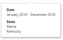
The dashboard title can contain command buttons.
Command Button | Description |
|---|---|
Export To | Allows end-users to export the dashboard. To learn more about exporting, see Exporting. |
Parameters | Allows end-users to modify dashboard parameter values. To learn more about parameters, see Parameters. |
Customization
The Web Dashboard allows customizing the dashboard item caption and dashboard title. For instance, you can add custom command buttons, create additional menus, add static texts, etc. Use the DashboardTitleToolbarOptions class to get access to a specific toolbar item’s collection in the dashboard title (like command buttons or static text). The ViewerToolbarItem object represents a toolbar item.
Use the following members to customize the dashboard title:
Event | Description |
|---|---|
Allows you to customize a dashboard title (for instance, add custom buttons, menus, etc.). | |
DashboardViewerApiOptionBuilder.OnDashboardTitleToolbarUpdated | Specifies the JavaScript function (or its name) executed before the dashboard title toolbar is updated. |
DashboardControlClientSideEvents.DashboardTitleToolbarUpdated | Gets or sets a function used in JavaScript frameworks that is executed when the ASPxClientDashboard.DashboardTitleToolbarUpdated event is raised. |
Specifies a handler for the event occurring before the dashboard title toolbar is updated. |
See Extensions Overview for information on how to use DashboardControl extensions.
Predefined Colors
Tip
You can use the ResourceManager.registerIcon method as an alternative variant to add an icon onto the page.
You can use predefined colors for toolbar icons to make the icons consistent with the entire dashboard application. For example, you can use the predefined color for a new toolbar button. In this case, the button’s color depends on the selected Web Dashboard theme.
The table below lists the available predefined color classes:
| Predefined Color | Description |
|---|---|
| dx-dashboard-icon | The theme’s primary color. |
| dx-dashboard-contrast-icon | The theme’s additional color. |
| dx-dashboard-accent-icon | The theme’s accent color. |
| dx-dashboard-green-icon | A green hue based on the theme. |
| dx-dashboard-red-icon | A red hue based on the theme. |
| dx-dashboard-yellow-icon | A yellow hue based on the theme. |
Use the class="colorName" attribute in the icon’s svg definition to specify the icon’s color. If you want to change an icon’s color when it is hovered, add the style="fill: currentColor" attribute to the svg definition.
The code snippet below defines an icon that changes its color depending on the theme’s primary color and when you hover over it:
<svg id="baseCircle" class="dx-dashboard-icon" style="fill: currentColor" viewBox="0 0 24 24" width="24" height="24"><circle cx="12" cy="12" r="11" /></svg>
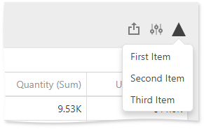
Example 1: Add a Toolbar Item
Tip
Before you begin, have a look at the Extensions Overview section for information on how to use DashboardControl extensions.
The following example shows how to add a toolbar item to the dashboard title. The code snippet below creates a custom button with a popup menu. The DashboardTitleToolbarUpdated event is used to customize the dashboard title. The button belongs to the actionItems collection and is displayed on the right (like the Export To and Parameters buttons).
The image below shows the result:
extensions: {
    'viewerApi': {
        onDashboardTitleToolbarUpdated: function (e) {
            e.options.actionItems.push({
                icon: 'grayTriangle',
                type: "menu",
                menu: {
                    title: 'Custom Menu',
                    type: 'list',
                    items: ['First Item', 'Second Item', 'Third Item'],
                    selectionMode: 'single',
                    itemClick: function (itemData, itemElement, index) {
                        alert(itemData.toString());
                    }
                }
            })
        },
    }
}
Example 2: Change a Toolbar Item
The following example shows how to change the specific toolbar item. The code snippet below changes a dashboard title:
extensions: {
    'viewerApi': {
        onDashboardTitleToolbarUpdated: function (e) {
            var caption = e.options.contentItems.filter(function(item) {
                return item.name === 'dashboard-title'
            });
            if(caption.length > 0) {
                caption[0].text = 'Sales Overview';
            }
        }
    }
}
Example 3: Remove a Toolbar Item
The following example shows how to delete a specific element from the toolbar items collection. The code snippet below removes the ‘Export To’ button from the dashboard title:
extensions: {
    'viewerApi': {
         onDashboardTitleToolbarUpdated: function (e) {
                e.options.actionItems = e.options.actionItems.filter(function(item) {
                    return item.name !== 'export-menu'
                });
            }
        }
    }
}
See DashboardControl's Client-Side API Overview for more information on how to customize the dashboard control on the client side.
Refer to the Array documentation for information on how to manage the collection of toolbar items.