Customize Dashboard Colors
- 5 minutes to read
Important
This documentation applies to v16.2. Starting with v17.1, the ASPxDashboardViewer control is in maintenance mode. In v19.1, the new Web Dashboard Control replaces the old Web Dashboard Viewer. This means that the Web Dashboard Viewer will not be included in our installation packages. See our blog post for more information.
Refer to the following KB articles to learn how to migrate to ASPxDashboard / ASP.NET MVC Dashboard:
ASPxDashboardViewer -> ASPxDashboard
How to migrate from ASPxDashboardViewer to ASPxDashboard working in the ViewerOnly mode
MVCxDashboardViewer -> MVCxDashboard
How to migrate from DashboardViewerExtension to DashboardExtension working in the ViewerOnly mode
The Dashboard Designer provides the capability to manage the coloring of dashboard item elements. To learn more, see Coloring.
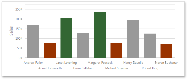
The ASPxClientDashboardViewer allows you to color specified dashboard item elements (for instance, chart series points, pie segments or scatter chart points) at runtime by handling the ASPxClientDashboardViewer.ItemElementCustomColor event. For instance, this can be used to color specified elements based on their values. The image below illustrates the Chart dashboard item whose bars are colored based on the their values: values that exceed 200k are colored in green, values below 100k are colored in red, and values that fall into the range between 100k and 200k are colored in gray.
The ASPxClientDashboardItemElementCustomColorEventArgs class exposes the following members that allow you to color the required element.
- Use the ASPxClientDashboardItemElementCustomColorEventArgs.ItemName property to obtain the component name of the dashboard item for which the event was raised.
The ASPxClientDashboardItemElementCustomColorEventArgs.GetTargetElement method returns the axis point tuple that corresponds to the current dashboard item element.
The ASPxClientDashboardItemElementCustomColorEventArgs.GetMeasures method returns measures corresponding to the current dashboard item element. Use the ASPxClientDashboardViewer.GetItemData method to create the required tuple (using the ASPxClientDashboardItemData.CreateTuple method) and to obtain dashboard item measures (using the ASPxClientDashboardItemData.GetMeasures method).
- Use the ASPxClientDashboardItemElementCustomColorEventArgs.SetColor method to set the color of the current dashboard item element.
Note
By default, the Chart dashboard item colors lines (or fills areas) for the Line/Area series types using the color of the first series point. For these lines/areas, the ASPxClientDashboardItemElementCustomColorEventArgs.GetTargetElement method returns a tuple that does not contain the ASPxClientDashboardItemDataAxisPoint on the DashboardDataAxisNames.ChartArgumentAxis.
Example
The following example demonstrates how to color dashboard item elements using the ASPxClientDashboardViewer.ItemElementCustomColor event.
In this example, chart series points, whose values exceed specified thresholds, are colored in green. Chart series points, whose values fall below specified thresholds, are colored in red.
Pie segments, whose contributions in total fall below the specified threshold, are colored in orange.
Note
A complete sample project is available at https://github.com/DevExpress-Examples/how-to-color-dashboard-item-elements-in-the-web-viewer-t198119.
- WebForm1.aspx.vb
- ElementCustomColor.js (VB.NET)
- WebForm1.aspx (VB.NET)
- ElementCustomColor.js (C#)
- WebForm1.aspx.cs
- WebForm1.aspx (C#)
Imports System
Imports DevExpress.DashboardWeb
Imports DevExpress.DataAccess.ConnectionParameters

Namespace Dashboard_ElementCustomColor_Web
    Partial Public Class WebForm1
        Inherits System.Web.UI.Page

        Protected Sub Page_Load(ByVal sender As Object, ByVal e As EventArgs)

        End Sub

        Protected Sub ASPxDashboardViewer1_ConfigureDataConnection(ByVal sender As Object, _
                                           ByVal e As ConfigureDataConnectionWebEventArgs)
            If e.ConnectionName = "nwindConnection" Then

                ' Gets connection parameters used to establish a connection to the database.
                Dim parameters As Access97ConnectionParameters =
                    CType(e.ConnectionParameters, Access97ConnectionParameters)
                Dim databasePath As String = Server.MapPath("App_Data/nwind.mdb")

                ' Specifies the path to a database file.
                parameters.FileName = databasePath
            End If
        End Sub
    End Class
End Namespace