DxToast.IconCssClass Property
Specifies the name of the CSS class applied to the toast notification icon.
Namespace: DevExpress.Blazor
Assembly: DevExpress.Blazor.v25.1.dll
NuGet Package: DevExpress.Blazor
Declaration
[DefaultValue(null)]
[Parameter]
public string IconCssClass { get; set; }
Property Value
| Type | Default | Description |
|---|---|---|
| String | null | The CSS class name. |
Remarks
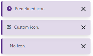
A toast notification displays a predefined icon. Use the IconCssClass property to customize icon settings or display a custom icon. Set the ShowIcon property to false to hide the icon.
DevExpress Blazor components support pre-defined icon sets (such as Iconic or Bootstrap-recommended libraries) and custom icon libraries. Refer to the following topic for more information: Icons.
<DxButton RenderStyle="ButtonRenderStyle.Secondary" Text="Show a toast" Click="ShowToasts" />
<DxToastProvider ThemeMode="ToastThemeMode.Pastel" />

<DxToast Id="Toast1" Text="Predefined icon." />
<DxToast Id="Toast2" Text="Custom icon." IconCssClass="oi oi-task" />
<DxToast Id="Toast3" Text="No icon." ShowIcon="false" />

@code {
    [Inject] IToastNotificationService ToastService { get; set; }

    private void ShowToasts() {
        ToastService.ShowToast("Toast1");
        ToastService.ShowToast("Toast2");
        ToastService.ShowToast("Toast3");
    }
}
See Also